Floating logo over navigation bar with inner shadow in banner - Bootstrap
To make logo overlap banner, you need to add properties position and z-index to image's parent:
.navbar-collapse .navbar-brand .white-circle {
  ...

  position: relative;
  z-index: 2;
}
Then, you need to increase image's size, to make it same with parent's size:
.navbar-collapse .navbar-brand .white-circle .logo {
    width: 161px;
    height: 161px;
}
And make image circle, you may to add border-radius: 50%, I've just used bootstrap's class img-circle.
To center image, I've used class text-center for div.collapse (it's navbar-brand's parent).
Then, to make shadow for navbar and logo I've used Green's suggestion, thanks him:
.navbar-header,
.collapse.navbar-collapse,
img.logo {
  box-shadow: 0px 2px 14px 2px rgba(0, 0, 0, 0.7);
}
But now you have another issue, when reduce screen's size, right part of navbar falls down image! In my example, I've changed container class to container-fluid and then added div.row to make navbar a bit bigger. Then I've changed @media-queries for collapsing navbar. If you need only container class, just play with max-width in @media-queries to increase it.
excitive
I make experiences better for the user and profitable for businesses. I code, design and dream.
Updated on June 05, 2022Comments
-
excitive almost 2 years
What should be the correct way to implement following with Bootstrap?
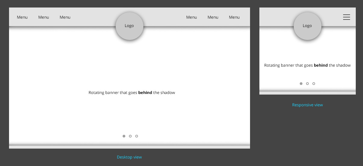
The logo ‘comes out’ of the navigation bar and extends over the banner. Banner has inner shadow and behind which the images should be rotating. The navigation should collapse in a typical Bootstrap fashion when in responsive.
So far, I have been able to bring the logo in center and have the two-part navigation collapse with following:
<nav class="navbar navbar-inverse navbar-main">
    <div class="container">
    <!-- Brand and toggle get grouped for better mobile display -->
    <div class="navbar-header">
        <a class="navbar-brand visible-xs" href="index.php">Logo</a>
        <button type="button" class="navbar-toggle collapsed" data-toggle="collapse" data-target="#bs-example-navbar-collapse-1" aria-expanded="false">
            <span class="sr-only">Toggle navigation</span>
            <span class="icon-bar"></span>
            <span class="icon-bar"></span>
            <span class="icon-bar"></span>
        </button>
    </div>
    <div class="collapse navbar-collapse" id="bs-example-navbar-collapse-1">
        <ul class="nav navbar-nav">
            <li class="active"><a href="index.php">Home <span class="sr-only">(current)</span></a></li>
            <li><a href="about-us.php">About Us</a></li>
            <li><a href="media.php">Media</a></li>
            <li><a href="events.php">Events</a></li>
        </ul>
        <div class="navbar-brand hidden-xs">
            <a class="white-circle" href="index.php">
                <img class="logo" src="http://excitive.me/demo/temp/logo.svg" alt="Logo">
            </a>
        </div>
        <ul class="nav navbar-nav navbar-right">
            <li><a href="things-to-do.php">Things To Do</a></li>
            <li><a href="offers.php">Offers</a></li>
            <li><a href="index.php#location">Location</a></li>
            <li><a href="book-now.php">Book Now</a></li>
        </ul>
    </div><!-- /.navbar-collapse -->
    </div><!-- /.container-fluid -->
</nav>

<div class="container">
    <div id="carousel-example-generic" class="carousel slide" data-ride="carousel">
        <!-- Indicators -->
        <ol class="carousel-indicators">
            <li data-target="#carousel-example-generic" data-slide-to="0" class="active"></li>
            <li data-target="#carousel-example-generic" data-slide-to="1"></li>
            <li data-target="#carousel-example-generic" data-slide-to="2"></li>
        </ol>
        <!-- Wrapper for slides -->
        <div class="carousel-inner" role="listbox">
            <div class="item active">
                <img src="http://excitive.me/demo/temp/banner-home-01.jpg" alt="Banner Alt">
                <div class="carousel-caption">
                    Lorem ipsum
                </div>
            </div>
            <div class="item">
                <img src="http://excitive.me/demo/temp/banner-home-02.jpg" alt="Banner Alt">
                <div class="carousel-caption">
                    Dolor sit
                </div>
            </div>
            <div class="item">
                <img src="http://excitive.me/demo/temp/banner-home-03.jpg" alt="Banner Alt">
                <div class="carousel-caption">
                    Amet consectetur
                </div>
            </div>
        </div>
    </div>
</div>
CSS:
.navbar .container {
  text-align: center;
}
.navbar-collapse .navbar-brand {
  display: inline-block;
  float: none;
  padding: 0;
  margin: 0 !important;
  overflow: visible;
}
.navbar-collapse .navbar-brand .white-circle {
  display: block;
  width: 161px;
  height: 161px;
  background-color: white;
  border-radius: 50%;
  border: 1px dotted red;
}
.navbar-collapse .navbar-brand .white-circle .logo {
  width: 144px;
}
https://jsfiddle.net/rvnwp1xv/
(Please extend the output panel in JSFiddle to view normal navigation)
Now the question remains about the shadow and how to make logo overlap the banner.
The layout is set to fixed width, so my next attempt is to use absolute positioning. But for that banner has to come before navigation in HTML, which doesn’t sound right.
-
 Jamie Ivanov almost 6 yearsExcellent work! Would you happen to know how to accomplish this in Bootstrap 4?
 -
Állan Fidelis Toledo over 5 yearsI'm looking for this answer too (bootstrap 4). If I found something, I'll put it here.