How can I make a circular sector using CSS
Solution 1
I have finished the menu: Circular menu v6 - jsFiddle.
There is no JavaScript involved in this menu. It's done in pure CSS!
Here is the code:
#menu {
  background: #aaa;
  position: relative;
  width: 200px;
  height: 200px;
  margin: 0 auto;
  overflow: hidden;
  border-radius: 100px;
  -moz-border-radius: 100px;
  -webkit-border-radius: 100px;
}

#center {
  position: absolute;
  left: 70px;
  top: 70px;
  width: 60px;
  height: 60px;
  z-index: 10;
  background: #eee;
  background: linear-gradient(top, #eee, #aaa);
  background: -moz-linear-gradient(top, #eee, #aaa);
  background: -webkit-gradient(linear, left top, left bottom, from(#eee), to(#aaa));
  border-radius: 30px;
  -moz-border-radius: 30px;
  -webkit-border-radius: 30px;
}

#center a {
  display: block;
  width: 100%;
  height: 100%
}

.item {
  background: #aaa;
  overflow: hidden;
  position: absolute;
  width: 100px;
  height: 100px;
  transform-origin: 100% 100%;
  -moz-transform-origin: 100% 100%;
  -webkit-transform-origin: 100% 100%;
  transition: background .5s;
  -moz-transition: background .5s;
  -webkit-transition: background .5s;
  -o-transition: background .5s;
  -ms-transition: background .5s;
}

.item:hover {
  background: #eee
}

.item1 {
  z-index: 1;
  transform: rotate(60deg);
  -moz-transform: rotate(60deg);
  -webkit-transform: rotate(60deg);
}

.item2 {
  z-index: 2;
  transform: rotate(120deg);
  -moz-transform: rotate(120deg);
  -webkit-transform: rotate(120deg);
}

.item3 {
  z-index: 3;
  transform: rotate(180deg);
  -moz-transform: rotate(180deg);
  -webkit-transform: rotate(180deg);
}

.item4 {
  z-index: 4;
  transform: rotate(240deg);
  -moz-transform: rotate(240deg);
  -webkit-transform: rotate(240deg);
}

.item5 {
  z-index: 5;
  transform: rotate(300deg);
  -moz-transform: rotate(300deg);
  -webkit-transform: rotate(300deg);
}

.item6 {
  border: none;
  position: absolute;
  z-index: 6;
  transform: rotate(-30deg);
  -moz-transform: rotate(-30deg);
  -webkit-transform: rotate(-30deg);
}

#wrapper6 {
  position: absolute;
  width: 100px;
  height: 100px;
  overflow: hidden;
  transform-origin: 100% 100%;
  -moz-transform-origin: 100% 100%;
  -webkit-transform-origin: 100% 100%;
}

.item1 .content {
  left: -10px;
  top: 15px;
  transform: rotate(-60deg);
  -moz-transform: rotate(-60deg);
  -webkit-transform: rotate(-60deg);
}

.item2 .content {
  left: -11px;
  top: 16px;
  transform: rotate(-120deg);
  -moz-transform: rotate(-120deg);
  -webkit-transform: rotate(-120deg);
}

.item3 .content {
  left: -7px;
  top: 12px;
  transform: rotate(-180deg);
  -moz-transform: rotate(-180deg);
  -webkit-transform: rotate(-180deg);
}

.item4 .content {
  left: -5px;
  top: 18px;
  transform: rotate(-240deg);
  -moz-transform: rotate(-240deg);
  -webkit-transform: rotate(-240deg);
}

.item5 .content {
  left: -10px;
  top: 20px;
  transform: rotate(-300deg);
  -moz-transform: rotate(-300deg);
  -webkit-transform: rotate(-300deg);
}

.item6 .content {
  left: 20px;
  top: -10px;
  transform: rotate(30deg);
  -moz-transform: rotate(30deg);
  -webkit-transform: rotate(30deg);
}

.content,
.content a {
  width: 100%;
  height: 100%;
  text-align: center
}

.content {
  position: absolute;
}

.content a {
  line-height: 100px;
  display: block;
  position: absolute;
  text-decoration: none;
  font-family: 'Segoe UI', Arial, Verdana, sans-serif;
  font-size: 20px;
  text-shadow: 1px 1px #eee;
  text-shadow: 0 0 5px #fff, 0 0 5px #fff, 0 0 5px #fff
}

.display-target {
  display: none;
  text-align: center;
  opacity: 0;
}

.display-target:target {
  display: block;
  opacity: 1;
  animation: fade-in 1s;
  -moz-animation: fade-in 1s;
  -webkit-animation: fade-in 1s;
  -o-animation: fade-in 1s;
  -ms-animation: fade-in 1s;
}

@keyframes fade-in {
  from {
    opacity: 0
  }
  to {
    opacity: 1
  }
}

@-moz-keyframes fade-in {
  from {
    opacity: 0
  }
  to {
    opacity: 1
  }
}

@-webkit-keyframes fade-in {
  from {
    opacity: 0
  }
  to {
    opacity: 1
  }
}

@-o-keyframes fade-in {
  from {
    opacity: 0
  }
  to {
    opacity: 1
  }
}

@-ms-keyframes fade-in {
  from {
    opacity: 0
  }
  to {
    opacity: 1
  }
}
<div id="menu">
<div class="item1 item">
<div class="content"><a href="#one">one</a></div>
</div>
<div class="item2 item">
<div class="content"><a href="#two">two</a></div>
</div>
<div class="item3 item">
<div class="content"><a href="#three">three</a></div>
</div>
<div class="item4 item">
<div class="content"><a href="#four">four</a></div>
</div>
<div class="item5 item">
<div class="content"><a href="#five">five</a></div>
</div>
<div id="wrapper6">
<div class="item6 item">
<div class="content"><a href="#six">six</a></div>
</div>
</div>
<div id="center">
<a href="#"></a>
</div>
</div>
<div id="one" class="display-target">Welcome!
<br />This changing effect is done by ...</div>
<div id="two" class="display-target">... having <code><div></code>s with <code>id</code>s ... </div>
<div id="three" class="display-target">... that have the style <code>display: none</code> and the style
<pre style="text-align: left">:target {
display: block;
}</pre>so that these messages appear when there is a hash tag like <code>#three</code> (look at the address bar!)</div>
<div id="four" class="display-target">Look at the source of this page ...</div>
<div id="five" class="display-target">... to see how the circular menu works.</div>
<div id="six" class="display-target">By Shaquin Trifonoff</div>
<p><a href="http://stackoverflow.com/users/1421049/shaquin-trifonoff" title="My profile on Stack Overflow">By Shaquin Trifonoff</a></p>Solution 2
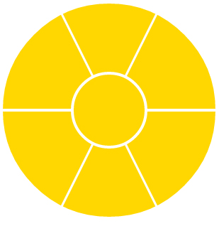
Simple circle seperated in 6 sectors
Using borders on pseudo elements to make the triangles:
output:
.circle {
  position: relative;
  display: inline-block;
  width: 300px;
  height: 300px;
  border-radius: 50%;
  overflow: hidden;
}

.circle:before,
.circle:after,
.circle > div:before,
.circle > div:after {
  content: '';
  position: absolute;
  z-index: -1;
}

.circle:before {
  bottom: 50%;
  left: 50%;
  margin-left: 2px;
  margin-bottom: 2px;
  border-top: 300px solid transparent;
  border-right: 150px solid gold;
}

.circle:after {
  top: 50%;
  left: 50%;
  margin-left: 2px;
  margin-top: 2px;
  border-right: 150px solid gold;
  border-bottom: 300px solid transparent;
}

.sector1:before {
  bottom: 50%;
  right: 50%;
  margin-right: 2px;
  margin-bottom: 2px;
  border-top: 300px solid transparent;
  border-left: 150px solid gold;
}

.sector1:after {
  bottom: 50%;
  margin-bottom: 5px;
  border-top: 300px solid gold;
  border-right: 150px solid transparent;
  border-left: 150px solid transparent;
}

.sector2:before {
  top: 50%;
  right: 50%;
  margin-right: 2px;
  margin-top: 2px;
  border-bottom: 300px solid transparent;
  border-left: 150px solid gold;
}

.sector2:after {
  top: 50%;
  margin-top: 5px;
  border-right: 150px solid transparent;
  border-bottom: 300px solid gold;
  border-left: 150px solid transparent;
}

.round-middle {
  position: absolute;
  top: 96px;
  left: 96px;
  width: 100px;
  height: 100px;
  border: 4px solid #fff;
  border-radius: 50%;
  background: gold;
}
<div class="circle">
<div class="sector1"></div>
<div class="sector2"></div>
<div class="round-middle"></div>
</div>Solution 3
It can be done using -moz-transform, try this fiddle. Actually, we don't need .sec1.sec_ to .sec4.sec_. And then .sec5.sec_ is .sec6
#container {
  margin: 50px 0 0 50px;
  position: relative;
}

#center {
  position: absolute;
  width: 50px;
  height: 50px;
  background-color: #ccc;
  -moz-border-radius: 100px;
  border-radius: 100px;
  position: relative;
  margin: 50px 0 0 0px;
  border: solid #fff 1px;
  z-index: 1000;
}

.outer_sec {
  width: 75px;
  height: 75px;
  overflow: hidden;
  position: absolute;
  left: -50px;
  top: 25px;
}

.sec {
  position: absolute;
  height: 75px;
  width: 75px;
  z-index: 1;
  border-radius: 100px 0 0 0;
  -moz-border-radius: 100px 0 0 0;
  top: -50px;
  left: -50px;
  -moz-transform-origin: 100% 100%;
  cursor: pointer;
}

.sec1.sec {
  -moz-transform: rotate(0deg);
  z-index: 1;
  background-color: #cc1;
}

.sec2.sec {
  -moz-transform: rotate(60deg);
  z-index: 2;
  background-color: #cb2;
}

.sec3.sec {
  -moz-transform: rotate(120deg);
  z-index: 3;
  background-color: #ca3;
}

.sec4.sec {
  -moz-transform: rotate(180deg);
  z-index: 4;
  background-color: #c94;
}

.sec5.sec {
  -moz-transform: rotate(240deg);
  z-index: 5;
  background-color: #c85;
}

.sec6.sec {
  -moz-transform: rotate(300deg);
  z-index: 6;
  margin: 0px 0px 0px 50px;
  background-color: #c76;
  top: -74px;
}

.sec:hover {
  background-color: #06c;
}
<div id="container">
<div class="sec1 sec"></div>
<div class="sec2 sec"></div>
<div class="sec3 sec"></div>
<div class="sec4 sec"></div>
<div class="sec5 sec"></div>
<div class="outer_sec">
<div class="sec6 sec"></div>
</div>
<div id="center"></div>
</div>Related videos on Youtube
 19 : 08
 09 : 20
 03 : 46
 02 : 03
 04 : 09
 01 : 35
 02 : 00
 12 : 22
 02 : 04
 09 : 30
 01 : 15
palAlaa
Interested in web application. Java web application. PHP web application. Also interested in HTML4, html5 , css2, css3, json, jQuery, chrome extension and mobile development using phone gap.
Updated on July 13, 2022Comments
-
palAlaa almost 2 years
I want to make a circular sector using CSS. The sectors will form a complete circle. How can I make it using CSS?
I found a sample, but it makes a quarter circular sector. I want to make six circular sectors that make a complete circle. How can I make it?
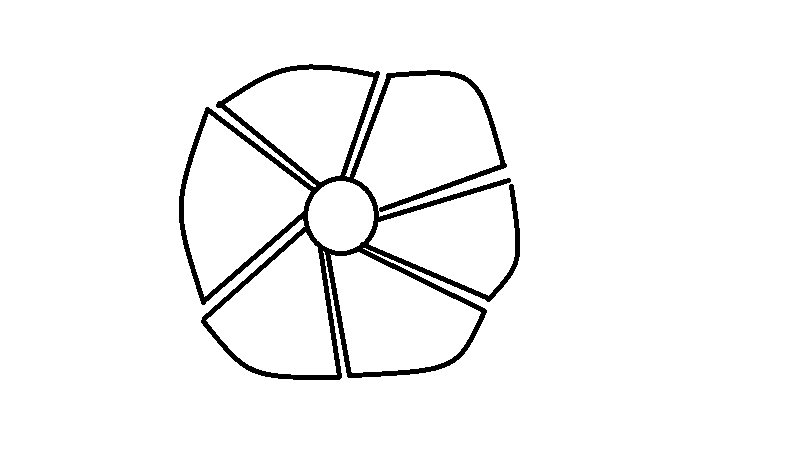
Note: I am not good at drawing, but here's a sample of what I want...
div {
  width: 50px;
  height: 50px;
  background-color: #ccc;
  background-color: #ccc;
  -moz-border-radius: 100px;
  border-radius: 100px;
}
#center {
  position: relative;
  margin: 100px 0 0 100px;
  border: solid #fff 1px;
}
#tl,#tr,#bl,#br {
  position: absolute;
  height: 75px;
  width: 75px;
  z-index: -1;
}
#tl {
  border-radius: 100px 0 0 0;
  -moz-border-radius: 100px 0 0 0;
  top: -50px;
  left: -50px;
}
#tr {
  border-radius: 0 100px 0 0;
  -moz-border-radius: 0 100px 0 0;
  top: -50px;
  left: 26px;
}
#bl {
  border-radius: 0 0 0 100px;
  -moz-border-radius: 0 0 0 100px;
  top: 26px;
  left: -50px;
}
#br {
  border-radius: 0 0 100px 0;
  -moz-border-radius: 0 0 100px 0;
  top: 26px;
  left: 26px;
}
<div id="center"> <div id="tl"></div> <div id="tr"></div> <div id="bl"></div> <div id="br"></div> </div>-
 doniyor almost 12 yearsnedbatchelder.com/blog/200805/css_homer_animated.html or if you think js is also okay here it is: walterzorn.de/en/jsgraphics/jsgraphics_e.htm
 -
doniyor almost 12 years
-
doniyor almost 12 yearsbut this shape is what you want exactly: gabri.me/demo/Coffee%20with%20CSS3%20Gradients
-
palAlaa almost 12 years@doniyor, It's not the shape I want! I don't want circle, I want circular sectors.
-
 Roko C. Buljan almost 12 years+1 for your painting skills
 -
doniyor almost 12 yearsoh yeah, i thought, PalAla can derive some ideas/codes from those examples.. but your one is of course the thing what PalAla is after, i guess...
-
 feeela almost 12 yearsThat would be a good use-case for SVG.
-
-
raymondralibi almost 12 yearsI've updated the the fiddle. too bad,
:hoverstill not working. -
palAlaa almost 12 yearsIt's quarter, the shape i need is 1/6, the same as image here i.imgur.com/zw8VQ.png
-
raymondralibi almost 12 yearsno, it's not quarter. maybe you can't see because it don't have outlines. maybe you have to see it using FF. for fast reply, it's only use -moz-transform (not include -webkit or -o), i've only tested it with FF. it's 1/6, not quarter.
-
raymondralibi almost 12 yearsi've figured it out, the problem is its z-index. i've updated the fiddle again.
-
arttronics over 11 years+1 I like that this Answer, done in CSS, includes fade animations. Cheers!
-
uınbɐɥs over 11 years@arttronics Thanks for putting it on jsFiddle! I forgot!
-
arttronics over 11 yearsIt's too bad that this example doesn't allow text to be presented inside each sector, severely limiting it's use.
-
uınbɐɥs over 11 years@arttronics - I've linked to a Fiddle (in an edit) with links on the menu (using
:target), that is how it was on my website. -
Jeemusu over 11 yearsThe fiddle seems to be missing a
border-radius: 100px 0 0 0;on the.itemclass, otherwise the circumfrance isn't circular in chrome. -
uınbɐɥs over 11 years@Jeemusu - Thanks for that, it looks like a Chrome-only bug (it doesn't listen to
overflow: hiddenon#menuand works fine on Firefox), I have made a fiddle here withborder-radiusand-webkit-border-radius, because I don't know how old the bug is. (It's probably because oftransform, Firefox has az-indexbug withtransformrather than anoverflowbug). -
raymondralibi over 11 yearsIt surely allows text. Put a
divinside each sector and set the position with css. this example doesn't use text 'cause we don't know what the question want, e.g. alignment, orientation, size, etc. -
arttronics over 11 years@raymondralibi, that's a fair statement. But considering the other answer has
textin it (to allow text-links or labels for example), the bar has been raised to a higher standard. To be sure, I did upvote you yesterday. Cheers!