How to apply flex in flutter
Solution 1
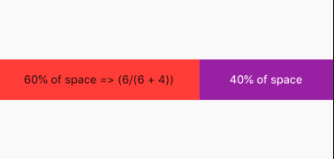
By using Expanded and setting the flex property, we can give each widget in a Row or Column its own weight. That means how much of the available space of that widget it is allowed to fill. So we can have the following code for a horizontal alignment:
By default, Expanded takes the whole available space, so if we want 2 widgets to take 50% of the space, we can remove the flex property altogether.
Here's simple code example to understand:
@override
  Widget build(BuildContext context) {
    return Scaffold(
      appBar: AppBar(
        title: Text("Expanded"),
      ),
      body: Container(
        child: Row(
          children: <Widget>[
            Expanded(
              flex: 6, // 60% of space => (6/(6 + 4))
              child: Container(
                color: Colors.red,
              ),
            ),
            Expanded(
              flex: 4, // 40% of space
              child: Container(
                color: Colors.purple,
              ),
            ),
          ],
        ),
      ),
    );
  }
Solution 2
Expanded is Similar to Flex and supports adding flex,
You can wrap your children with Expanded and give flex as below
Updated Code :
Container(
  child: new Row(
    children: <Widget>[
      new Expanded (
        flex:1,
        child : Column(
        children: <Widget>[new Text("Hello World")],
      ),),
      new Expanded(
        flex :2,
        child: Column(
        children: <Widget>[
          new Text(
              "This is a long text this is a long test this is This is a long text this is a long test this is This is a long text this is a long test this is This is a long text this is a long test this is This is a long text this is a long test this is This is a long text this is a long test this is ")
        ],
      ),)
    ],
  ),
)
Expanded : A widget that expands a child of a Row, Column, or Flex so that the child fills the available space.
You can read more at official docs here
Solution 3
Widgets inside a Flex widget (eg. Column, Row) can be wrapped in the Flexible widget. The Flexible widget has flex propery. Flutter has 3 flexible widgets: Flexible, Expanded and Spacer
return Container(
child: new Row(
  children: <Widget>[
    Flexible(
      flex: 1 /*or any integer value above 0 (optional)*/,
      child: Column(
        children: <Widget>[
          Expanded(
              flex: 1 /*or any integer value above 0 (optional)*/,
              child: new Text("Hello World")),
        ],
      ),
    ),
    new Column(
      children: <Widget>[
        new Text(
            "This is a long text this is a long test this is This is a long text this is a long test this is This is a long text this is a long test this is This is a long text this is a long test this is This is a long text this is a long test this is This is a long text this is a long test this is ")
      ],
    )
  ],
),

);
Solution 4
#FlexFit.loose : The child is forced to fill the available space.
#FlexFit.tight or Expanded : The child can be at most as large as the available space.
Unbreakable
The fool didn't know it was impossible, so he did it!
Updated on January 06, 2022Comments
-
Unbreakable over 2 years
I am a beginner in a flutter, and I have learned how to handle the sizing and text rendering when the screen sizing changes from desktop to tablet to mobile. But I want to understand how can I change the sizing or flex the content when I am decreasing the screen size within the same screen mode.
For Instance -
return Container(
  child: new Row(
    children: <Widget>[
      new Column(
        children: <Widget>[new Text("Hello World")],
      ),
      new Column(
        children: <Widget>[
          new Text(
              "This is a long text this is a long test this is This is a long text this is a long test this is This is a long text this is a long test this is This is a long text this is a long test this is This is a long text this is a long test this is This is a long text this is a long test this is ")
        ],
      )
    ],
  ),
);
With this scenario when I try to decrease the screen size from desktop to table I start getting oveflow exception. Please guide me on how to handle it.