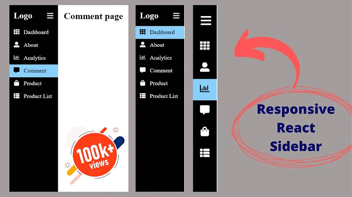
How to create a fixed sidebar using ReactJS? The sidebar should collapse in smaller screens
Based on my comment I've built a very basic example for you. It's far from beautiful or perfect, but it should get the point across. No JS needed. Just plain HTML + CSS.
<!DOCTYPE html>
<html lang="en">

<head>
  <meta charset="UTF-8">
  <meta name="viewport" content="width=device-width, initial-scale=1.0">
  <meta http-equiv="X-UA-Compatible" content="ie=edge">
  <title>Sidebar Test</title>
  <style>
    html,
    body {
      margin: 0;
      padding: 0;
    }

    body {
      display: flex;
      flex-flow: row;
    }

    aside {
      width: 20vw;
      height: 100vh;
    }

    main {
      width: 100%;
      height: 100vh;
      background: cornflowerblue;
      color: white;
    }

    #sidebar-toggle {
      display: none;
    }

    .toggle-btn {
      display: none;
      width: 4em;
      height: 2em;
      position: relative;
      cursor: pointer;
      background: yellow;
      padding: 2px;
    }

    @media(max-width:1200px) {
      .toggle-btn {
        display: block;
      }
      aside {
        width: 0vw;
        transition: width 0.25s ease-out;
      }
      #sidebar-toggle:checked+aside {
        width: 20vw;
      }
    }
  </style>
</head>

<body>
  <label class="toggle-btn" for="sidebar-toggle">click me</label>
  <input id="sidebar-toggle" type="checkbox" />
  <aside>
    <div>
      <ul>
        <li>Item-1</li>
        <li>Item-2</li>
        <li>Item-3</li>
      </ul>
    </div>
  </aside>
  <main>
    <div style="padding: 20px;margin:0 auto;text-align: center;font-size:2em;">Some content</div>
  </main>
</body>

</html>Related videos on Youtube
 14 : 35
 36 : 20
 24 : 56
 01 : 44 : 18
 12 : 53
 12 : 05
 20 : 26
shacy
Updated on June 04, 2022Comments
-
shacy almost 2 years
i have two columns on a page.i want to create a sidebar which is fixed on the left side so it shouldn't be scrolled if the content contained in the main body is being scrolled. in smaller screens, the sidebar should collapseable.
after looking into various sources, it seems that i need to use jquery but as much as possible, i want to maximize the functionalities of ReactJs. besides, some sources also say that it's not a good idea to mix Jquery with ReactJs.
the sidebar is now fixed but my problem now is i can't seem to collapse it in smaller screens. it's just fixed in there and it disappears in smaller screen. my goal is to create a button in smaller screens that when clicked should show the sidebar
This is not my whole code. i'm just posting the relevant snippets:
[.js]
constructor(props) {
        this.state = {
            collapsed: true
        };
        this.toggleNavbar = this.toggleNavbar.bind(this);
}
toggleNavbar() {
        this.setState({
            collapsed: !this.state.collapsed
        });
}
render() {
        return (
            <div  id="sidebar" >
                <Navbar color="faded" light className="sticky-top" data-spy="affix">
                    <NavbarToggler onClick={this.toggleNavbar} className="main-toggler"/>
                    <Collapse isOpen={this.state.collapsed} navbar>
                        <Nav navbar>
                            <Container>
                                <div>
                                    <NavbarBrand>Theories</NavbarBrand>
                                    <NavbarToggler onClick={this.toggleTheories} />
                                    <Collapse isOpen={!this.state.theoriesCollapsed} navbar>
                                        <NavItem>
                                        </NavItem>
                                    </Collapse>
                                </div>
                            </Container>
                        </Nav>
                    </Collapse>
                </Navbar>
            </div>
        );
    }
[.css]
@media screen and (max-width: 768px)) { .main-toggler { display: block; } } @media screen and (max-width: 768px){ #sidebar { display: none; } } #sidebar { background: lightgrey; height:100%; position: fixed; z-index: 1; overflow-y: auto; will-change: transform; backface-visibility: hidden; } .main-toggler { float: left !important; } .sticky-top { top: 1rem; padding-top: 2rem; } #sidebar .navbar{ display: inherit; }-
 Xceno over 5 yearsI'd suggest doing a very simple demo in plain HTML. You don't need any kind of JS for this functionality. The problem can be fixed in various ways: Using flexbox, css-grids, or simply sticking it to the side like you do above. Sidenote: Yeah, you really don't need jquery at all. Honestly, make it work in plain HTML+CSS first, then apply your new knowledge to your react app.
 -
Xceno over 5 yearsCould you figure out how to do it, or do you need some more help?
-