How to do waffle charts in python? (square piechart)
Solution 1
I spent a few days to build a more general solution, PyWaffle.
You can install it through
pip install pywaffle
The source code: https://github.com/gyli/PyWaffle
PyWaffle does not use matshow() method, but builds those squares one by one. That makes it easier for customization. Besides, what it provides is a custom Figure class, which returns a figure object. By updating attributes of the figure, you can basically control everything in the chart.
Some examples:
Colored or transparent background:
import matplotlib.pyplot as plt
from pywaffle import Waffle
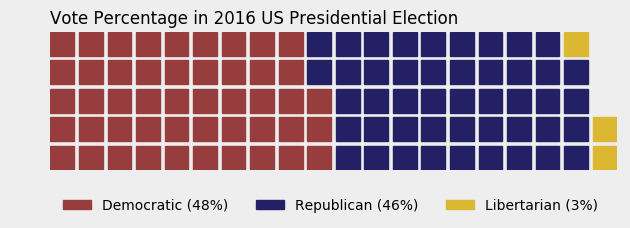
data = {'Democratic': 48, 'Republican': 46, 'Libertarian': 3}
fig = plt.figure(
FigureClass=Waffle,
rows=5,
values=data,
colors=("#983D3D", "#232066", "#DCB732"),
title={'label': 'Vote Percentage in 2016 US Presidential Election', 'loc': 'left'},
labels=["{0} ({1}%)".format(k, v) for k, v in data.items()],
legend={'loc': 'lower left', 'bbox_to_anchor': (0, -0.4), 'ncol': len(data), 'framealpha': 0}
)
fig.gca().set_facecolor('#EEEEEE')
fig.set_facecolor('#EEEEEE')
plt.show()
Use icons replacing squares:
data = {'Democratic': 48, 'Republican': 46, 'Libertarian': 3}
fig = plt.figure(
    FigureClass=Waffle,
    rows=5,
    values=data,
    colors=("#232066", "#983D3D", "#DCB732"),
    legend={'loc': 'upper left', 'bbox_to_anchor': (1, 1)},
    icons='child', icon_size=18,
    icon_legend=True
)

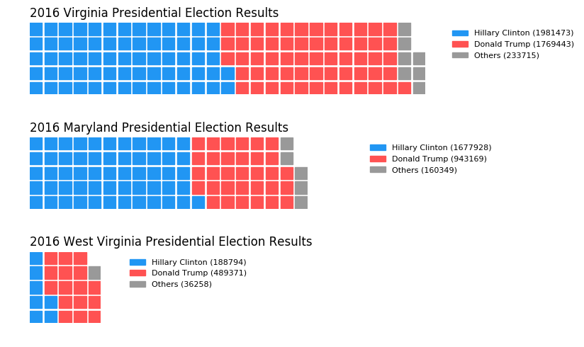
Multiple subplots in one chart:
import pandas as pd
data = pd.DataFrame(
    {
        'labels': ['Hillary Clinton', 'Donald Trump', 'Others'],
        'Virginia': [1981473, 1769443, 233715],
        'Maryland': [1677928, 943169, 160349],
        'West Virginia': [188794, 489371, 36258],
    },
).set_index('labels')
fig = plt.figure(
    FigureClass=Waffle,
    plots={
        '311': {
            'values': data['Virginia'] / 30000,
            'labels': ["{0} ({1})".format(n, v) for n, v in data['Virginia'].items()],
            'legend': {'loc': 'upper left', 'bbox_to_anchor': (1.05, 1), 'fontsize': 8},
            'title': {'label': '2016 Virginia Presidential Election Results', 'loc': 'left'}
        },
        '312': {
            'values': data['Maryland'] / 30000,
            'labels': ["{0} ({1})".format(n, v) for n, v in data['Maryland'].items()],
            'legend': {'loc': 'upper left', 'bbox_to_anchor': (1.2, 1), 'fontsize': 8},
            'title': {'label': '2016 Maryland Presidential Election Results', 'loc': 'left'}
        },
        '313': {
            'values': data['West Virginia'] / 30000,
            'labels': ["{0} ({1})".format(n, v) for n, v in data['West Virginia'].items()],
            'legend': {'loc': 'upper left', 'bbox_to_anchor': (1.3, 1), 'fontsize': 8},
            'title': {'label': '2016 West Virginia Presidential Election Results', 'loc': 'left'}
        },
    },
    rows=5,
    colors=("#2196f3", "#ff5252", "#999999"),  # Default argument values for subplots
    figsize=(9, 5)  # figsize is a parameter of plt.figure
)
Solution 2
I've put together a working example, below, which I think meets your needs. Some work is needed to fully generalize the approach, but I think you'll find that it's a good start. The trick was to use matshow() to solve your non-square problem, and to build a custom legend to easily account for categorical values.
import numpy as np
import pandas as pd
import matplotlib as mpl
import matplotlib.pyplot as plt
import matplotlib.patches as mpatches
# Let's make a default data frame with catagories and values.
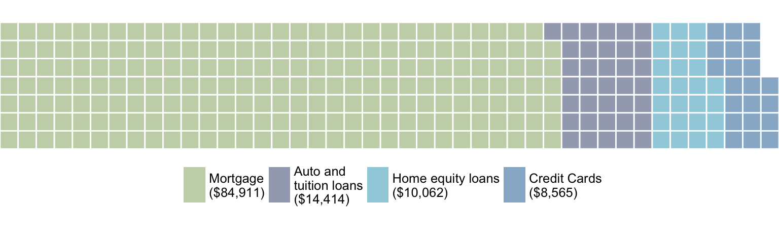
df = pd.DataFrame({ 'catagories': ['cat1', 'cat2', 'cat3', 'cat4'],
'values': [84911, 14414, 10062, 8565] })
# Now, we define a desired height and width.
waffle_plot_width = 20
waffle_plot_height = 7
classes = df['catagories']
values = df['values']
def waffle_plot(classes, values, height, width, colormap):
# Compute the portion of the total assigned to each class.
class_portion = [float(v)/sum(values) for v in values]
# Compute the number of tiles for each catagories.
total_tiles = width * height
tiles_per_class = [round(p*total_tiles) for p in class_portion]
# Make a dummy matrix for use in plotting.
plot_matrix = np.zeros((height, width))
# Popoulate the dummy matrix with integer values.
class_index = 0
tile_index = 0
# Iterate over each tile.
for col in range(waffle_plot_width):
for row in range(height):
tile_index += 1
# If the number of tiles populated is sufficient for this class...
if tile_index > sum(tiles_per_class[0:class_index]):
# ...increment to the next class.
class_index += 1
# Set the class value to an integer, which increases with class.
plot_matrix[row, col] = class_index
# Create a new figure.
fig = plt.figure()
# Using matshow solves your "non-square" problem.
plt.matshow(plot_matrix, cmap=colormap)
plt.colorbar()
# Get the axis.
ax = plt.gca()
# Minor ticks
ax.set_xticks(np.arange(-.5, (width), 1), minor=True);
ax.set_yticks(np.arange(-.5, (height), 1), minor=True);
# Gridlines based on minor ticks
ax.grid(which='minor', color='w', linestyle='-', linewidth=2)
# Manually constructing a legend solves your "catagorical" problem.
legend_handles = []
for i, c in enumerate(classes):
lable_str = c + " (" + str(values[i]) + ")"
color_val = colormap(float(i+1)/len(classes))
legend_handles.append(mpatches.Patch(color=color_val, label=lable_str))
# Add the legend. Still a bit of work to do here, to perfect centering.
plt.legend(handles=legend_handles, loc=1, ncol=len(classes),
bbox_to_anchor=(0., -0.1, 0.95, .10))
plt.xticks([])
plt.yticks([])
# Call the plotting function.
waffle_plot(classes, values, waffle_plot_height, waffle_plot_width,
plt.cm.coolwarm)
Below is an example of the output this script produced. As you can see, it works fairly well for me, and meets all of your stated needs. Just let me know if it gives you any trouble. Enjoy!
Solution 3
You can use this function for automatic creation of a waffle with simple parameters:
def create_waffle_chart(categories, values, height, width, colormap, value_sign=''):
    # compute the proportion of each category with respect to the total
    total_values = sum(values)
    category_proportions = [(float(value) / total_values) for value in values]
    # compute the total number of tiles
    total_num_tiles = width * height # total number of tiles
    print ('Total number of tiles is', total_num_tiles)
    # compute the number of tiles for each catagory
    tiles_per_category = [round(proportion * total_num_tiles) for proportion in category_proportions]
    # print out number of tiles per category
    for i, tiles in enumerate(tiles_per_category):
        print (df_dsn.index.values[i] + ': ' + str(tiles))
    # initialize the waffle chart as an empty matrix
    waffle_chart = np.zeros((height, width))
    # define indices to loop through waffle chart
    category_index = 0
    tile_index = 0
    # populate the waffle chart
    for col in range(width):
        for row in range(height):
            tile_index += 1
            # if the number of tiles populated for the current category
            # is equal to its corresponding allocated tiles...
            if tile_index > sum(tiles_per_category[0:category_index]):
                # ...proceed to the next category
                category_index += 1
            # set the class value to an integer, which increases with class
            waffle_chart[row, col] = category_index
    # instantiate a new figure object
    fig = plt.figure()
    # use matshow to display the waffle chart
    colormap = plt.cm.coolwarm
    plt.matshow(waffle_chart, cmap=colormap)
    plt.colorbar()
    # get the axis
    ax = plt.gca()
    # set minor ticks
    ax.set_xticks(np.arange(-.5, (width), 1), minor=True)
    ax.set_yticks(np.arange(-.5, (height), 1), minor=True)
    # add dridlines based on minor ticks
    ax.grid(which='minor', color='w', linestyle='-', linewidth=2)
    plt.xticks([])
    plt.yticks([])
    # compute cumulative sum of individual categories to match color schemes between chart and legend
    values_cumsum = np.cumsum(values)
    total_values = values_cumsum[len(values_cumsum) - 1]
    # create legend
    legend_handles = []
    for i, category in enumerate(categories):
        if value_sign == '%':
            label_str = category + ' (' + str(values[i]) + value_sign + ')'
        else:
            label_str = category + ' (' + value_sign + str(values[i]) + ')'
        color_val = colormap(float(values_cumsum[i])/total_values)
        legend_handles.append(mpatches.Patch(color=color_val, label=label_str))
    # add legend to chart
    plt.legend(
        handles=legend_handles,
        loc='lower center',
        ncol=len(categories),
        bbox_to_anchor=(0., -0.2, 0.95, .1)
    )
Related videos on Youtube
 03 : 50
 34 : 34
 17 : 02
 13 : 56
 05 : 20
 07 : 54
 06 : 42
 12 : 11
lincolnfrias
using python for social science (visualization, data analysis etc.).
Updated on September 17, 2020Comments
-
 lincolnfrias almost 3 years
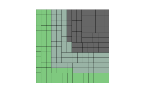
Something like this:
There is a very good package to do it in R. In python, the best that I could figure out is this, using the
squarifypackage (inspired by a post on how to do treemaps):import numpy as np import pandas as pd import matplotlib as mpl import matplotlib.pyplot as plt import seaborn as sns # just to have better line color and width import squarify # for those using jupyter notebooks %matplotlib inline df = pd.DataFrame({ 'v1': np.ones(100), 'v2': np.random.randint(1, 4, 100)}) df.sort_values(by='v2', inplace=True) # color scale cmap = mpl.cm.Accent mini, maxi = df['v2'].min(), df['v2'].max() norm = mpl.colors.Normalize(vmin=mini, vmax=maxi) colors = [cmap(norm(value)) for value in df['v2']] # figure fig = plt.figure() ax = fig.add_subplot(111, aspect="equal") ax = squarify.plot(df['v1'], color=colors, ax=ax) ax.set_xticks([]) ax.set_yticks([]);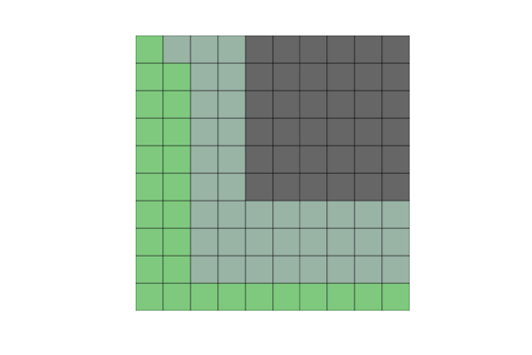
But when I create not 100 but 200 elements (or other non-square numbers), the squares become misaligned.
Another problem is that if I change v2 to some categorical variable (e.g., a hundred As, Bs, Cs and Ds), I get this error:
could not convert string to float: 'a'
So, could anyone help me with these two questions:
- how can I solve the alignment problem with non-square numbers of observations?
- how can use categorical variables in v2?
Beyond this, I am really open if there are any other python packages that can create waffle plots more efficiently.
-
 blacksite over 6 yearsHere is an example using
bokeh... You will have to tweak it a bit to get your proportional view, but yes, it's possible to do in Python. -
lincolnfrias over 6 yearsThanks @not_a_robot, I will try bokeh this week.
-
 Jared Goguen over 6 years200 is not a square number
 -
lincolnfrias over 6 yearsTrue, thanks @JaredGoguen. I edited my question asking how to deal with non-squared numbers.
-
 harry04 over 3 yearsThat's brilliant! Can we set different alpha values or darker shades of a colour to different cells of a particular category (for eg. like what you see on your Git Profile Overview) using this module?
 -
 user147529 about 3 yearsthanks. how do i change the order of the legend/colors. do others, donald, hilary. my plot doesn't match the dict order
 -
 Guangyang Li about 3 years@user147529 Legend and colors follow the index order in data. When saying the plot doesn't match the dict order, I assume you are talking about the dict for creating Dataframe. Check if you have right data in DF, or create the DF with list, like pd.DataFrame([[1981473, 1677928, 188794],[1769443, 943169, 489371],[233715, 160349, 36258]], index=['Hillary Clinton', 'Donald Trump', 'Others'], columns=['Virginia', 'Maryland', 'West Virginia'])
 -
 Pluviophile almost 2 years<ipython-input-113-fab7cdb01750> in create_waffle_chart(categories, values, height, width, colormap, value_sign) 14 # print out number of tiles per category 15 for i, tiles in enumerate(tiles_per_category): ---> 16 print (df_dsn.index.values[i] + ': ' + str(tiles)) 17 18 # initialize the waffle chart as an empty matrix NameError: name 'df_dsn' is not defined