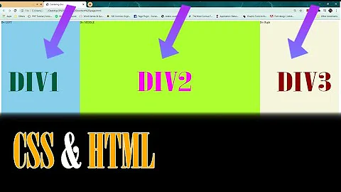
How to float 3 divs side by side using CSS?
Solution 1
Just give them a width and float: left;, here's an example:
<div style="width: 500px;">
 <div style="float: left; width: 200px;">Left Stuff</div>
 <div style="float: left; width: 100px;">Middle Stuff</div>
 <div style="float: left; width: 200px;">Right Stuff</div>
 <br style="clear: left;" />
</div>
Solution 2
The modern way is to use the CSS flexbox, see support tables.
.container {
  display: flex;
}
.container > div {
  flex: 1; /*grow*/
}
<div class="container">
<div>Left div</div>
<div>Middle div</div>
<div>Right div</div>
</div>You can also use CSS grid, see support tables.
.container {
  display: grid;
  grid-template-columns: 1fr 1fr 1fr; /* fraction*/
}
<div class="container">
<div>Left div</div>
<div>Middle div</div>
<div>Right div</div>
</div>Solution 3
It is same way as you do for the two divs, just float the third one to left or right too.
<style>
  .left{float:left; width:33%;}
</style>

<div class="left">...</div>
<div class="left">...</div>
<div class="left">...</div>
Solution 4
float them all left
make sure a width is specified that they can all fit in their container (either another div or the window), otherwise they will wrap
Solution 5
<br style="clear: left;" />
that code that someone posted up there, it did the trick!!! when i paste it just before closing the Container DIV, it helps clear all subsequent DIVs from overlapping with the DIVs i've created side-by-side at the top!
<div>
<div class="left"></div>
<div class="left"></div>
...
...
<div class="left"></div>
<!--  then magic trick comes here  -->
<br style="clear: left;" />
</div>
tadaa!! :)
Related videos on Youtube
Dameon
Updated on March 02, 2021Comments
-
Dameon about 3 years
I know how to make 2 divs float side by side, simply float one to the left and the other to the right.
But how to do this with 3 divs or should I just use tables for this purpose?
-
Josh Stodola about 14 yearsNot enough information. How wide are the layers?
-
Adam Waite almost 10 yearsI'd
display: inline-blockthose guys rather than float them. If their widths are in total less than the container width they'll sit next to each other. -
John Henckel over 7 yearsI recommend using "display: table". It is the most maintainable and reliable solution. see stackoverflow.com/questions/14070787/…
-
-
Ashwin about 11 yearsBut DIV is a block level element, right? Then how come they are placed side by side and not in the next lines(as block level elements start and end with a line break). Does float have some other affect on it also?
-
 CodyBugstein about 10 yearsWhat if you want them all to expand as the page is expanded?
 -
 CodyBugstein about 10 yearsDoes't that cause mess-ups when the browser is resized?
 -
TehTris about 10 years@imray just use % instead of px
-
jpbourbon over 9 yearsOf course, to use this technique and due to the absolute positioning you need to enclose the divs on a container and do a postprocessing to define the height of if, something like this:
-
jpbourbon over 9 yearsjQuery(document).ready(function(){ jQuery('.main').height(Math.max(jQuery('.column-left').height(),jQuery('.column-right').height(),jQuery('.column-center').height())); }); Not the most amazing thing in the world, but at least doesn't break on older IEs.
-
Arwen over 9 yearsThe point is that my answer is the most correct one and when a new person will be searching this Q on internet they will come across my answer which would be the most helpful for them.
-
cfi over 9 yearsThat may be. But it lacks any explanation. It is ok on this site to copy other answers, merging multiple partial answers into one combined better answer. You could edit and complete yours. However new users have a few restrictions (upvoting, few links), so I'd still recommend to not focus on old and answered questions.
-
Arwen over 9 years@cfi thank you, I will keep it for future reference.
-
 Mike de Klerk over 8 yearsCould you elaborate on why to use
<br style="clear: left;" />with that style in particular. -
 Angel Politis over 7 years@MikedeKlerk it's a clearfix, to avoid having the parent collapse.
 -
 Nesha Zoric about 6 yearsas @Nick Craver explained, you should give all of your elements the float: left property. This is happening because the float property specifies how the element is placed along the left or right side of its parent container.
 -
John Grabauskas over 5 yearsIn bootstrap 4, I think you have to wrap the whole thing in a div with the row class.
-
 TylerH about 3 yearsThis seems to repeat multiple answers that existed for years already.

![Float 3 DIV Boxes Side by Side in a Row | Align DIV Boxes Side by Side [HOW TO]](https://i.ytimg.com/vi/uLL_hIcTOrQ/hq720.jpg?sqp=-oaymwEcCNAFEJQDSFXyq4qpAw4IARUAAIhCGAFwAcABBg==&rs=AOn4CLBfHjWYzHhejAvEM34A0PezvYUemw)


