How to implement curve background in CSS?
I will consider the same idea as this previous answer to create the curve using mask and radial-gradient. Simply adjust both variables until you get the needed result:
.box {
  height:300px;
  background: url(https://images.unsplash.com/photo-1581362508717-f542c1ecf295?ixlib=rb-1.2.1&ixid=eyJhcHBfaWQiOjEyMDd9&auto=format&fit=crop&w=1651&q=80) center/cover;
  -webkit-mask:
    radial-gradient(var(--r1,100%) var(--r2,50%) at top   ,white 79.5%,transparent 80%) top left,
    radial-gradient(var(--r1,100%) var(--r2,50%) at bottom,transparent 79.5%,white 80%) top center,
    radial-gradient(var(--r1,100%) var(--r2,50%) at top   ,white 79.5%,transparent 80%) top right;
  mask:
    radial-gradient(var(--r1,100%) var(--r2,50%) at top   ,white 79.5%,transparent 80%) top left,
    radial-gradient(var(--r1,100%) var(--r2,50%) at bottom,transparent 79.5%,white 80%) top center,
    radial-gradient(var(--r1,100%) var(--r2,50%) at top   ,white 79.5%,transparent 80%) top right;
   /* adjust the 150% to control the covered area, the bigger the value the bigger the area will be*/
  -webkit-mask-size:33.4% 150%;
  -webkit-mask-repeat:no-repeat;
  mask-size:33.4% 150%;
  mask-repeat:no-repeat;
}
<div class="box" style="--r1:130%;--r2:71.5%">
</div>To understand the trick replace the mask with background:
.box {
  height:300px;
  background:
    radial-gradient(var(--r1,100%) var(--r2,50%) at top   ,red 79.5%,transparent 80%)  top left,
    radial-gradient(var(--r1,100%) var(--r2,50%) at bottom,transparent 79.5%,blue 80%) top center,
    radial-gradient(var(--r1,100%) var(--r2,50%) at top   ,red 79.5%,transparent 80%)  top right;
  mask:
    radial-gradient(var(--r1,100%) var(--r2,50%) at top   ,red 79.5%,transparent 80%)  top left,
    radial-gradient(var(--r1,100%) var(--r2,50%) at bottom,transparent 79.5%,blue 80%) top center,
    radial-gradient(var(--r1,100%) var(--r2,50%) at top   ,red 79.5%,transparent 80%)  top right;
  background-size:33.4% 150%;
  background-repeat:no-repeat;
  border:1px solid;
}
<div class="box" style="--r1:130%;--r2:71.5%">
</div>Applying this to your code:
.hero-container {
  background: url(https://images.unsplash.com/photo-1581362508717-f542c1ecf295?ixlib=rb-1.2.1&ixid=eyJhcHBfaWQiOjEyMDd9&auto=format&fit=crop&w=1651&q=80) top/cover;
  padding: 16.625rem 0;
  -webkit-mask:
    radial-gradient(var(--r1,160%) var(--r2,68.15%) at top   ,white 79.5%,transparent 80%) top left,
    radial-gradient(var(--r1,160%) var(--r2,68.15%) at bottom,transparent 79.5%,white 80%) top center,
    radial-gradient(var(--r1,160%) var(--r2,68.15%) at top   ,white 79.5%,transparent 80%) top right;
  mask:
    radial-gradient(var(--r1,160%) var(--r2,68.15%) at top   ,white 79.5%,transparent 80%) top left,
    radial-gradient(var(--r1,160%) var(--r2,68.15%) at bottom,transparent 79.5%,white 80%) top center,
    radial-gradient(var(--r1,160%) var(--r2,68.15%) at top   ,white 79.5%,transparent 80%) top right;
  -webkit-mask-size:33.4% 140%;
  -webkit-mask-repeat:no-repeat;
  mask-size:33.4% 140%;
  mask-repeat:no-repeat;
}
<link rel="stylesheet" type="text/css" href="https://stackpath.bootstrapcdn.com/bootstrap/4.4.1/css/bootstrap.css">
<section class="hero-container position-relative">
<div class="container">
<div class="row">
<div class="col-md-7 col-xs-12">
<h1 class="mb-3">Lorem ipsum dolor sit amet</h1>
<p class="mb-4 text-white">Lorem ipsum dolor sit amet Lorem ipsum dolor sit amet Lorem ipsum dolor sit amet Lorem ipsum dolor sit amet Lorem ipsum dolor sit amet</p>
<button class="btn btn-secondary">Register My Club</button>
</div>
</div>
</div>
</section>Related videos on Youtube
 11 : 43
 04 : 35
 03 : 17
 08 : 53
 13 : 42
 06 : 55
Rick Cannon
Updated on June 04, 2022Comments
-
Rick Cannon almost 2 years
I have a landing page with a curve background. Please refer to the following image. I would like to know the best approach when coding this from CSS. I also need to make this responsive and I'm using bootstrap as a CSS framework. Following is what I have done.
I have used an SVG image as the background and used it with :before pseudo-class to display in the bottom. And also I have removed width and height from the SVG and kept the view box and added preserveAspectRatio="xMinYMin meet" to SVG to make it responsive. (Please note these attributes not added to the example in JSFiddle)
What is the best approach to create these curvy backgrounds?
.hero-container {
  background-image: url(https://images.unsplash.com/photo-1581362508717-f542c1ecf295?ixlib=rb-1.2.1&ixid=eyJhcHBfaWQiOjEyMDd9&auto=format&fit=crop&w=1651&q=80);
  background-size: cover;
  background-repeat: no-repeat;
  background-position: top center;
  padding: 16.625rem 0;
}

.hero-container:after {
  content: url('http://svgshare.com/i/Hud.svg');
  position: absolute;
  width: 100%;
  height: auto;
  bottom: -85px;
}
<link rel="stylesheet" type="text/css" href="https://stackpath.bootstrapcdn.com/bootstrap/4.4.1/css/bootstrap.css"> <section class="hero-container position-relative"> <div class="container"> <div class="row"> <div class="col-md-7 col-xs-12"> <h1 class="mb-3">Lorem ipsum dolor sit amet</h1> <p class="mb-4 text-white">Lorem ipsum dolor sit amet Lorem ipsum dolor sit amet Lorem ipsum dolor sit amet Lorem ipsum dolor sit amet Lorem ipsum dolor sit amet</p> <button class="btn btn-secondary">Register My Club</button> </div> </div> </div> </section>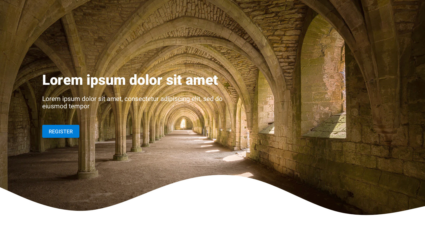
-
 Raj singh about 4 yearsyou can play with div and css. creat 4 div element below img, and play with border radius. Please change the div display property from block to inline-block.
-