how to make input-group responsive (search and dropdown)
12,523
just use mediaqueries
@media (min-width: 1100px) {
  /*code for destop*/
}
@media (max-width: 1100px) {
/*code for ipad and netbooks*/
 }
@media (max-width: 480px) {
/*code for mobile here*/

}
if you are using BS3
@media(max-width:767px){

}
@media(min-width:768px){

}
@media(min-width:992px){

}
@media(min-width:1200px){

}
in your case it would be something like this:
@media (max-width: 480px) {
  body {
    background: #f95e8a;
  }
.input-group-addon, .input-group-btn, .input-group .form-control {
    display: block;
    margin-bottom: 10px;
    clear: both;
    }
.input-group {
    display: block;
    }
}
Related videos on Youtube
Author by
adit
Updated on June 04, 2022Comments
-
adit almost 2 years
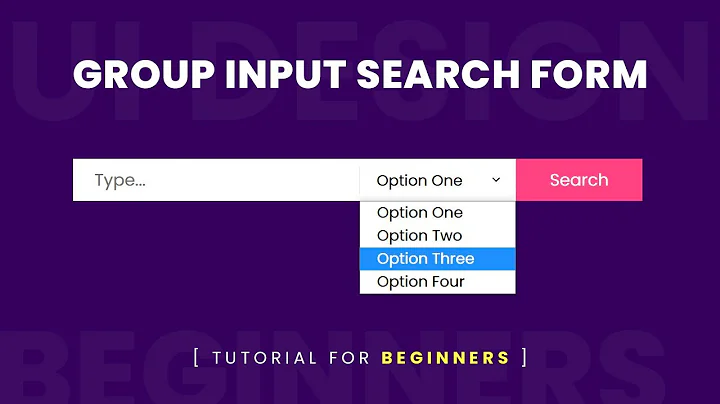
I have the following fiddle, it works fine for desktops. However I want to make it responsive, such that on mobile devices the main category and second category is below the search input text. How do I do so?
I know I can use media queries to make things responsive, but I am not sure how to make the 'input-group-button' on the new line on screen sizes below 600px. What's the easiest way to do this?
<div class="input-group"> <input type="text" class="form-control search-query" placeholder="Masukkan produk yang kamu cari disini"> <div class="input-group-btn" data-toggle="tooltip" data-trigger="manual" data-placement="top" title="Pilih kategori utama pencarian"> <button type="button" class="btn btn-default dropdown-toggle top-category-label" data-toggle="dropdown"> Main Category <span class="caret"></span></button> <ul class="dropdown-menu pull-right top-category"> </ul> </div> <div class="input-group-btn" data-toggle="tooltip" data-trigger="manual" data-placement="bottom" title="Pilih kategori kedua pencarian"> <button type="button" class="btn btn-default dropdown-toggle first-level-label" data-toggle="dropdown"> Second Category <span class="caret"></span></button> <ul class="dropdown-menu pull-right first-level-category"> </ul> </div> </div> -
adit about 10 yearsI know how to use media queries, but how do I make it in a separate new line in media queries.. that's my question
-
 Gildas.Tambo about 10 yearsfloat:left with a min-width or display:block;
 -
adit about 10 yearsI needed a fiddle that would work with my fiddle. I tried using display: block, but it didn't work out
-
 Gildas.Tambo about 10 yearscheck the new demo then
