How to overlap Bootstrap Navbar on Carousel?
As per you html file try adding the below code. Explanation when you make Carousel position:absolute with top:0, it goes on top , overlapping all html components, now to make it full screen we use 100% width. here the navbar is not visible now it is their but not visible it is behind the carousel, so to make it visible we use z-index:9;
.navbar{
 z-index:9;
}
#fullCarousel{
  position:absolute;
  width:100%;
  top:0;
}
i hope you understand.
Related videos on Youtube
 14 : 23
 13 : 06
 09 : 17
 09 : 21
 12 : 05
 31 : 02
 09 : 54
KyleJayMaxwell
UI Developer, currently working with Vue.JS and SCSS. Previous knowledge of AngularJS/Angular 2/Angular 4.
Updated on May 26, 2022Comments
-
KyleJayMaxwell almost 2 years
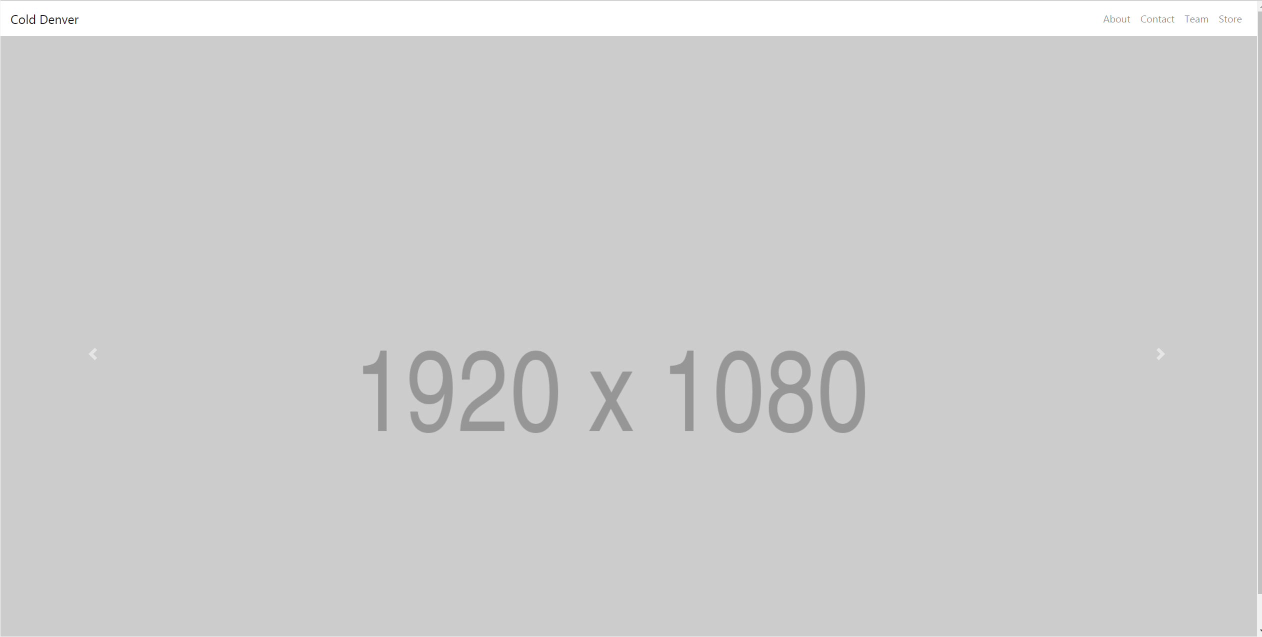
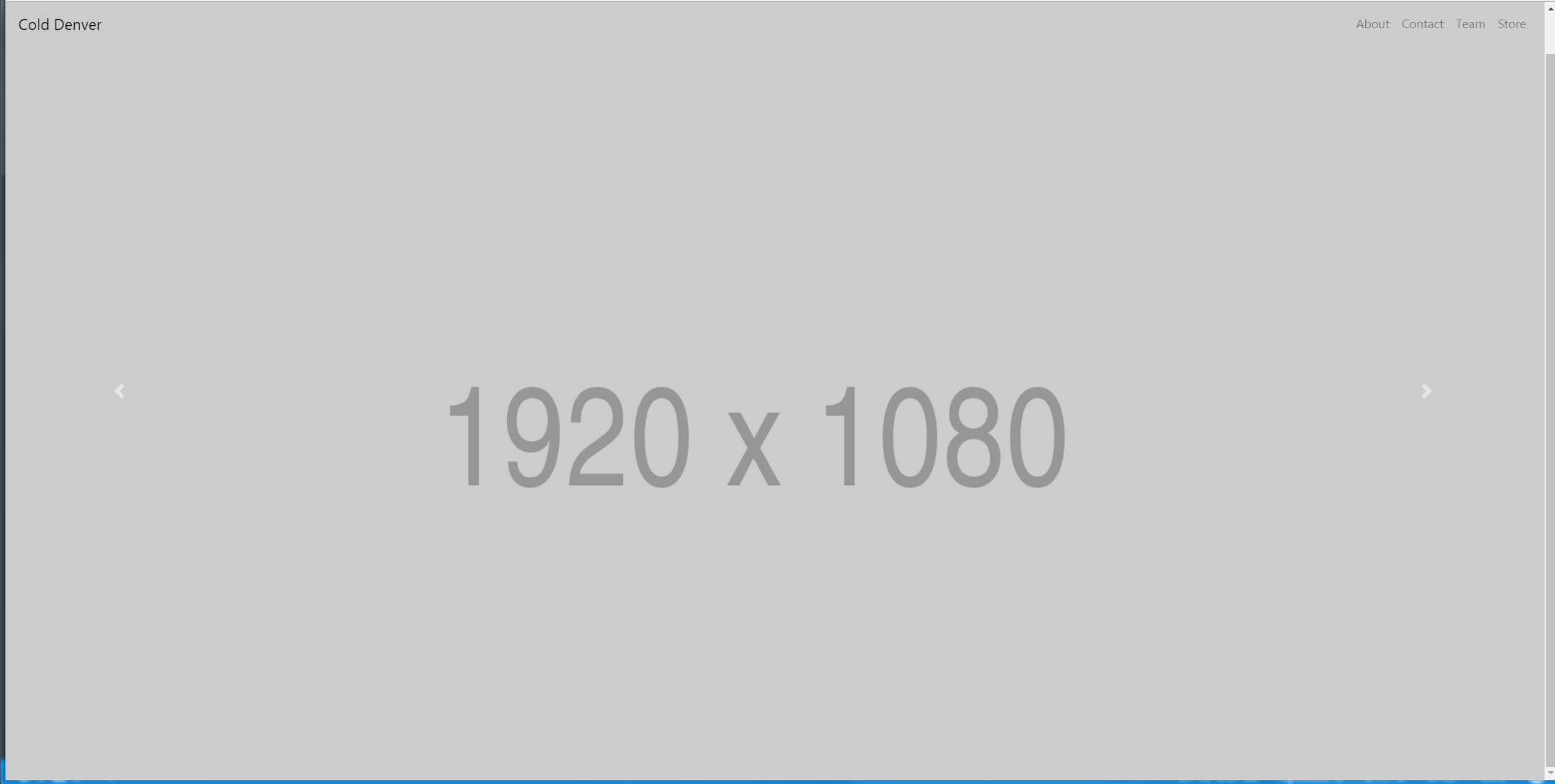
I am working on a mock up and I want a full-screen carousel with the nav bar links sitting on top of the images. Currently, the navbar is clear and when I scroll down on the image/slider it's full screen. How can I have the nav bar lay on top of the carousel on initial load? I am using BS4 alpha also.
Currently: current position of nav bar on load
Wanted: wanted position of navbar on load
Code:
html,body {
  height:100vh;
}
.carousel, .item, .active {
  height:100vh;
}
.carousel {
  top: 0;
}
.carousel-inner {
  height:100vh;
}
.carousel-inner img {
  margin: auto;
}
<link href="https://maxcdn.bootstrapcdn.com/bootstrap/4.0.0-beta/css/bootstrap.min.css" rel="stylesheet"/> <script src="https://code.jquery.com/jquery-3.2.1.slim.min.js"></script> <script src="https://cdnjs.cloudflare.com/ajax/libs/popper.js/1.11.0/umd/popper.min.js" ></script> <script src="https://maxcdn.bootstrapcdn.com/bootstrap/4.0.0-beta/js/bootstrap.min.js" ></script> <!--nav bar --> <nav class="navbar sticky-top navbar-toggleable-md navbar-light"> <button class="navbar-toggler navbar-toggler-right" type="button" data-toggle="collapse" data-target="#navbarSupportedContent" aria-controls="navbarSupportedContent" aria-expanded="false" aria-label="Toggle navigation"> <span class="navbar-toggler-icon"></span> </button> <a class="navbar-brand" href="#">Cold Denver</a> <!-- all the links inside mobile menu --> <div class="collapse navbar-collapse" id="navbarSupportedContent"> <!-- left side nav bar --> <ul class="navbar-nav ml-auto mt-2 mt-lg-0"> <li class="nav-item"> <a class="nav-link" href="#">About</a> </li> <li class="nav-item"> <a class="nav-link" href="#">Contact</a> </li> <li class="nav-item"> <a class="nav-link" href="#">Team</a> </li> <li class="nav-item"> <a class="nav-link" href="#">Store</a> </li> </ul> </div> </nav> <!-- end nav --> <div id="fullCarousel" class="carousel slide" data-ride="carousel"> <div class="carousel-inner" role="listbox"> <div class="carousel-item active"> <img class="img-fluid" src="http://via.placeholder.com/1920x1080" width="100%" alt="First slide"> </div> <div class="carousel-item"> <img class="img-fluid" src="http://via.placeholder.com/1920x1080" width="100%" alt="Second slide"> </div> <div class="carousel-item"> <img class="img-fluid" src="http://via.placeholder.com/1920x1080" width="100%" alt="Third slide"> </div> <a class="carousel-control-prev" href="#fullCarousel" role="button" data-slide="prev"> <span class="carousel-control-prev-icon" aria-hidden="true"></span> <span class="sr-only">Previous</span> </a> <a class="carousel-control-next" href="#fullCarousel" role="button" data-slide="next"> <span class="carousel-control-next-icon" aria-hidden="true"></span> <span class="sr-only">Next</span> </a> </div> </div>-
 Mukesh Ram over 6 yearstry using
position:absoluteinnavbar -
KyleJayMaxwell over 6 years@MukeshRam there is no change when I add that in the css.
-
-
KyleJayMaxwell over 6 yearsWhen i add the absolute positioning to the carousel with "top: 0;" the carousel goes to the top left corner.
-
 Admin over 6 yearstry this: position:
absolute; left: 0px; top: 0px; z-index: -1; -
KyleJayMaxwell over 6 yearsThe carousel is going to the top left corner and not extending the full width when this happens. With just absolute and top 0.
-
KyleJayMaxwell over 6 yearsThat code worked for me. Would you care to elaborate as to why? Also the navbar z index code isn't needed. Also the width and position can be applied to both the id and class and still work.
-
 Anil over 6 yearsyou can use z-index:9 in navbar or you can also use z-index:-1 in carousel