How to properly float two columns side by side with css
Solution 1
You display:block along with float:left to float divs next to each other.
Check working example at http://jsfiddle.net/FhL4u/2/
To make mainContent fill up rest of the space if only the first div width is known then use percentages on both sideBar and mainContent ex: 20% 80% instead of using fixed width. otherwise you will need a JavaScript solution to achieve a cross browser compatibility.
Check jQuery solution at http://jsfiddle.net/FhL4u/3/
Solution 2
I'm modifying my answer from here: How to make an inline-block element fill the remainder of the line?
- Only
#sideBaris floated. - You can't really tweak this technique to have equal height columns later on, so that's why I asked before answering. (well, you can, but you need to use a
background-imagefor faux columns)
See: http://jsfiddle.net/qx32C/37/
#wrapper {
    overflow: hidden; /* clear the float */
}
#sideBar {
    width: 100px;
    float: left;
    background: #f0f
}
#mainContent {
    overflow: hidden;
    background: #ccc
}
Why did I replace margin-left: 100px with overflow: hidden on #mainContent?
Solution 3
using float left or right is not important. you have wrapper with the width of 600px. when you using float for both sidebar and contain inside the wrapper, you must make sure that the width of sidebar and contain (including margin and padding) equal or less than 600px. If not, the second element will be below the first one. Hope this helps ^^
Solution 4
use display:flex for two div floats side-by-side
#wrapper {
    width: 600px;
    display: flex;
}
#sideBar {
    display: inline-flex;
    width: 25%;
}
#mainContent {
    width: 75%;
    flex: 1;
}
Related videos on Youtube
 14 : 23
 09 : 20
 06 : 02
 05 : 07
 09 : 02
 04 : 38
 11 : 35
 01 : 30
 01 : 16
 01 : 06
The Muffin Man
I have a passion for creating data driven applications to the best of my ability. I'm currently working a lot with Angular 2 and Azure Service Fabric. Check out what I'm currently working on: http://www.easystreak.com
Updated on July 31, 2020Comments
-
The Muffin Man over 3 years
This is one of those things I learned a long time ago and never thought much about if I was actually doing it the right way.
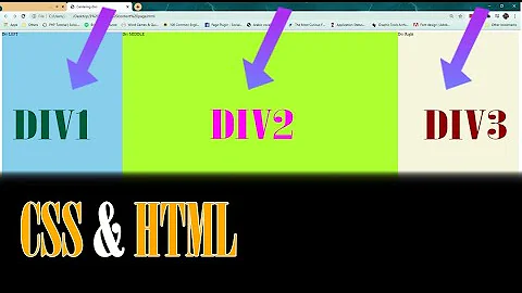
Let's say we have a structure like so:
<div id="wrapper">
  <div id="sideBar"></div>
  <div id="mainContent"></div>
</div>
Let's also say that
wrapperhas a width of600px.Should I float
sideBarleft, andmainContentright, or should I float them bothleft?Additionally, if I set a fixed width for
sideBarhow can I makemainContentfill up the rest of the space similar to how a table works? If I setmainContenttodisplay:inline-blockandwidth:100%it moves down onto the next line :/Note: In my specific scenario I do not want to use a table.
-
 Guttsy about 13 yearsSemi-related article: blog.mozilla.com/webdev/2009/02/20/cross-browser-inline-block. Be careful because older browsers (like IE7 or Firefox 2) don't handle inline-block well. You can also just float your content and use backgrounds in wrapper elements to make it look like the columns are of equal height.
 -
thirtydot about 13 yearsSome critique: you don't need jQuery (overkill..) to do this, see my answer. Also, whenever you use
display: inline-block, you should at least mention the fact that it doesn't work in IE7 without hacks (see the article linked by @Guttsy). Lastly, the first demo doesn't (quote from question)"fill up the rest of the space similar to how a table works". Edit: Also, you haveposition:inline-block- fix todisplay: inline-block. -
Hussein about 13 yearsI changed inline-block to block. Read comment above.
-
thirtydot about 13 yearsI see. Well, you might want to edit the first line of your answer, it's still talking about
inline-block. -
Hussein about 13 yearsMargin-left s not a flexible solution.
-
thirtydot about 13 yearsI feel like I'm picking on you now (sorry!), but: if you use
float: left(orright..), thendisplay: blockis "automatically set". You don't need to explicitly add it. -
Doug Cassidy over 10 yearsThe jquery solution doesnt seem to work with a width: 100% wrapper :(