How to reproduce CSS flex-grow space distribution behavior in a Flutter Row/Column?
1,691
If I've understood your right you wanna rebuild the CSS behavior. You can just leave out the Expanded widgets. Here a short standalone example:
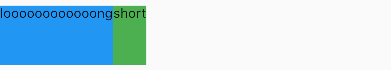
import 'package:flutter/material.dart';

void main() => runApp(MyApp());

class MyApp extends StatelessWidget {
  @override
  Widget build(BuildContext context) {
    return MaterialApp(
      home: Scaffold(
        body: Center(
          child: SizedBox(
            height: 64,
            child: Row(
              crossAxisAlignment: CrossAxisAlignment.stretch,
              children: <Widget>[
                Container(
                  color: Colors.blue,
                  child: Text('loooooooooooong'),
                ),
                Container(
                  color: Colors.green,
                  child: Text('short'),
                ),
              ],
            ),
          ),
        ),
      )
    );
  }
}
Author by
Tobias Marschall
Software developer and founder at http://appella.app & CS student at LMU Munich. In love with dope looking animated UIs and fascinated by space travel. 🚀
Updated on December 10, 2022Comments
-
Tobias Marschall over 1 year
I have a
Rowthat looks like this:SizedBox( height: 64, child: Row(crossAxisAlignment: CrossAxisAlignment.stretch, children: [ Expanded( child: Container( color: Colors.blue, child: Text("looooooooong", softWrap: false))), Expanded( child: Container( color: Colors.green, child: Text("short", softWrap: false))) ]));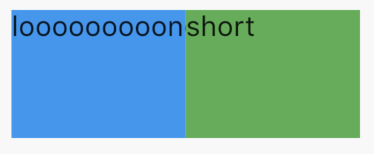
As you can see the text in the blue container gets cut of.
Building the same thing with CSS look like this:
#container {
  width: 100px;
  height: 64px;
  display: flex;
  align-items: stretch;
}

#first {
  flex-grow: 1;
  background-color: blue;
}

#second {
  flex-grow: 1;
  background-color: green;
}
<div id="container"> <div id="first">looooooooong</div> <div id="second">short</div> </div>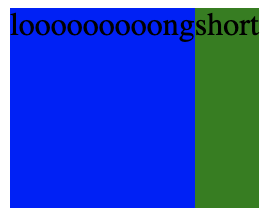
In this case the green container leaves its unused space over to the blue container and the text in the blue container doesn't get cut of.
How am I supposed to achieve the CSS flex-box behavior in Flutter?