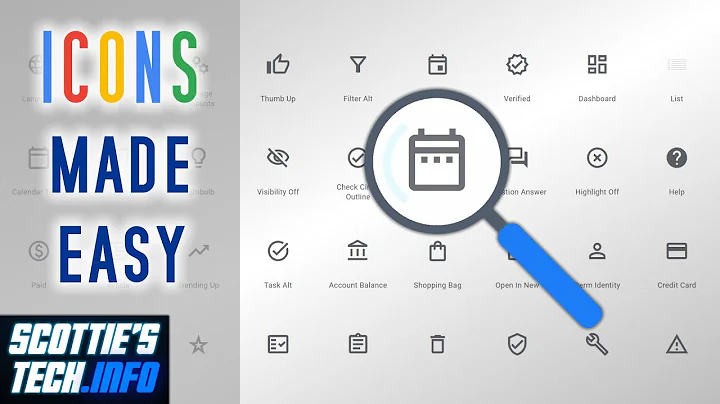
how to use outlined material icon
Solution 1
Looks like the outlined fonts have not been finalized yet per issue #773
https://github.com/google/material-design-icons/issues/773
I see you are reviewing this issue
How to use the new Material Design Icon themes: Outlined, Rounded, Two-Tone and Sharp?
Until the outlined versions are completely included you will need to use the workaround provided in that stackoverflow question... I verified it in stackblitz and it does work.
Add following import to index.html
<link rel="stylesheet" href="https://storage.googleapis.com/non-spec-apps/mio-icons/latest/outline.css">
Add the following to style.css
.material-icons-new {
    display: inline-block;
    width: 24px;
    height: 24px;
    background-repeat: no-repeat;
    background-size: contain;
}

.icon-white {
    webkit-filter: contrast(4) invert(1);
    -moz-filter: contrast(4) invert(1);
    -o-filter: contrast(4) invert(1);
    -ms-filter: contrast(4) invert(1);
    filter: contrast(4) invert(1);
}
Use the following in your component html.
<i class="material-icons-new outline-screen_share"></i>
Solution 2
Use
<link type="text/css"
href="https://fonts.googleapis.com/icon?
family=Material+Icons+Outlined"
rel="stylesheet">
Instead of
<link type="text/css"
href="https://fonts.googleapis.com/icon?
family=Material+Icons&style=outlined"
rel="stylesheet">
Related videos on Youtube
cucuru
Updated on June 04, 2022Comments
-
cucuru almost 2 years
Scenario :
- I'm using material icons, and I face a problem,
I usually use filled ones and everything is ok,
right now I want to use a outlined one, they have the same name, "screen_share"
Tried Case :
My try was include in index.html:<link type="text/css" href="https://fonts.googleapis.com/css?family=Material+Icons" rel="stylesheet"/> <link type="text/css" href="https://fonts.googleapis.com/icon?family=Material+Icons&style=outlined" rel="stylesheet">and in myComponent.html
<button mat-button>
   <mat-icon>
      screen_share_outline
   </mat-icon>
</button>
but it still shows the filled one.
How can I do it?
this is not the same than the suggested duplicate, because the solution presented is the option I try and didn't work
-
 Abhishek Kumar over 5 yearsPossible duplicate of How can I get Angular Material Icon to show the outline in my Angular app?
 -
 Abhishek Kumar over 5 yearsSee if these links are helpful : stackoverflow.com/questions/50358473/… , github.com/angular/material2/issues/11544 , github.com/google/material-design-icons/issues/773 , github.com/vuetifyjs/vuetify/issues/4164,
 -
 Abhishek Kumar over 5 yearsIf no luck, download svg for that outlined icon from material.io/tools/icons/?icon=print_disabled&style=outline, and use it in the markup.
- I'm using material icons, and I face a problem,


