Responsive tile layout with flexbox
Note: My solution below is suboptimal and should be ignored. It was crafted before I knew anything about CSS flex or grid, both of which provide complete and efficient solutions to the problem. I would delete it, but accepted answers cannot be deleted.
You can achieve this with float: left and don't need the flex box.
http://jsfiddle.net/jqk207cz/3/
.container {
 /* REMOVE THIS BLOCK
    display:flex;
    flex-direction: row;
    flex-wrap: wrap;
    justify-content: flex-start;
    align-content: flex-start;
    align-items: stretch; */

}

.box, .bigbox, .widebox {
  background-color: olive;
  width: 100px;
  height: 100px;
  margin: 5px;
  float: left; /* NEW */
}

.bigbox {
  background-color: olive;
  width: 210px;
  height: 210px;
}

.widebox {
  background-color: olive;
  width: 210px;
  height: 100px;
}
UPDATE (based on revised question)
One solution to get four boxes at the beginning is to create a separate container for that section.
It's still responsive and pure CSS.
http://jsfiddle.net/jqk207cz/4/
Patric
Please have a look at http://qoo.li I am a software engineer working in Switzerland.
Updated on June 04, 2022Comments
-
Patric almost 2 years
I want to create a tile layout (similiar to the metro style tile layout or what it's called of Windows 8). So I have some tiles/boxes, some are quadratic, some can be twice the sice and quadratic and some can have twice the width. So far so good, but I have an issue with responsiveness which I thougt flexbox would solve for me... but maybe I was wrong.
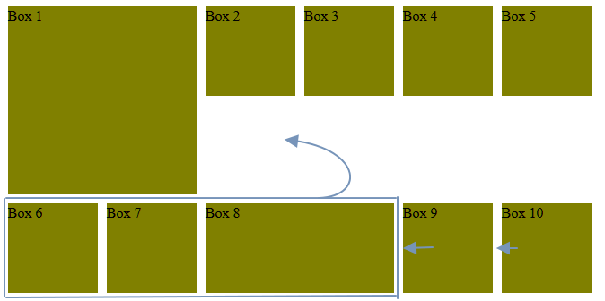
Currently the boxes are layouted like this (arrows show where boxes should "flow"):
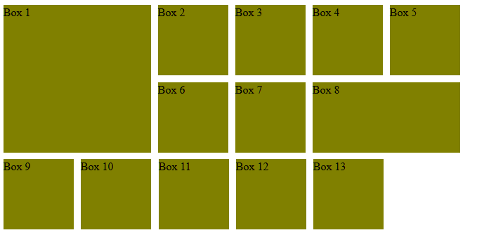
But what I want it for them to look like this:
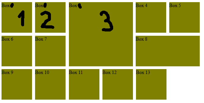
Or even this, if a big tile is placed somewhere in the middle (note: numbering can also be a bit different, e.g. boxes on the left of the big tile could be from 1-4 and then the big tile could be number 5, if this is more easy to do):
This is the code I currently have (see http://codepen.io/anon/pen/oXmraK):
<div class="container">
  <div class="bigbox">Box 1</div>
  <div class="box">Box 2</div>
  <div class="box">Box 3</div>
  <div class="box">Box 4</div>
  <div class="box">Box 5</div>
  <div class="box">Box 6</div>
  <div class="box">Box 7</div>
  <div class="widebox">Box 8</div>
  <div class="box">Box 9</div>
  <div class="box">Box 10</div>
  <div class="box">Box 11</div>
  <div class="box">Box 12</div>
  <div class="box">Box 13</div>
  <div class="box">Box 14</div>
  <div class="box">Box 15</div>
  <div class="box">Box 16</div>
  <div class="box">Box 17</div>
  <div class="box">Box 18</div>
  <div class="box">Box 19</div>
</div>
And CSS:
.container {
    display:flex;
    flex-direction: row;
    flex-wrap: wrap;
    justify-content: flex-start;
    align-content: flex-start;
    align-items: stretch;
}

.box, .bigbox, .widebox {
  background-color: olive;
  width: 100px;
  height: 100px;
  margin: 5px;
}

.bigbox {
  background-color: olive;
  width: 210px;
  height: 210px;
}

.widebox {
  background-color: olive;
  width: 210px;
  height: 100px;
}
Any ideas how to achieve the desired layout? Don't know if this is possible without JS but I hope it is.