Spacing Between Rows with Materialize CSS
36,683
Solution 1
I figured it out. Put each col within a single row will eliminate the vertical spacing.
<div class="row">
  <div class="col s12" style="text-align: center;">
    foobar
  </div>
  <div class="col s12" style="text-align: center;">
    12345
  </div>
</div>
It is confusing but it works. Conceptually, I would think that a "row" is like a table row, forcing everything inside it to be on a single row regardless of size, but this does work since each col has s12 (full width) size. Hope this answer helps someone else.
Solution 2
Use These Methods:
.row .col{
    padding: 0 !important;
}
Then the problem with unwanted space will be go away. Next you can add any other style to your div
Solution 3
I did this to make fast space with clear and margin if i need to.
<div class="clear-10"></div>

.clear, .clear-10, .clear-15 {
  clear: both;
  height: 0; overflow: hidden; /* Précaution pour IE 7 */
}
.clear-10 {
  margin-bottom: 10px
}
.clear-15 {
  margin-bottom: 15px
}
Related videos on Youtube
 19 : 10
Materialize CSS #4 - Navbar
 54 : 29
Build A Travel Agency Theme With Materialize CSS 1.0.0
 09 : 38
Materialize Tutorial #11 - Navbars (desktop & mobile)
 03 : 16
The Secret CSS Padding Trick!
 07 : 19
Materialize CSS - Responsive Navbar
 20 : 30
Learn MaterializeCSS and create a new portfolio - Part 4
 14 : 53
Learn MaterializeCSS and create a new portfolio - Part 7
 04 : 38
Build A Website In 4 Minutes With Materialize Css.
 12 : 58
Parte3 Maquetando sitio web con Materialize css
 08 : 30
Flex Gap CSS Property | Row Gap, Column Gap, Gap in CSS
Author by
Crash Override
Updated on April 15, 2020Comments
-
Crash Override about 4 years
Using MaterializeCSS, how can I adjust/remove the vertical spacing between rows?
Example code:
<div class="row">
  <div class="col s12" style="text-align: center;">
    foobar
  </div>
</div>
<div class="row">
  <div class="col s12" style="text-align: center;">
    12345
  </div>
</div>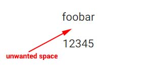
-
Thomas Maurstad Larsson almost 9 yearsThank you for posting the solution yourself. Btw, instead of adding inline CSS for text-align: center, use the CSS helper class "center-align".
-
Crash Override almost 9 yearsThanks for the top on using the "center-align" class. Yeah the whole "row" idea was confusing for me, coming from using html table tags for many years, but it finally makes sense to me. Materialize figures out which col's to put next to each other or on separate rows based on the browser window size. It makes it easier to produce a single page that is both mobile and desktop friendly. A "row" is really just a section, that can have about as many col's as you want.
-
Crash Override almost 9 yearsFYI, I found materializecss has a way to make the space between
<div class="row">tags go away. Do a<div class="row" style="margin-bottom: 0px;"> -
 icecub over 5 yearsMay I suggest you add
margin: 0 !important;to this as well? Otherwise the contents of each column will "float" outside of it. -
 mobibob over 3 yearscan't put the cols in single row since i have even/odd row styling. The other solutions with setting the margin-bottom to 0px did not work.