Suffix text form field (Flutter)
391
You have make custom widget for this purpose. I made StatefulWidget I hope it make sense for you.
-
FocusNodeis for handling focus change and animate the line underneath the Text. -
MouseRagionis for handling hovering events. -
IntrinsicWidthis for makingTextFormInputexpandable while typing.
This is the code:
class TextCustom extends StatefulWidget {
  const TextCustom({Key? key, this.textController, this.suffix})
      : super(key: key);

  final TextEditingController? textController;
  final String? suffix;
  @override
  State<TextCustom> createState() => _TextCustomState();
}

class _TextCustomState extends State<TextCustom> {
  bool _isHovering = false;
  bool _isFocased = false;

  FocusNode textFocus = FocusNode();

  @override
  void initState() {
    textFocus.addListener(() {
      setState(() {
        _isFocased = textFocus.hasFocus;
      });
    });

    super.initState();
  }

  @override
  Widget build(BuildContext context) {
    return SizedBox(
      child: MouseRegion(
        onEnter: (event) {
          setState(() {
            _isHovering = true;
          });
        },
        onExit: (event) {
          setState(() {
            _isHovering = false;
          });
        },
        child: GestureDetector(
          onTap: () {
            textFocus.requestFocus();
          },
          child: InputDecorator(
            expands: false,
            isFocused: _isFocased,
            isHovering: _isHovering,
            decoration: const InputDecoration(),
            child: Row(
              crossAxisAlignment: CrossAxisAlignment.baseline,
              textBaseline: TextBaseline.alphabetic,
              children: [
                IntrinsicWidth(
                  child: TextFormField(
                    focusNode: textFocus,
                    controller: widget.textController,
                    decoration: const InputDecoration(
                      constraints: BoxConstraints(minWidth: 20),
                      isCollapsed: true,
                      border: UnderlineInputBorder(borderSide: BorderSide.none),
                    ),
                    style: Theme.of(context)
                        .textTheme
                        .headline6!
                        .copyWith(fontSize: 34),
                  ),
                ),
                const SizedBox(width: 8),
                (widget.suffix != null)
                    ? Text(
                        'JOD',
                        style: Theme.of(context)
                            .textTheme
                            .headline6!
                            .copyWith(fontSize: 22),
                      )
                    : Container(),
              ],
            ),
          ),
        ),
      ),
    );
  }
}
Author by
Mohammed
Updated on January 04, 2023Comments
-
Mohammed over 1 year
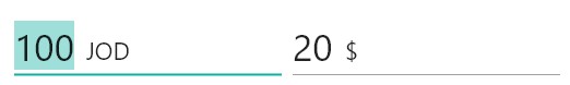
I want to align the price text as it is in the first image, I tried to do it as in the second image, but I could not.
I want to do:
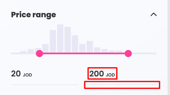
The problem:
This is the code I wrote to try to build the design.
TextFormField( controller: startController, keyboardType: TextInputType.number, textAlign: TextAlign.end, decoration: const InputDecoration().copyWith( border: const UnderlineInputBorder(borderSide: BorderSide(color: kPinCodeColor)), enabledBorder: const UnderlineInputBorder(borderSide: BorderSide(color: kPinCodeColor)), disabledBorder: const UnderlineInputBorder(borderSide: BorderSide(color: kPinCodeColor)), suffix: Text('JOD', style: Theme.of(context).textTheme.headline6!.copyWith(fontSize: Sizes.textSize_22)), ), style: Theme.of(context).textTheme.headline6!.copyWith(fontSize: Sizes.textSize_34), )-
 Lalit Fauzdar almost 2 yearsAs I just answered in one related question, to show the suffix just after the text, the width of the
TextFieldshould be adjusted according to that. Remove theendAlignment and adjust the width, it will be exactly like that. -
Mohammed almost 2 yearsHow to adjust the width? border is not null! If you can rewrite the code to be like the required form
-
-
Mohammed almost 2 yearsحبيب قلبي والله شكراََ كتير
-
George Rabbat almost 2 yearsولو تكرم عيونك @Mohammed