A simple solution to prevent scrolling problems mobile safari (iOS)
I'll add a comment here since this looks like recent, good overview of the problem (thanks for that!)
I also tried pretty much everything you said and eventually found a solution.
Basically, you need to set the size of both your main container and overlay, make them both fixed and give them overflow: auto, so that the document itself never scrolls.
- When the overlay is closed, the content scrolls inside the main container which stays put. (Using
height: 100vh; width: 100vw;ortop/left/bottom/right: 0;along withbox-sizing: border-box;helps make that unobtrusive.) - When you open the overlay, you switch the main container to
overflow: hidden, and at this point the content inside the overlay scrolls. Again, the document itself never does.
This has one drawback: the address bar never hides on iOS. I believe it's still a preferable experience as it's consistent throughout.
Additionally, if you start scrolling from outside the scrollable area, this takes focus and iOS's rubberband effect blocks subsequent interactions with the page until it's done rubberbanding. (There are posts elsewhere explaining how to counter that – you monitor the scroll events and push the element down by 1px if it reaches the top, or up by 1px if at the bottom.)
Here's a demo (codepen here):
let openBtns = document.getElementsByClassName('open'),
    closeBtns = document.getElementsByClassName('close'),
    overlay = document.getElementById('overlay');


for (let btn of openBtns) {
    btn.onclick = () => {
        document.body.classList.add('overlay-open');
        overlay.setAttribute('aria-hidden', false);
    };
}

for (let btn of closeBtns) {
    btn.onclick = () => {
        document.body.classList.remove('overlay-open');
        overlay.setAttribute('aria-hidden', true);
    };
}
#page, #overlay {
position: fixed;
top: 0; bottom: 0; left: 0; right: 0;
margin: auto;
box-sizing: border-box;
overflow: auto;
font-size: 4em;
-webkit-overflow-scrolling: touch;
}
#page {
padding: 1rem 2rem 2rem;
}
.overlay-open > #page {
position: fixed;
filter: blur(5px);
overflow: hidden;
pointer-events: none;
}
#overlay {
display: none;
padding: 2rem;
font-size: 2em;
}
#overlay > .content {
position: relative;
width: 20em;
margin: auto;
padding: 0 1rem 1rem;
background-color: rgba(200, 0, 255, 0.5);
}
.overlay-open > #overlay {
display: block;
}<body>
<div id="page">
<div class="content">
<button class="open">Open overlay</button>
<p>Sed ut perspiciatis unde omnis iste natus error sit voluptatem accusantium doloremque laudantium, totam rem aperiam, eaque ipsa quae ab illo inventore veritatis et quasi architecto beatae vitae dicta sunt explicabo. Nemo enim ipsam voluptatem quia voluptas sit aspernatur aut odit aut fugit, sed quia consequuntur magni dolores eos qui ratione voluptatem sequi nesciunt. Neque porro quisquam est, qui dolorem ipsum quia dolor sit amet, consectetur, adipisci velit, sed quia non numquam eius modi tempora incidunt ut labore et dolore magnam aliquam quaerat voluptatem. Ut enim ad minima veniam, quis nostrum exercitationem ullam corporis suscipit laboriosam, nisi ut aliquid ex ea commodi consequatur? Quis autem vel eum iure reprehenderit qui in ea voluptate velit esse quam nihil molestiae consequatur, vel illum qui dolorem eum fugiat quo voluptas nulla pariatur?</p>
<button class="open">Open overlay</button>
</div>
</div>
<div id="overlay" aria-hidden="true">
<div class="content">
<button class="close">Close overlay</button>
<p>At vero eos et accusamus et iusto odio dignissimos ducimus qui blanditiis praesentium voluptatum deleniti atque corrupti quos dolores et quas molestias excepturi sint occaecati cupiditate non provident, similique sunt in culpa qui officia deserunt mollitia animi, id est laborum et dolorum fuga. Et harum quidem rerum facilis est et expedita distinctio. Nam libero tempore, cum soluta nobis est eligendi optio cumque nihil impedit quo minus id quod maxime placeat facere possimus, omnis voluptas assumenda est, omnis dolor repellendus. Temporibus autem quibusdam et aut officiis debitis aut rerum necessitatibus saepe eveniet ut et voluptates repudiandae sint et molestiae non recusandae. Itaque earum rerum hic tenetur a sapiente delectus, ut aut reiciendis voluptatibus maiores alias consequatur aut perferendis doloribus asperiores repellat.</p>
<button class="close">Close overlay</button>
</div>
</div>
</body>(Be aware there's some CSS in there that is only necessary for the snippets to make sense here or on Codepen, basically everything that's not position/overflow-related is for show; it should be pretty easy to figure out but feel free to ask for clarifications.)
Comments
-
Crashtor about 4 years
Consider the following scenario:
You have 2 scrollable elements.
- A long flowing list of items attached to $(document).scroll()
- A separate container/overlay that listens to $(".class").scroll()
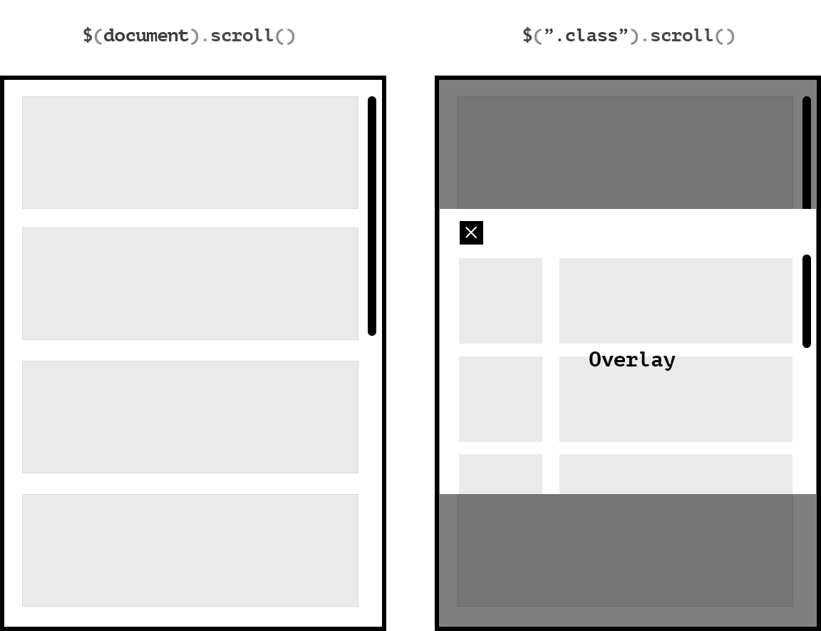
With the following CSS properties.
body {
overflow-y: scroll;
height: 100%;
}

.class {
height: 100%; /* 50% 20% 200px whatever you may */
position: fixed;
overflow-y: scroll;
-webkit-overflow-scrolling: touch;
}
In other words, a very standard setup, that in 2017 should work without any issues on any device. Wrong.
Here are the problems that I've experienced with this simple setup through the years, and never found a good, reliable solution to:
- The overlay starts flickering from mild to extreme when scrolled to top or bottom of overlay when 100% height, no matter HTML complexity across all iDevices. (Because of z-index issue with over-scrolling, or hardware acceleration issue, I don't know).
- The scrolling completely stops for the overlay when at the top or bottom in order to wait for body-scroll to stop over-scrolling.
When the scrolling has wrongfully stopped for the container (whilist over-scrolling kicks in), and the user keeps scrolling, the body will scroll instead, resulting in very inconsistent user experience as the user will now end up somewhere else in the body-scroll than they were before opening the overlay. It's also annoying to have to stop scrolling in order to wait for over-scrolling to stop.
if container is 100% height, and without scroll – If user starts scrolling, the body will scroll and scrollbar will be visible, but the page seemingly isn't scrolling, resulting in inconsistent user experience.
Some of the solutions I've tried without any success.
- iScroll. iScroll stops the over-scrolling issue by preventing any touch events on document. But delivers inconsistent and bad scrolling experience imho. Besides it shouldn't even be needed anymore.
- Every other scrolling plugin imaginable.
- Event delegation – Trying to enable scroll for only the element that is being interacted with. Works on desktop. Not mobile safari.
- Every jQuery scrolling aid imaginable. Mild success but very inconsistent.
It seems that whatever fix has been presented in the past, has somehow been depreciated for "various reason" (Don't mean to sound conspiratorial.)
I read a few weeks back that Apple is working on an update for the scrolling for webkit to make it more homogenous across all types of content-types served on the iPhone. But until then, this simple setup remains very problematic on mobile Safari.
I may have come up with a solution to this finally. But I'm very curious to hear how others are solving this issue in 2017...
Update 2018 for WebView Apps While Apple is making no efforts in solving this matter, the absolute best solution to completely eradicate any problems if you're building webview apps is to entirely disable browser-scroll (webview) completely directly in Swift.
When your WebView has loaded simply use:
    override func viewDidLoad() {
        super.viewDidLoad()
        wkWebView1.scrollView.isScrollEnabled = false
        wkWebView1.scrollView.bounces = false
}
And then in your CSS set the scrolling individually for each container that needs to be scrollable.
Note that $(document).scroll() will be completely disabled with this solution.
I hope it helps someone.