Android - How to change default SeekBar thickness?
Solution 1
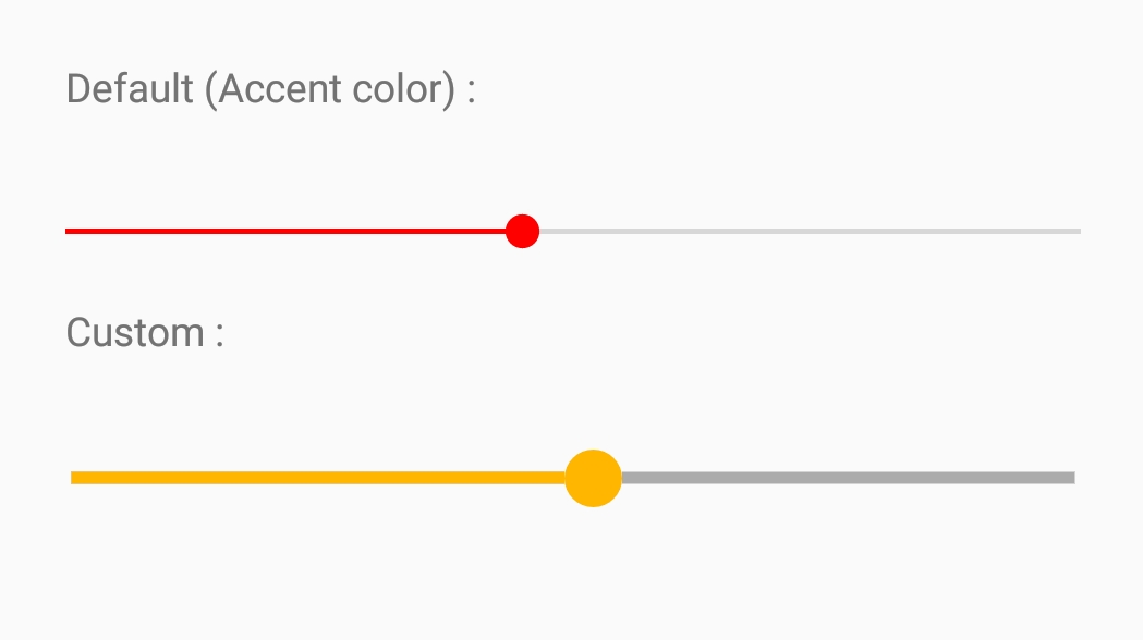
You have to change progressDrawable and thumb of SeekBar to adjust it's thickness :
<SeekBar
    android:id="@+id/seekBar"
    android:layout_width="match_parent"
    android:layout_height="wrap_content"
    android:layout_below="@id/indSeekBar"
    android:layout_marginTop="48dp"
    android:progressDrawable="@drawable/seek_bar"
    android:thumb="@drawable/seek_thumb"
    />
Add in drawable folder seek_bar.xml :
<layer-list xmlns:android="http://schemas.android.com/apk/res/android">
    <item android:id="@android:id/background">
        <shape
            android:shape="line">
            <stroke
                android:color="@color/seek_bar_background"
                android:width="@dimen/seek_bar_thickness"/>
        </shape>
    </item>
    <item android:id="@android:id/secondaryProgress">
        <clip>
            <shape
                android:shape="line">
                <stroke
                    android:color="@color/seek_bar_secondary_progress"
                    android:width="@dimen/seek_bar_thickness"/>
            </shape>
        </clip>
    </item>

    <item android:id="@android:id/progress">
        <clip>
            <shape
                android:shape="line">
                <stroke
                    android:color="@color/seek_bar_progress"
                    android:width="@dimen/seek_bar_thickness"/>
            </shape>
        </clip>
    </item>

</layer-list>
seek_thumb.xml :
<shape xmlns:android="http://schemas.android.com/apk/res/android"
    android:shape="oval">
    <size
        android:height="@dimen/seek_bar_thumb_size"
        android:width="@dimen/seek_bar_thumb_size"
        />
    <solid android:color="@color/seek_bar_progress"/>
</shape>
Add to dimension resources (change this to adjust thickness) :
<dimen name="seek_bar_thickness">4dp</dimen>
<dimen name="seek_bar_thumb_size">20dp</dimen>
Add color resources :
<color name="seek_bar_background">#ababab</color>
<color name="seek_bar_progress">#ffb600</color>
<color name="seek_bar_secondary_progress">#3399CC</color>
Solution 2
You should do like this:
<SeekBar
    android:layout_width="match_parent"
    android:layout_height="wrap_content"
    android:layout_marginTop="20dp"
    android:thumb="@drawable/seek"
    android:progressDrawable="@drawable/seek_style"
    />
The thumb is the circle which can be dragged, and the progressDrasable is the style of progress.
seek_style.xml:
<layer-list xmlns:android="http://schemas.android.com/apk/res/android">
    <item android:id="@android:id/background">
        <shape>
            <corners android:radius="5dip" />
            <gradient
                android:startColor="#ff9d9e9d"
                android:centerColor="#ff5a5d5a"
                android:centerY="0.75"
                android:endColor="#ff747674"
                android:angle="270"
                />
        </shape>
    </item>

    <item android:id="@android:id/secondaryProgress">
        <clip>
            <shape>
                <corners android:radius="5dip" />
                <gradient
                    android:startColor="#80ffd300"
                    android:centerColor="#80ffb600"
                    android:centerY="0.75"
                    android:endColor="#a0ffcb00"
                    android:angle="270"
                    />
            </shape>
        </clip>
    </item>

    <item android:id="@android:id/progress">
        <clip>
            <shape>
                <corners android:radius="5dip" />
                <gradient
                    android:startColor="#ff0099CC"
                    android:centerColor="#ff3399CC"
                    android:centerY="0.75"
                    android:endColor="#ff6699CC"
                    android:angle="270"
                    />
            </shape>
        </clip>
    </item>
</layer-list>
seek.xml:
<shape xmlns:android="http://schemas.android.com/apk/res/android" android:shape="oval">
    <size
        android:width="20dp"
        android:height="20dp"
        />
    <solid android:color="#60f0"/>
</shape>
Solution 3
You can use the Slider provided by the Material Components Library.
Use the app:trackHeight="xxdp" (the default value is 4dp) to change the height of the track bar.
    <com.google.android.material.slider.Slider
        app:trackHeight="12dp"
        .../>
If you want to change also the thumb radius you can use the app:thumbRadius attribute:
        <com.google.android.material.slider.Slider
            app:trackHeight="12dp"
            app:thumbRadius="16dp"
            ../>

It requires the version 1.2.0 of the library.
Solution 4
I solved the problem with: android:scaleX="2"
Joe Rakhimov
Updated on November 06, 2020Comments
-
Joe Rakhimov over 3 years
I have this SeekBar:
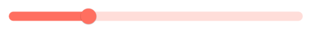
        <SeekBar
        android:layout_width="match_parent"
        android:layout_height="wrap_content"
        android:layout_marginTop="26dp"
        android:id="@+id/seekbar"
        android:visibility="gone"
        android:maxHeight="3dp"/>
I have tried to change this SeekBar thickness using maxHeight. But nothing changed. It looks like this:
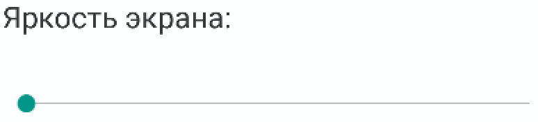
I want to change this SeekBar's thickness to 3dp and make look like this:

So my question is it possible to change SeekBar thickness somehow? If yes, how?
-
 Micer over 6 yearsThis actually works, may I ask downvoters for the explanation why this is wrong?
 -
Ricardo Alves about 6 yearsThis is a hammer fix. It will not work sometimes and it will lead you to visual bugs.
-
stevendesu over 4 yearsCould you explain how to "add to dimension resources"? I see "drawable", "layout", and "values" in my
resfolder in Android Studio, but no "dimension" -
 Vaibhav Jani over 4 years@stevendesu create file dimens.xml in values resource folder, technically you can declare any string, color, dimension resources in any XML file in values folder enclosed in <resources> </resources> tag
 -
 Arno Schoonbee about 2 yearsSlider doesn't seem to have support for things like secondary progress.