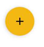
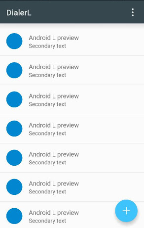
Android L - Floating Action Button (FAB)
Solution 1
UPDATE: there's now an official widget for FAB: FloatingActionButton, see Gabriele Mariotti reply for full information.
According to Adam Powell and Chet Haase they didn't create a widget for the FAB button cause it's a very easy component to reproduce.
There was a question in the Google IO 2014 speech "Google I/O 2014 - Material science: Developing Android applications with material design", at the end of the speech (at about 37:50) there was exactly that question, you can hear it here: https://www.youtube.com/watch?v=lSH9aKXjgt8#t=2280
Chet Haase says there's a RoundedBitmapDrawable (I didn't check if that's the name) that should already do the job of defining the Outline.
But you can do it with your own drawable, set an Elevation to it and define an circle Outline programmatically.
This should give you the round button with shadow on L release. But I think You'll have to build the Shadow pre-L on your own.
I should check the code for CardView to see how it reproduce the shadow pre-L. I'll probably do that, but do not have time now. If no one pops in with the details I'll do it after I've found the time to go and check it up.
EDIT:
Gabriele Mariotti (see his answer below, thank you) added some code to show you how to do it.
Thanks to @shomeser comments, he wrote a library to make the fab button:
https://github.com/shamanland/floating-action-button
To use it:
dependencies {
    compile 'com.shamanland:fab:0.0.3'
}
You can also read his answer to another question: How can I add the new "Floating Action Button" between two widgets/layouts
Solution 2
UPDATED: 26/08/2021
With the Material components for android add to your build.gradle:
implementation 'com.google.android.material:material:1.x.x'
Then add in your layout:
<com.google.android.material.floatingactionbutton.FloatingActionButton
      android:id="@+id/floating_action_button"
      android:layout_width="wrap_content"
      android:layout_height="wrap_content"
      android:layout_gravity="bottom|right"
      android:layout_margin="16dp"
      app:srcCompat="@drawable/ic_plus_24"/>
And use it:
FloatingActionButton floatingActionButton =
    (FloatingActionButton) findViewById(R.id.floating_action_button);
floatingActionButton.setOnClickListener(new OnClickListener() {
    @Override
    public void onClick(View view) {
        // Handle the click.
    }
});
If you are using a Theme.MaterialComponents.* theme your FAB will inherit the material style. Otherwise just apply the style @style/Widget.MaterialComponents.FloatingActionButton
<com.google.android.material.floatingactionbutton.FloatingActionButton
    style="@style/Widget.MaterialComponents.FloatingActionButton"
    ../>
More info here.
With Jetpack compose 1.0.x use:
//Simple FAB
FloatingActionButton(onClick = { /* .. */ } ) {
    Icon(Icons.Filled.Add,"contentDescription")
}

//FAB custom color
FloatingActionButton(
    onClick = { /* .. */ },
    backgroundColor = Color.Blue,
    contentColor = Color.White
){
    Icon(Icons.Filled.Add,"contentDescription")
}
UPDATED: 30/05/2015 with the official Design Support Library
There an official widget now.
Just add this dependency to your build.gradle
compile 'com.android.support:design:22.2.0'
Add this view to your layout:
<android.support.design.widget.FloatingActionButton
    android:id="@+id/fab"
    android:layout_width="wrap_content"
    android:layout_height="wrap_content"
    android:layout_gravity="end|bottom"
    android:src="@drawable/ic_done" />
And use it:
FloatingActionButton fab = (FloatingActionButton) findViewById(R.id.fab);
        fab.setOnClickListener(new View.OnClickListener() {
            @Override
            public void onClick(View view) {
               //TODO
            }
        });
Documentation Android documentation.
UPDATED: 02/12/2014 with Android 5 code
Also you can add and stateListAnimator to your Button:
<Button
 android:stateListAnimator="@anim/anim"
/>
Where anim.xml is:
<selector xmlns:android="http://schemas.android.com/apk/res/android">
    <item
        android:state_enabled="true"
        android:state_pressed="true">
        <objectAnimator
            android:duration="@android:integer/config_shortAnimTime"
            android:propertyName="translationZ"
            android:valueFrom="@dimen/button_elevation"
            android:valueTo="@dimen/button_press_elevation"
            android:valueType="floatType" />
    </item>
    <item>
        <objectAnimator
            android:duration="@android:integer/config_shortAnimTime"
            android:propertyName="translationZ"
            android:valueFrom="@dimen/button_press_elevation"
            android:valueTo="@dimen/button_elevation"
            android:valueType="floatType" />
    </item>
</selector>
Dimens.xml is
<resources>
    <dimen name="fab_size">56dp</dimen>

    <dimen name="button_elevation">2dp</dimen>
    <dimen name="button_press_elevation">4dp</dimen>
</resources>
Check the Daniele's answer.
About Outline mentioned by Daniele. Add the elevation attribute to your Button, and set the Outline via code:
   <ImageButton
        android:background="@drawable/ripple"
        android:stateListAnimator="@anim/anim"
        android:src="@drawable/ic_action_add"
        android:elevation="4dp"
        />
About Outline:
public class MainActivity extends Activity {

    @Override
    protected void onCreate(Bundle savedInstanceState) {
        super.onCreate(savedInstanceState);
        setContentView(R.layout.layoutfab);

        //Outline: OLD METHOD IN L-PREVIEW
        //int size = getResources().getDimensionPixelSize(R.dimen.fab_size);
        //Outline outline = new Outline();
        //outline.setOval(0, 0, size, size);
        //findViewById(R.id.fab).setOutline(outline);

        Button fab = (Button) findViewById(R.id.fab);
        ViewOutlineProvider viewOutlineProvider = new ViewOutlineProvider() {
           @Override
           public void getOutline(View view, Outline outline) {
              // Or read size directly from the view's width/height
              int size = getResources().getDimensionPixelSize(R.dimen.fab_size);
              outline.setOval(0, 0, size, size);
           }
        };
        fab.setOutlineProvider(viewOutlineProvider);
    }

}
Solution 3
Google now provides an official library, called design library, containing the Fab Button. Just add the following Gradle dependency:
compile 'com.android.support:design:22.2.0'
Afterwards you can use the fab button like this:
<android.support.design.widget.FloatingActionButton
android:id="@+id/fab"
android:layout_width="wrap_content"
android:layout_height="wrap_content"/>
More information can be found in their announcement
http://android-developers.blogspot.ch/2015/05/android-design-support-library.html
or on the javadoc page
http://developer.android.com/reference/android/support/design/widget/FloatingActionButton.html
Solution 4
Since Labels FAB feature (like in Evernote or Inbox apps) was added to this awesome library feel free to use it:
Gradle dependency:
compile 'com.getbase:floatingactionbutton:1.3.0'
Layout.xml:
     <com.getbase.floatingactionbutton.FloatingActionsMenu
        android:id="@+id/multiple_actions"
        android:layout_width="wrap_content"
        android:layout_height="wrap_content"
        android:layout_alignParentBottom="true"
        android:layout_alignParentRight="true"
        android:layout_alignParentEnd="true"
        fab:fab_addButtonColorNormal="@color/white"
        fab:fab_addButtonColorPressed="@color/white_pressed"
        fab:fab_addButtonPlusIconColor="@color/half_black"
        fab:fab_labelStyle="@style/menu_labels_style"
        android:layout_marginBottom="16dp"
        android:layout_marginRight="16dp"
        android:layout_marginEnd="16dp">

        <com.getbase.floatingactionbutton.FloatingActionButton
            android:layout_width="wrap_content"
            android:layout_height="wrap_content"
            fab:fab_colorNormal="@color/white"
            fab:fab_title="Action A"
            fab:fab_colorPressed="@color/white_pressed"/>

        <com.getbase.floatingactionbutton.FloatingActionButton
            android:layout_width="wrap_content"
            android:layout_height="wrap_content"
            fab:fab_colorNormal="@color/white"
            fab:fab_title="Action B"
            fab:fab_colorPressed="@color/white_pressed"/>

    </com.getbase.floatingactionbutton.FloatingActionsMenu>
menu_labels_style.xml:
    <style name="menu_labels_style">
        <item name="android:background">@drawable/fab_label_background</item>
        <item name="android:textColor">@color/white</item>
    </style>
fab_label_background.xml:
    <?xml version="1.0" encoding="utf-8"?>
<shape xmlns:android="http://schemas.android.com/apk/res/android">
    <solid android:color="@color/black_semi_transparent"/>
    <padding
        android:left="16dp"
        android:top="4dp"
        android:right="16dp"
        android:bottom="4dp"/>
    <corners
        android:radius="2dp"/>
</shape>
Enjoy!
yannickpulver
Android Dev @appswithlove, Student, Really into taking pictures.
Updated on July 09, 2022Comments
-
yannickpulver almost 2 years
Did Google already released a defined style or a component for this new circular FAB button or should I implement the design on my own?
The button is described here: Google Design | Floating Action Buttons
EDIT (05/2015): Check Lukas' answer / Gabriele's answer showing an easy way to implement it with the design support library.
-
yannickpulver almost 10 yearsThanks! Meanwhile I'm getting better on android l. But I got one question, what does this "stateListAnimator" do? I implemented it but actually saw no change, is it for customizing the "ripple" effect?
-
Gabriele Mariotti almost 10 years@theyanu The stateListAnimator provides the Z-animation based on button state.
-
Oleksii K. over 9 yearsalthough this widget is very simple, I published library with this widget:
com.shamanland:fab:0.0.3, check my post: stackoverflow.com/a/25098626/1891118 -
 ugo over 9 yearsFYI, if you use a
stateListAnimatorto adjust the z-translation (like in this answer), you do not need to specify anelevation. Adding anelevationin such a case will make the animation less obvious as the created shadow will always be visible, whatever state the button is in (at least in the Preview version of Android-L). -
 Dinesh T A over 9 years@GabrieleMariotti seems there is no method called setOutline
 -
Gabriele Mariotti over 9 years@DineshAnandan This method was used in android Preview. Now the code is different. I've updated the answer with the new code.
-
Dinesh T A over 9 years@GabrieleMariotti got oval shape in ImageButton but the shadow is not visible same on cardview. Is there any issue from my side?
-
Dinesh T A over 9 years@GabrieleMariotti i have fixed my shadow issue. Here you can find the answer stackoverflow.com/q/27653781/1394139
-
Kuba Spatny about 9 yearsThis is awesome :) Thanks for sharing!
-
Murali Ganesan over 8 years@GabrieleMariotti FAB not showing fully in lollipop(Moto G). Image link i.stack.imgur.com/qmR0f.png
-
 CularBytes over 8 yearsFor others, to set color: stackoverflow.com/a/32031019/2901207 and to get it to the bottom. stackoverflow.com/a/31213989/2901207
 -
hellodear over 7 years@Roman I am using this library only. But, I am not able to get the ripple by the method you suggested here. Please give some inputs.