Applying box-shadow to Bootstrap 4 card component
Solution 1
The problem causes the column-count css property that you use on the card-columns class. You can align cards with flex or add transform: translateZ(0); to the .card class as a workaround.
Solution 2
Please add display: flex; property to .card-columns. That will solve your problem.
Daniel W.
0x0000 74 68 69 73 20 73 70 61 63 65 20 69 73 20 72 65 0x0010 73 65 72 76 65 64 20 66 6f 72 20 6c 61 74 65 72 0x0020 20 75 73 61 67 65 00 00 00 00 00 00 00 00 00 00 https://danielwendler.dev Domains for sale: knastspiel.de | blogrotation.com | plattedestages.de | woisteinebank.de
Updated on June 04, 2022Comments
-
Daniel W. almost 2 years
I'm trying to apply a simple shadow to a cards component. Somehow the shadow glitches and looks mirrored and misplaced.
I think it has to do with
margin-bottombut there's more to it I can't figure out.What is the correct approach to let cards have a shadow?
https://jsfiddle.net/qdjeuo65/
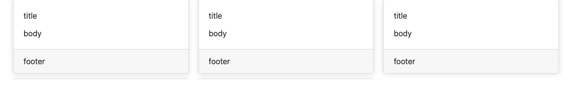
<style>
    .card {
      box-shadow: 0 0 10px 0 rgba(100, 100, 100, 0.26);
    }

</style>

<div class="card-columns">
    <div class="card">
        <div class="card-body">
            <div class="card-title">title</div>
            <div class="card-text">
                body
            </div>
        </div>
        <div class="card-footer">
            footer
        </div>
    </div>

    <div class="card">
        <div class="card-body">
            <div class="card-title">title</div>
            <div class="card-text">
                body
            </div>
        </div>
        <div class="card-footer">
            footer
        </div>
    </div>

    <div class="card">
        <div class="card-body">
            <div class="card-title">title</div>
            <div class="card-text">
                body
            </div>
        </div>
        <div class="card-footer">
            footer
        </div>
    </div>
</div>
My browser is Chrome 84.
-
Daniel W. over 3 yearsCould you explain why this happens without? I'll use Bootstrap's shortcut to display flex:
class="card-columns d-flex". -
Sunny Vaghadia over 3 yearsSure. So, by default card-columns are set to
display: inline-blockto prevent the card breaking across the column. Also, Cards are built with CSS column properties instead of flexbox for easier alignment. Hope you find this helpful. -
Daniel W. over 3 years
-
FluffyKitten over 3 yearsThis breaks the spacing between the cards though...