Bootstrap 4, make list-group scrollable, in a row, with flexbox, with or without body scroll
Solution 1
According to the spec, the setting flex: 1 (on the .main element) is equivalent to flex: 1 1 0, shorthand for:
flex-grow: 1flex-shrink: 1flex-basis: 0
However, for some reason, flex: 1 is not working as expected in your code. (I'm only checking in Chrome, per your question).
However, if you give .main the full shorthand – and make it a flex container and add overflow – your layout appears to work.
.main {
    flex: 1 1 0; /* flex: 1, which you had before, is equivalent but doesn't work */
    display: flex;
    flex-direction: column;
    overflow-y: scroll;
}
Reference:
EDIT (based on changes to the question)
My answer above removes scrollbars from the body and provides a vertical scrollbar for the .main section.
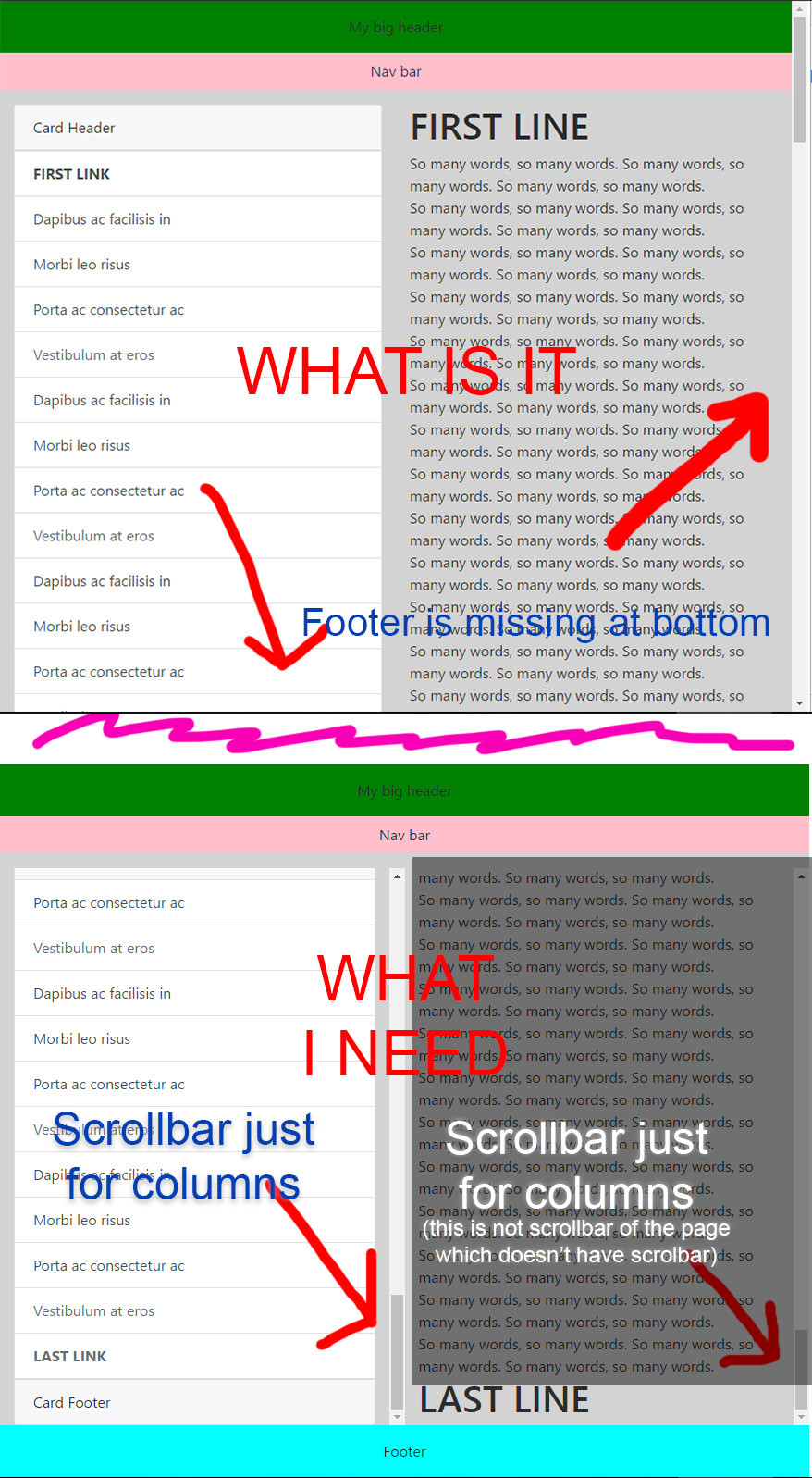
To make vertical scroll bars available for each column in the .main section, make this adjustment:
.main {
    flex: 1 1 0;
    display: flex;
}
.container-fluid {
    display: flex;
}
.col-6 {
    overflow-y: auto;
}
Solution 2
I have
<div class="fixed-top collapse show wrapper">
 <ul class="list-group bg-white menu">
 </ul>
</div>
I fixed it by
.wrapper {
    margin-top: 48px; /* place it under navbar */
    height: 100vh;
    overflow: scroll;
    padding-bottom: 48px; /* compensate margin top */
}
Admin
Updated on July 05, 2020Comments
-
Admin almost 4 years
I'm using Bootstrap 4 (now I'm on alpha-6).
I have this situation:
<body>

  <!-- HERE I HAVE one div automatically generated with randomly ID and class -->

  <div class="bigone">

    <div class="container-fluid">

      <div class="header">
        My header
      </div>

    </div>

    <div class="mybar">
      Nav bar
    </div>

    <div class="main">
      <div class="container-fluid">
        <div class="row">

          <div class="col-6">
            <div class="card">
              <div class="card-header">
                Card Header
              </div>
              <div class="list-group list-group-flush">
                <a href="#" class="list-group-item list-group-item-action"><b>FIRST LINK</b></a>
                <a href="#" class="list-group-item list-group-item-action">Dapibus ac facilisis in</a>
                <a href="#" class="list-group-item list-group-item-action">Dapibus ac facilisis in</a>
                <a href="#" class="list-group-item list-group-item-action">Morbi leo risus</a>

                <a href="#" class="list-group-item list-group-item-action disabled"><b>LAST LINK</b></a>
              </div>
              <div class="card-footer">
                Card Footer
              </div>
            </div>
          </div>

          <div class="col-6">
            <h1>FIRST LINE</h1> So many words, so many words. So many words, so many words. So many words, so many words.
            <br> So many words, so many words. So many words, so many words. So many words, so many words.
            <br> So many words, so many words. So many words, so many words. So many words, so many words.
            <br>
            <h1>LAST LINE</h1>
          </div>

        </div>
      </div>
    </div>

    <div class="footer">
      Footer
    </div>

  </div>

  <!-- HERE THAT DIV CLOSED -->

</body>
This is the css:
.bigone {
  display: flex;
  min-height: 100vh;
  flex-direction: column;
}

.main {
  flex: 1;
}
There is a DEMO on plnkr: https://plnkr.co/edit/Q9PQIj8uDFY80bxJGks3
I need footer to be on bottom when the page content is empty, for this reason I'm using:
.bigone { height: 100vh; }and Bootstrap Flexbox align utilities like:<div class="bigone d-flex flex-column">Now I need the
list-groupincardand thecol-6with "so many words" to be scrollable, so to have an height for both max to the bottom where the footer is.In a nutshell: BODY must not have the scroll bar.
My header and footer height are not fixed, they change.
How to? I'm not a flexbox expert.
I don't need IE, just Chrome.
IMPORTANT:
I can't make my card height fixed with something like this:
height: calc(100vh - header.height - footer.height - etc...);because my header, footer, etc. heights change dynamically.
Picture of the problem:
-
Admin over 7 yearsI need all this in
list-groupof thecardcomponent. Not the simple header, main and footer, unfortunately. -
Admin over 7 yearsMaybe my question isn't clear enough. I need the
cardincol-6to be scrollable, without usingheight: calc(100vh - [header and footer height]). How to do that? You answer for what is? It doesn't change scrollable feature of the twocol-6to my own plnkr. -
Michael Benjamin over 7 yearsMy demo is different than yours. The scrollbar works as you request. And there is no
heightorcalc. -
Admin over 7 yearsOk, dear @Michael_B, I misunderstood your answer, but still it isn't what I need. I need to show
Footerat bottom, but ONLY when bothcol-6columns have scrollbar and their height is (100% of the page minus height of header, navbar and footer). All this dinamically, because my header and footer height changes and so I can't usecalc(). This is my question. I updated plnkr. I will update my question with screenshots. -
Michael Benjamin over 7 yearsIn your question you say: I need footer to be on bottom even if the page content is empty.
-
Admin over 7 yearsYes, but not when there is content. I updated question. Sorry.
-
Admin over 7 yearsOk, we almost are... I updated my plunker: plnkr.co/edit/Q9PQIj8uDFY80bxJGks3: I need scroll on
list-group, notcol-6. How to? -
Admin over 7 yearsOk, really last doubt: I updated my plunker with your css translated in Bootstrap utility (it's the same and it works good!), but now there is a little problem: my Angular project creates some divs with randomly classes and IDs every time, in my plunker I called it
somethingRandomlyEveryTime. If I not put the classd-flexor the same cssdisplay: flexon every div who contains my cards it doesn't works. This is the real problem of my tests. -
Michael Benjamin over 7 yearsThat sounds like an Angular issue. This question was about CSS. You may want to post another question focusing on Angular.
-
Admin over 7 yearsYes, but the css question is: is it really necessary
display: flexon every upper divs? -
Michael Benjamin over 7 yearsWhen you make an element a flex container (
display: flexorinline-flex) it automatically gives the children full height (align-items: stretch). That's the reason: you get dynamic full height; nocalcorheightnecessary. -
Admin over 7 yearsOk, I understand. This problem is mine, but only now I realized that enlarging the window columns no longer complies with the responsiveness. Look at it: run.plnkr.co/iUqgmpIMvFUEaerk, this is the plnkr: plnkr.co/edit/Awoof7KfACHXlPpQYNLo
-
Michael Benjamin over 7 yearsYour demo doesn't have any of the code from my answers. You're missing the
overflow-y, etc. -
Admin over 7 yearsUnfortunately also in your plnkr there is the problem: plnkr.co/edit/gMbgxvUqHNDsQVe4P7ny (big page: run.plnkr.co/lLz9uWiw7SDsfxTO) the only difference is your columns are centered.
-
Michael Benjamin over 7 yearsYou're on the wrong plunkr. My answer works in both the small and large screen: run.plnkr.co/HtUpdYmIACNEDkHI
-
Admin over 7 yearsAt link you posted now (run.plnkr.co/HtUpdYmIACNEDkHI) I see the two columns centered, even if they are
col-6. This is the problem. Enlarge the window, please. -
Michael Benjamin over 7 yearsWe're not seeing the same thing. My link worked when I sent it to you. When you sent it back it doesn't. Now it doesn't work at all (Page Not Found). Something strange going on.
-
Michael Benjamin over 7 yearsMake sure the code from my revised answer is included in your layout. It works. Maybe try in another IDE (like jsfiddle.net or codepen.io).
-
Admin over 7 yearsLet us continue this discussion in chat.
-
Admin about 7 yearsif I have a long page and I don't need the footer in front, how can I put the scroll in bottom like no flexbox? In this fork (plnkr.co/edit/DdrXhlxWPY015OLmZTm6) when I scroll the page the footer remains there.
-
Michael Benjamin about 7 yearsWorks fine on Edge.
-
Michael Benjamin about 7 yearsFor Chrome try
.main { flex: 1 1 auto }instead offlex: 1 1 0. -
Admin about 7 yearsIt doesn't work on Chrome because the scroll in page where I need to scroll doesn't work anymore, just disappear.
-
Admin about 7 yearsDear Michael_b, I opened this question: stackoverflow.com/questions/43175481/…. Why this behavior?
-
Alex Lenail over 6 years@Michael_B would you be willing to make the solution a little more general for folks being directed here by google? I have two bootstrap columns, I'd like them both to scroll independently and occupy the full vertical space.. what do I do?
-
Michael Benjamin over 6 years@AlexLenail, consider posting a new question, with all your details and requirements. That may bring in answers more suitable to your needs.