Bootstrap 4: Navbar with logo and 2 rows
Solution 1
The Bootstrap 4 grid row>col-* aren't designed to be used inside the Navbar. Here is the supported content. Now that Bootstrap 4 uses flexbox, it's much easier to align Navbar content without using the grid row>col-*.
If you want a Navbar with logo and 2 rows, see this answer:
Bootstrap 4 navbar with 2 rows
<nav class="navbar navbar-expand navbar-dark fixed-top bg-dark">
    <div class="container">
        <h1 class="mb-0"><a href="#">Logo</a></h1>
        <div class="d-flex flex-column flex-wrap" id="navbarCollapse">
            <span class="navbar-text ml-auto py-0 px-lg-2">(00) 1234 5678</span>
            <ul class="navbar-nav mb-auto mt-0 ml-auto">
                <li class="nav-item active">
                    <a class="nav-link py-0" href="#">Home</a>
                </li>
                <li class="nav-item">
                    <a class="nav-link py-0" href="#">Product</a>
                </li>
                <li class="nav-item">
                    <a class="nav-link py-0" href="#">Company</a>
                </li>
                <li class="nav-item">
                    <a class="nav-link py-0" href="#">Blog</a>
                </li>
            </ul>
        </div>
    </div>
</nav>
Examples:
Basic Navbar with 2 rows: https://www.codeply.com/go/ilJBKjJsEy
Responsive Navbar with 2 rows: https://www.codeply.com/go/DsfePuoZy0
The 2nd example collapses into a mobile stacked menu on small screens that can be toggled using the hamburger icon. Use the flexbox and spacing utility classes to position elements as desired. There are many ways to achieve what you want: https://www.codeply.com/go/pGE8fTf9dM
Solution 2
You can use 2 navbar-nav elements and then stack them up by using the flex-column class like so:
<link rel="stylesheet" href="https://maxcdn.bootstrapcdn.com/bootstrap/4.0.0-beta.3/css/bootstrap.min.css" integrity="sha384-Zug+QiDoJOrZ5t4lssLdxGhVrurbmBWopoEl+M6BdEfwnCJZtKxi1KgxUyJq13dy" crossorigin="anonymous">

<script src="https://code.jquery.com/jquery-3.2.1.slim.min.js" integrity="sha384-KJ3o2DKtIkvYIK3UENzmM7KCkRr/rE9/Qpg6aAZGJwFDMVNA/GpGFF93hXpG5KkN" crossorigin="anonymous"></script>
<script src="https://cdnjs.cloudflare.com/ajax/libs/popper.js/1.12.9/umd/popper.min.js" integrity="sha384-ApNbgh9B+Y1QKtv3Rn7W3mgPxhU9K/ScQsAP7hUibX39j7fakFPskvXusvfa0b4Q" crossorigin="anonymous"></script>
<script src="https://maxcdn.bootstrapcdn.com/bootstrap/4.0.0-beta.3/js/bootstrap.min.js" integrity="sha384-a5N7Y/aK3qNeh15eJKGWxsqtnX/wWdSZSKp+81YjTmS15nvnvxKHuzaWwXHDli+4" crossorigin="anonymous"></script>

<nav class="navbar navbar-expand-lg navbar-light bg-light">
    <div class="container">
        <a class="navbar-brand" href="#">
            <img src="https://picsum.photos/140/70" width="140" height="70" alt="Logo">
       </a>

        <button class="navbar-toggler" type="button" data-toggle="collapse" data-target="#navbarCollapse" aria-controls="navbarCollapse" aria-expanded="false" aria-label="Toggle navigation">
           <span class="navbar-toggler-icon"></span>
       </button>

        <div class="collapse navbar-collapse flex-column align-items-end" id="navbarCollapse">
            <!-- navbar1 -->
            <div class="navbar-nav mb-lg-0">
                <a class="nav-item nav-link" href="#">(00) 1234567</a>
            </div>

            <!-- navbar2 -->
            <ul class="navbar-nav mt-0">
                <li class="nav-item active">
                    <a class="nav-link" href="#">Home <span class="sr-only">(current)</span></a>
                </li>
                <li class="nav-item">
                    <a class="nav-link" href="#">About</a>
                </li>
                <li class="nav-item">
                    <a class="nav-link" href="#">Features</a>
                </li>
                <li class="nav-item dropdown">
                    <a class="nav-link dropdown-toggle" href="#" id="navbarDropdown" role="button" data-toggle="dropdown" aria-haspopup="true" aria-expanded="false">Products</a>
                    <div class="dropdown-menu" aria-labelledby="navbarDropdown">
                        <a class="dropdown-item" href="#">Action</a>
                        <a class="dropdown-item" href="#">Another action</a>
                        <div class="dropdown-divider"></div>
                        <a class="dropdown-item" href="#">Something else here</a>
                    </div>
                </li>
                <li class="nav-item">
                    <a class="nav-link" href="#">Free Cookies</a>
                </li>
                <li class="nav-item">
                    <a class="nav-link" href="#">Contact</a>
                </li>
            </ul>
        </div>
    </div>
</nav>
Josh
Updated on July 05, 2022Comments
-
Josh almost 2 years
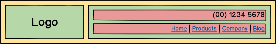
I am trying to create a website header that conforms to the schematic below using Bootstrap 4:
The code I am using to achieve this is as follows (extraneous code omitted):
<div class="navbar">
  <div class="container yellow">
    <div class="row">
      <div class="col-sm-4 green">Logo</div>
      <div class="col-sm-8 green">
        <div class="row">
          <div class="col text-right red">
            (00) 1234 5678
          </div>
        </div>
        <div class="row">
          <div class="col text-right red">
            <!-- nav links here -->
            <a href="#">link</a>
          </div>
        </div>
      </div>
    </div>
  </div>
</div>
The only custom CSS is to change the background colours to match those of the schematic.
This results in the following rendered HTML page, where the row does not span the container:

However, in Bootstrap 3 this is not an issue. Only changing the framework to Bootstrap 3 gives the correct layout:

Also, the correct layout can be achieved within Bootstrap 4 if the container (and its nested content) is removed from its navbar parent:

What do I need to do within Bootstrap 4 to achieve this desired layout whilst still using the navbar class?