Bootstrap button drop-down inside responsive table not visible because of scroll
Solution 1
I solved myself this and I put the answer in scope to help other user that have same problem: We have an event in bootstrap and we can use that event to set overflow: inherit but this will work if you don't have the css property on your parent container.
$('.table-responsive').on('show.bs.dropdown', function () {
     $('.table-responsive').css( "overflow", "inherit" );
});

$('.table-responsive').on('hide.bs.dropdown', function () {
     $('.table-responsive').css( "overflow", "auto" );
})
info: In this fiddle example works strange and I'm not sure why but in my project works just fine.
Solution 2
A CSS only solution is to allow the y-axis to overflow.
http://www.bootply.com/YvePJTDzI0
.table-responsive {
  overflow-y: visible !important;
}
EDIT
Another CSS only solution is to responsively apply the overflow based on viewport width:
@media (max-width: 767px) {
    .table-responsive .dropdown-menu {
        position: static !important;
    }
}
@media (min-width: 768px) {
    .table-responsive {
        overflow: inherit;
    }
}
https://www.codeply.com/go/D3XBvspns4
Solution 3
For reference, it's 2018 and I'm using BS4.1
Try adding data-boundary="viewport" to the button that toggles the dropdown (the one with the class dropdown-toggle). See https://getbootstrap.com/docs/4.1/components/dropdowns/#options
Solution 4
I'd took a different approach, I had detached the element from the parent and set it with position absolute by jQuery
Working JS fidle: http://jsfiddle.net/s270Lyrd/
The JS solution I am using.
//fix menu overflow under the responsive table
// hide menu on click... (This is a must because when we open a menu )
$(document).click(function (event) {
    //hide all our dropdowns
    $('.dropdown-menu[data-parent]').hide();

});
$(document).on('click', '.table-responsive [data-toggle="dropdown"]', function () {
    // if the button is inside a modal
    if ($('body').hasClass('modal-open')) {
        throw new Error("This solution is not working inside a responsive table inside a modal, you need to find out a way to calculate the modal Z-index and add it to the element")
        return true;
    }

    $buttonGroup = $(this).parent();
    if (!$buttonGroup.attr('data-attachedUl')) {
        var ts = +new Date;
        $ul = $(this).siblings('ul');
        $ul.attr('data-parent', ts);
        $buttonGroup.attr('data-attachedUl', ts);
        $(window).resize(function () {
            $ul.css('display', 'none').data('top');
        });
    } else {
        $ul = $('[data-parent=' + $buttonGroup.attr('data-attachedUl') + ']');
    }
    if (!$buttonGroup.hasClass('open')) {
        $ul.css('display', 'none');
        return;
    }
    dropDownFixPosition($(this).parent(), $ul);
    function dropDownFixPosition(button, dropdown) {
        var dropDownTop = button.offset().top + button.outerHeight();
        dropdown.css('top', dropDownTop + "px");
        dropdown.css('left', button.offset().left + "px");
        dropdown.css('position', "absolute");

        dropdown.css('width', dropdown.width());
        dropdown.css('heigt', dropdown.height());
        dropdown.css('display', 'block');
        dropdown.appendTo('body');
    }
});
Solution 5
This solution worked great for me :
@media (max-width: 767px) {
    .table-responsive .dropdown-menu {
        position: static !important;
    }
}
@media (min-width: 768px) {
    .table-responsive {
        overflow: visible;
    }
}
More detail: https://github.com/twbs/bootstrap/issues/15374
Related videos on Youtube
 01 : 03
 01 : 12
 01 : 25
 01 : 03
 01 : 12
BurebistaRuler
Updated on April 22, 2022Comments
-
BurebistaRuler about 2 years
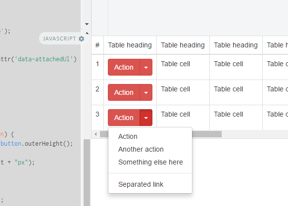
I have a problem with drop-down buttons inside tables when are responsive and scroll active because the drop-down is not visible because of
overflow: auto;property. How can I fix that in order to show drop-down option of button when this is collapsed? I can use some jQuery but after I have problems with scroll left-right so I decided to find another solution. I have attached a photo to understand better.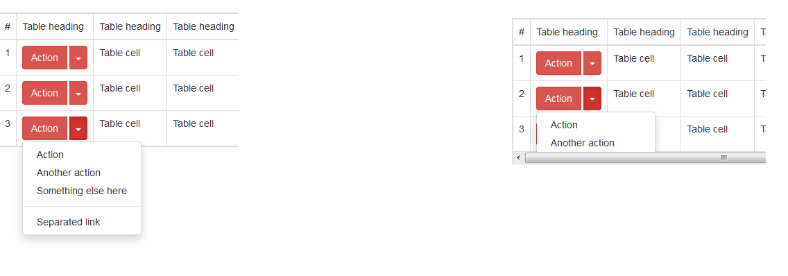
-
Almino Melo over 9 yearsThis only works for tables with a dropdown on the first cell of the line.
-
Exlord over 8 yearsin case of dynamic loaded table :
$('body') .on('show.bs.dropdown', '.table-responsive', function () { $(this).css("overflow", "visible"); }) .on('hide.bs.dropdown', '.table-responsive', function () { $(this).css("overflow", "auto"); }); -
Sergio Ivanuzzo over 8 yearsthis is the best solution, I'm using it for ui-select in my responsive table.
-
 Phil Young over 8 yearsThis is the only solution that worked for me, but I would suggest using $table.css("padding-bottom", menuOffsetHeight - tableOffsetHeight + 16); insetad of $table.css("padding-bottom", menuOffsetHeight - tableOffsetHeight); to add extra padding that's on bootstrap by default, plus a small gap at the bottom.
 -
 Qasim about 8 yearsThis works, but the padding makes it look bad. Wish there was a solution that made it work without the padding bloat.
 -
Mauro over 7 yearsBest solution also for me
-
 Shreya Shah about 7 yearsBut after the click the data goes outside the min size of the screen. So this doesn't work.!!!!
 -
 Jemar Jones about 7 years@ZimSystem Still does the same thing, this fundamentally isn't the solution.
 -
Fernando almost 7 yearsThis solution works even if you remove the custom css. Maybe it's an html thing. I am still looking for a css-only solution.
-
Peter Chaula over 6 yearsNo. Doesn't work. I guess it's because I'm using data-tables
-
 Admin over 6 yearsThis answer is perfect fix for me while using jquery datatable(ajax render). I adjusted accordingly and it works great.
 -
NMC over 6 yearsnice and simple solution
-
 Ponyboy about 6 yearsThis would work if you could stop the table from scrolling back to the left when the dropdown is opened. But as is, if you have a dropdown to the right of the screen the table jerks to the left when opening. Dropdowns that are far to the right (masked by the
.table-responsiveclass) are completely hidden when trying to edit them. -
HelloIT about 6 yearsThis fiddle doesn't work. It keeps hiding the dropdown beneath the table.
-
Leo Caseiro about 6 years@HelloIT try the codepen (updated) codepen.io/leocaseiro/pen/rKxmpz
-
MrPaulDriver about 6 yearsAgree with @hellioIT this method does not appear to be working in the pen
-
Furgas about 6 yearsI'm most happy with that solution in the end.
$('table tr:nth-last-child(-n+3) td').addClass('dropup'). -
sdvnksv almost 6 yearsI confirm this is a working solution I came up with as well.
-
 Seika85 over 5 yearsNot a solution for smaller view height. The lower dropdown links are getting no longer reachable due to out of view.
 -
Tez LaCoyle over 5 yearsI can't speak for earlier versions, but for Bootstrap 4 this really is the best solution. It's simple, it doesn't sacrifice responsiveness, it uses functionality that is already provided in the framework instead of trying to hack around it with extra styles or scripts.
-
Brucie Alpha over 5 yearsworks for me except the button is on the bottom of the page... then the dropdown appears outside of the window...
-
nevada_scout about 5 yearsBootstrap 4 only solution
-
 Aaron Hudon over 2 yearsThis actually works quite nice if you apply the
overflow-yto the tbody element -
Adrian over 2 yearsBig thanks for this solution.
-
 Yogi Arif Widodo over 2 years"bootstrap": "4.6.0", "bootstrap-vue": "2.21.1", doesnt work , not work!
 -
Yogi Arif Widodo over 2 yearsbut we cant scroll horizontal
-
Yogi Arif Widodo over 2 yearsbut its broken my table cant scroll on horizontal! the table is much column
-
 Dan NoNeed over 2 yearsNot working with BS5
 -
user3071284 about 2 yearsThis was working when this answer was posted but doesn't seem to work anymore.
-
Hamza Khanzada about 2 yearsIn my case, I was using Bootstrap's
btn-groupin my<td>which had the position asrelative, changing it tostaticsolved my problem. +1 -
 Jonathan Wood about 2 yearsI consider this the correct answer. Unfortunately, this is broken in Bootstrap 5. Even if you change it to use the more current
data-bs-boundary="viewport". -
 Bayu Zangetsu almost 2 yearsthis is working solution for latest bootstrap version 4 too