Bootstrap Carousel image doesn't align properly
Solution 1
The solution is to put this CSS code into your custom CSS file:
.carousel-inner > .item > img {
  margin: 0 auto;
}
Solution 2
With bootstrap 3, just add the responsive and center classes:
<img class="img-responsive center-block" src="img/....jpg" alt="First slide">
This automatically does image resizing, and centers the picture.
Edit:
With bootstrap 4, just add the img-fluid class
<img class="img-fluid" src="img/....jpg">
Solution 3
I faced the same problem and solved it this way:
It's possible to insert non-image content to Carousel, so we can use it.
You should first insert div.inner-item (where you will make center alignment), and then insert image inside this div.
Here is my code (Ruby):
<div id="myCarousel" class="carousel slide">
<!-- Carousel items -->
<div class="carousel-inner">
<div class="active item">
<%= image_tag "couples/1.jpg" %>
</div>
<% (2..55).each do |t|%>
<div class="item">
<div class='inner-item'>
<%= image_tag "couples/#{t}.jpg" %>
</div>
</div>
<% end -%>
</div>
<!-- Carousel nav -->
<a class="carousel-control left" href="#myCarousel" data-slide="prev">‹</a>
<a class="carousel-control right" href="#myCarousel" data-slide="next">›</a>
</div>
And my css-code(.scss):
.inner-item {
    text-align: center;
    img {
        margin: 0 auto;
    }
}
Solution 4
While vekozlov's answer will work in Bootstrap 3 to center your image, it will break when the carousel is scaled down: the image retains its size instead of scaling down with the carousel.
Instead, do this on the top-level carousel div:
<div id="my-carousel" class="carousel slide"
    style="max-width: 900px; margin: 0 auto">
    ...
</div>
This will center the entire carousel and prevent it from growing beyond the width of your images (i.e. 900 px or whatever you want to set it to). However, when the carousel is scaled down the images scale down with it.
You should put this styling info in your CSS/LESS file, of course.
Solution 5
In Bootstrap 4, you can add mx-auto class to your img tag.
For instance, if your image has a width of 75%, it should look like this:
<img class="d-block w-75 mx-auto" src="image.jpg" alt="First slide">
Bootstrap will automatically translate mx-auto to:
ml-auto, .mx-auto {
    margin-left: auto !important;
}

.mr-auto, .mx-auto {
    margin-right: auto !important;
}
Nambi
Java, Android, REST, MySQL, Linux, Maven, Perl, Javascript, html, SQL.
Updated on July 08, 2022Comments
-
Nambi almost 2 years
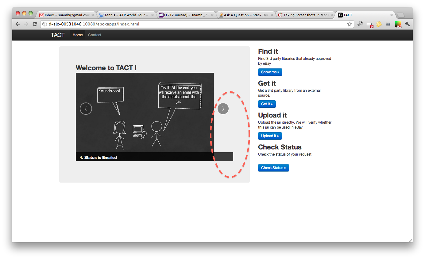
Please take a look at the following image, we are using bootstrap carousel to rotate the images. However, when the window width is large, the image doesn't align with the border properly.
But the carousel example provided by bootstrap always works fine, no matter the width of the window. Following the code.
Can someone explain why carousel is behaving differently? Is this anything to do with Image size or some bootstrap config is missing?
<section id="carousel"> <div class="hero-unit span6 columns"> <h2>Welcome to TACT !</h2> <div id="myCarousel" class="carousel slide" > <!-- Carousel items --> <div class="carousel-inner"> <div class="item active" > <img alt="" src="/eboxapps/img/3pp-1.png"> <div class="carousel-caption"> <h4>1. Need a 3rd party jar?</h4> </div> </div> <div class="item"> <img alt="" src="/eboxapps/img/3pp-2.png"> <div class="carousel-caption"> <h4>2. Create Request</h4> </div> </div> <div class="item"> <img alt="" src="/eboxapps/img/3pp-3.png"> <div class="carousel-caption"> <h4>3. What happens?</h4> </div> </div> <div class="item"> <img alt="" src="/eboxapps/img/3pp-4.png"> <div class="carousel-caption"> <h4>4. Status is Emailed</h4> </div> </div> </div> <!-- Carousel nav --> <a class="carousel-control left" href="#myCarousel" data-slide="prev">‹</a> <a class="carousel-control right" href="#myCarousel" data-slide="next">›</a> </div> </div>