Bootstrap full responsive navbar with logo or brand name text
Solution 1
If you want to achieve this (you can resize the window to see how it will look for mobile version), all you have to do is to have 2 logo images (1 for desktop and one for mobile) and display them depending of the enviroment using visible-xs and hidden-xs classes.
So i used something like this:
<img class="hidden-xs" src="http://placehold.it/150x50&text=Logo" alt="">
<img class="visible-xs" src="http://placehold.it/120x40&text=Logo" alt="">
And ofcourse, i styled the mobile logo using:
@media (max-width: 767px) {
    .navbar-brand {
        padding: 0;
    }

    .navbar-brand img {
        margin-top: 5px;
        margin-left: 5px;
    }
}
You can see all the code here. In case you need a text on mobile version insted of the logo, it's not a big deal. Just replace the logo with a <h1 class="visible-xs">AppName</h3> and change the style inside the media query like this:
@media (max-width: 767px) {
    .navbar-brand {
        padding: 0;
    }

    .navbar-brand h1{
        //here add your style depending of the position you want the text to be placed
    }
}
EDIT:
You need this conditions to make it work:
.navbar-toggle {
   margin: 23px 0;
}

.navbar-nav, .navbar-nav li, .navbar-nav li a {
  height: 80px;
  line-height: 80px;
}

.navbar-nav li a {
  padding-top: 0;
  padding-bottom:0;
}
Solution 2
Best approach to add a brand logo inside a navbar-inner class and a container. About the <h3> issue <h3> has a certain padding given to it in bootstrap as @creimers told. And if you are using a bigger image, increase the height of navbar too or the logo will float outside.
<nav class="navbar navbar-inverse navbar-fixed-top" role="navigation">
<div class="navbar-inner"> <!--changes made here-->
    <div class="container">

        <div class="navbar-header">
            <button type="button" class="navbar-toggle" data-toggle="collapse"
                    data-target="#bs-example-navbar-collapse-1">

                <span class="sr-only">Toggle navigation</span>
                <span class="icon-bar"></span>
                <span class="icon-bar"></span>
                <span class="icon-bar"></span>

            </button>
            <a class="navbar-brand" href="#">
                <img src="http://placehold.it/150x50&text=Logo" alt="">
            </a>
        </div>

        <div class="collapse navbar-collapse" id="bs-example-navbar-collapse-1">
            <ul class="nav navbar-nav navbar-right">
                <li><a href="#">About</a></li>
                <li><a href="#">Services</a></li>
                <li><a href="#">Contact</a></li>
            </ul>
        </div>
    </div>
</div>
</nav>
Hladeo
Updated on July 31, 2022Comments
-
Hladeo almost 2 years
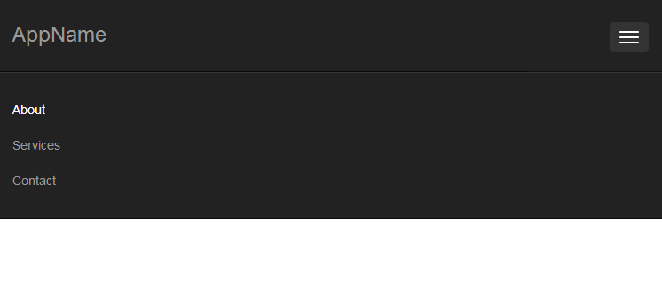
I would like to do a full responsive navbar with specified height in Twitter Bootstrap 3.1.1, where the brand could consists of image (logo) or text.
html:
<nav class="navbar navbar-inverse navbar-fixed-top" role="navigation">
    <div class="container">

        <div class="navbar-header">
            <button type="button" class="navbar-toggle" data-toggle="collapse"
                    data-target="#bs-example-navbar-collapse-1">

                <span class="sr-only">Toggle navigation</span>
                <span class="icon-bar"></span>
                <span class="icon-bar"></span>
                <span class="icon-bar"></span>

            </button>
            <a class="navbar-brand" href="#">
                <img src="http://placehold.it/150x50&text=Logo" alt="">
            </a>
        </div>

        <div class="collapse navbar-collapse" id="bs-example-navbar-collapse-1">
            <ul class="nav navbar-nav navbar-right">
                <li><a href="#">About</a></li>
                <li><a href="#">Services</a></li>
                <li><a href="#">Contact</a></li>
            </ul>
        </div>
    </div>
</nav>
css:
body {
    margin-top: 125px;
}

.navbar-fixed-top .nav {
    padding: 15px 0;
}
The problem is that after the browser's window size is decreased and menu is collapsed, navbar returns to its original height and logo image is as below:


The other problem is that changing
<img src="http://placehold.it/150x50&text=Logo" alt="">into<h3>AppName</h3>makes that AppName is not in the middle:
Currently it is centered by setting padding values, but I do not know how to make it independent from it.
Does anyone could help me solve this problem?
Regards
EDIT:
Here are prepared images of effect that I want to achieve:
not collapsed navbar with logo image:
collapsed navbar (the same height of navbar, the same size of image, but different width od navbar):

not collapsed navbar with brand name text:

collapsed navbar (everything is the same except width of navbar caused by changing browser's window width):
-
ATL_DEV almost 10 yearsIt's quite amazing that the bootstrap team hasn't provided facilities to handle this very common case in the majority of web sites, yet have tons of facilities for less common layouts. I have yet to find a good tutorial or plain documentation on how to do this.
-
-
Hladeo almost 10 yearsHow could I change navbar height? I think that the easiest solution for my problems is setting
padding-topandpadding-bottomto 0, setting static height value ofnavbarand just center vertically placed image or text, or make to dynamically set height depending on height of text or image. But I do not know how to do that. -
 paulalexandru almost 10 yearsSo, on mobile version you want a smaller image or a text?
 -
 creimers almost 10 yearsIf you change the height of
.navbar-brand, which is currently set to50px, your whole navbar will take the hight of its largest child. You could set amin-heightor set noheightat all. -
Hladeo almost 10 yearsIt is interesting solution, but it is different than I expected. I have edited my post, so that you could clearly see what I want to achieve. I would like to create universal navbar where instead of logo, the brand name text could be placed by only changing <img> tag to <h3> tag. And ofc I could set static height of navbar (collapsed nav and not collapsed nav have the same height), or make it dynamically set by the font size/logo height (always vertically in the middle).
-
paulalexandru almost 10 yearsYour colapsed nav have a bigger height than the non colapse nav, and the size of the images are diferent to, why dp you say that they are the same? For example your image have 50px height like as the nav menu, this means it will be fit without any other space between them. Your question is not clear yet.
-
Hladeo almost 10 yearsNo! They are the same! It must have been scaled... please compare: i.stack.imgur.com/jv66U.png and i.stack.imgur.com/G16iL.png (i.stack.imgur.com/O0CFm.png and i.stack.imgur.com/OzWnp.png)
-
Hladeo almost 10 yearssorry, could not edit. navbar height is 80px and logo height is 50px in this case
-
paulalexandru almost 10 yearsSomething like this you want ? jsfiddle.net/paulalexandru/z2pH4/1/embedded/result , if yes, all you need to do is to set the h3 height like the height of the navbar and then use line-height the same, and it will be verticaly aligned perfectly.
-
Hladeo almost 10 yearsjsbin.com/liyogale/1/edit - based on your work, I made this, and the only problem is to center vertically menu items and collapsing button. And I think it will be all what I need :)
-
paulalexandru almost 10 years.navbar-toggle { margin: 23px 0; } This is to center the colapse button
-
paulalexandru almost 10 years.navbar-nav, .navbar-nav li, .navbar-nav li a { height: 80px; line-height: 80px; } .navbar-nav li a { padding-top: 0; padding-bottom:0; } and this is to middle align the menu items. I also updated the answer.
-
Hladeo almost 10 yearsI thought it will be possible to avoid setting static margin in navbar-toggle... but ok. I accept this answer. Thank you for your effort :) +1
-
Hladeo almost 10 yearsOh. One more thing that I have not noticed... Drawback of your solution is that after the menu is collapsed, if it is opened by clicking on button, than height of each line is also 80px... do you know how to fix that?
-
paulalexandru almost 10 yearsMabey when you download bootstrap from here getbootstrap.com/customize/#navbar, you should generate it after changing the navbar from 50px (default) to 80px, and after that you wont get any other problems.
-
 CSS over 8 yearsAwesome. Solved my issue after having looked through 5 or 6 other potentials. This has been the first that has worked to solve my issues. Thanks a bunch.
 -
Mukus about 8 yearsThis will not work. I don't understand why there are upvotes for this. It is misleading.
-
 zanderwar about 8 yearsThis really is not an answer,
navbar-brand > imgwill not appropriately resize according to browser/device resolution