Categorical scatter plot with mean segments using ggplot2 in R
Solution 1
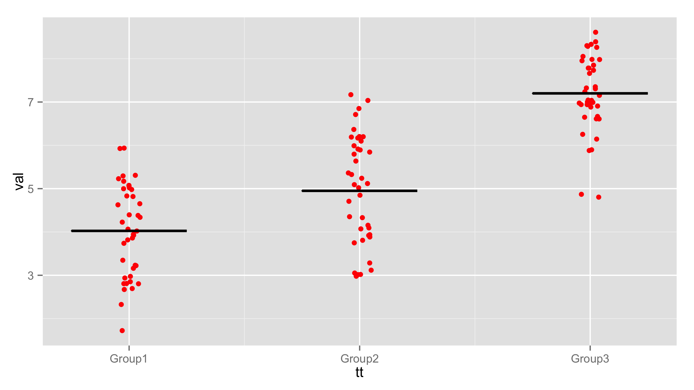
You can use geom_crossbar() and use val as y, ymin and ymax values. With scale_x_continuous() you can change x axis labels for original data or use @agstudy solution to change original data and labels will appear automatically.
ggplot()+
  geom_jitter(aes(tt, val), data = df, colour = I("red"),
              position = position_jitter(width = 0.05)) +
  geom_crossbar(data=dfc,aes(x=tt,ymin=val, ymax=val,y=val,group=tt), width = 0.5)+
  scale_x_continuous(breaks=c(1,2,3),labels=c("Group1", "Group2", "Group3"))
Solution 2
To get the group labelling , You can change continuous tt a factor like this :
dfc$tt <- factor(dfc$tt,labels=c("Group1", "Group2", "Group3"))
Of course before calling summarySE and creating dfc.
and using crossbar as mentioned in the other solution below , you get:
user2337032
Updated on August 01, 2022Comments
-
user2337032 over 1 year
I am trying to plot a simple scatter plot for 3 groups, overlaying a segment indicating the mean for each group and labelling the groups. I have managed to get a scatter plot with error bars, but I would only like a segment indicating where the mean is. I also cannot seem to be getting the group labelling right.
To get the summary statistics I am using the function "summarySE" from this page. [EDIT: note this function is also provided in the Rmisc package]
Is there any simpler way to do this, and to get a segment instead of a point for the mean?
I really appreciate your help!
library(ggplot2) library(plyr) df <- data.frame(tt = rep(1:3, each = 40), val = round(rnorm(120, m = rep(c(4, 5, 7), each = 40)))) # After loading the summarySE function: dfc <- summarySE(df, measurevar="val", groupvars="tt") ggplot(dfc, aes(tt, val), main="Scatter plot with mean bars", xlab="Groups", ylab="Values", names=c("Group1", "Group2", "Group3"))+ geom_jitter(aes(tt, val), data = df, colour = I("red"), position = position_jitter(width = 0.05)) + geom_point(size = 3) + geom_errorbar(aes(ymin=val-sd, ymax=val+sd), width = 0.01, size = 1) -
user2337032 over 10 yearsThis is perfect! Sorry about the code for summarySE, it is here: cookbook-r.com/Graphs/Plotting_means_and_error_bars_(ggplot2)