Centering grid items in an auto-fill container
Solution 1
Flexbox
The most efficient solution to your problem is probably flexbox, as flex items are not confined to individual tracks (columns/rows) like grid items.
.grid {
  display: flex;
  flex-wrap: wrap;
  margin-bottom: 1em;
}

.item {
  flex: 1 0 100px;
  background: #eee;
  text-align: center;
  border: 1px dashed gray;
  box-sizing: border-box;
}
<div class="grid">
<div class="item">Item 1</div>
</div>
<div class="grid">
<div class="item">Item 1</div>
<div class="item">Item 2</div>
</div>
<div class="grid">
<div class="item">Item 1</div>
<div class="item">Item 2</div>
<div class="item">Item 3</div>
</div>
<div class="grid">
<div class="item">Item 1</div>
<div class="item">Item 2</div>
<div class="item">Item 3</div>
<div class="item">Item 4</div>
</div>But if you want to stick with Grid Layout, here are some issues to consider and a potential solution.
Grid
1fr
When you say 1fr, like you do in your code, that means "consume all free space". But when there is no free space, there can be no alignment.
Keyword alignment properties (i.e. justify-* and align-*) work by distributing free space. They cannot left-align, right-align, space-between, space-around or center, without free space.
This isn't just Grid behavior. It's standard HTML/CSS: A div is a block-level element by default. This means it occupies 100% width of its parent. So a div cannot be centered (unless you override the default settings).
Structure
Columns and rows in a grid extend across the entire container. So once auto-fill creates, let's say, three columns, all following rows will have three columns.
If the first row has three grid items and the second row has two grid items, there is still a third column going through (and occupying space) on the second row. Therefore, the two items in the second row cannot be centered on the line.
auto-fill
When the repeat() function is set to auto-fill or auto-fit, the container creates as many grid tracks as possible without overflowing the container.
With auto-fill, when there are no grid items to fill all tracks created, those tracks are preserved. Basically, the grid layout remains fixed, with or without items.
You pointed this out in your question. You have two grid items, but other "shadow" items also exist. Just note that these "shadow" items are not grid items. They are just empty grid cells.
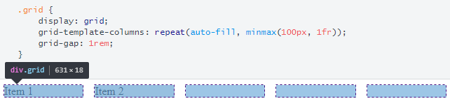
Because of the empty grid cells, there is no free space left for centering the grid items.
auto-fit
The auto-fit keyword does the same as auto-fill, except for this: empty tracks are collapsed.
In your case, since you have 1fr set as the max-size in the minmax() function, the extra space is distributed among both grid items.
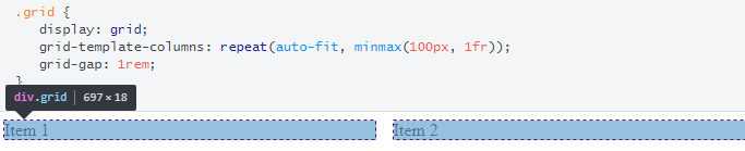
Again, centering is not possible, but this time because the fr unit is consuming all free space (as explained in the 1fr section above).
justify-content: center
As described above, centering the grid items is not possible because there is no free space available on the line for alignment purposes.
One way around this, which still allows for flexible column sizes, is to use max-content instead of 1fr, along with auto-fit.
.grid {
  display: grid;
  grid-template-columns: repeat(auto-fit, minmax(100px, max-content));
  justify-content: center;
  grid-gap: 1rem;
}

.item {
  background: #eee;
}
<div class="grid">
<div class="item">Item 1</div>
</div>
<hr>
<div class="grid">
<div class="item">Item 1</div>
<div class="item">Item 2</div>
</div>
<hr>
<div class="grid">
<div class="item">Item 1</div>
<div class="item">Item 2</div>
<div class="item">Item 3</div>
</div>
<hr>
<div class="grid">
<div class="item">Item 1</div>
<div class="item">Item 2</div>
<div class="item">Item 3</div>
<div class="item">Item 4</div>
</div>More Info
Solution 2
The problem is that using auto-fill you're creating a lot of empty columns, which makes justify-items:center not behave as you'd expect it to.
You need to use auto-fit instead.
.grid {
    display: grid;
    grid-template-columns: repeat(auto-fit, minmax(100px, 1fr));
    grid-gap: 1rem;
    justify-items:center;
}
https://jsfiddle.net/1ymkg327/36/
Jens Törnell
Updated on June 05, 2022Comments
-
Jens Törnell about 2 years
I have set up a grid with two items. This grid can contain any number of items but two is enough for this example.
Background
In the example there are two gray boxes align to the left. Using an inspector on a wide screen (above 1000px) we can spot a third (or more) "shadow" item that fills up the rest of the space.
Question
How can I center the boxes in the grid? Like the "shadow" item(s) does not exist.
On the
.gridelement I still want to use a grid because of the automatic media queries I don't need to write. On the wrapper, anything goes.Also, a fixed width is not an option.
.wrap {
  display: flex;
  flex-direction: column;
  /*justify-content: center;
      align-items: center;*/
}

.grid {
  display: grid;
  grid-template-columns: repeat(auto-fill, minmax(100px, 1fr));
  grid-gap: 1rem;
}

.item {
  background: #eee;
}
<div class="wrap"> <div class="grid"> <div class="item"> Item 1 </div> <div class="item"> Item 2 </div> </div> </div>Fiddle