Changing spinner arrow, Appcompat v21
Solution 1
Since you are using AppCompat-v21, you can take advantage of the new material design styles attributes:
colorPrimary: your app branding color for the app bar, applies to action bar
colorPrimaryDark: darker variant for the status bar and contextual app bars
colorAccent: lets you define bright complement to the primary branding color. By default, this is the color applied to framework controls (via colorControlActivated)
colorControlNormal: color applied to framework controls in their normal state
colorControlActivated: applied to framework controls in their activated
Here is an example for you
styles.xml
<!-- Base application theme. -->
<style name="AppTheme" parent="Theme.AppCompat.Light.DarkActionBar">
    <!-- colorPrimary is used for the default action bar background -->
    <item name="colorPrimary">@color/primary</item>
    <!-- colorPrimaryDark is used for the status bar -->
    <item name="colorPrimaryDark">@color/primary_dark</item>
    <!-- colorAccent is used as the default value for colorControlActivated which is used to tint widgets -->
    <item name="colorAccent">@color/accent</item>
    <item name="colorControlNormal">@color/primary</item>
</style>
colors.xml
<resources>
    <color name="primary">#ff0000ff</color>
    <color name="primary_dark">#ff0000af</color>
    <color name="accent">#870000ff</color>
    <color name="white">#ffffffff</color>
</resources>
Here is how it looks

Hope this helps.
Solution 2
Might be late but better late than never. To respond to your question: "Is there a way to use it only in spinner?". The answer is yes, refer to the code below.
Add this code to your theme or style file
<style name="customSpinnerTheme" parent="yourAppThemeThatUseAppCompat21">
    <item name="colorControlNormal">#eaeaea</item>
    <item name="colorControlActivated">#000000</item>
    <item name="colorControlHighlight">#000000</item>
</style>
Then in your XML that use spinner you can add this line
android:theme="@style/customSpinnerTheme"
e.g.
<Spinner
    android:theme="@style/customSpinnerTheme"
    android:id="@+id/spinner"
    android:layout_width="match_parent"
    android:layout_height="wrap_content"
    android:layout_marginLeft="8dp"
    android:layout_marginRight="8dp"
    android:spinnerMode="dialog" />
Solution 3
There is a way to change your arrow color... actually it's not color you can change this image with blue color image..
create a xml file myspinner_selector in your drawable folder
and paste
<?xml version="1.0" encoding="utf-8"?>
<selector xmlns:android="http://schemas.android.com/apk/res/android">

  <item><layer-list>
        <item><shape>
                <gradient android:angle="90" android:endColor="#ffffff" android:startColor="#ffffff" android:type="linear" />

                <stroke android:width="1dp" android:color="#504a4b" />

                <corners android:radius="5dp" />

                <padding android:bottom="3dp" android:left="3dp" android:right="3dp" android:top="3dp" />
            </shape></item>
        <item ><bitmap android:gravity="bottom|right" android:src="@drawable/blue_arrow" />   // you can use any other image here, instead of default_holo_dark_am
        </item>
      </layer-list></item>

 </selector>
blue_arrow is an image, and add this style in your style file
 <style name="spinner_style" >
        <item name="android:background">@drawable/myspinner_selector</item>
        <item name="android:layout_marginLeft">5dp</item>
        <item name="android:layout_marginRight">5dp</item>
        <item name="android:layout_marginBottom">5dp</item>
        <item name="android:paddingLeft">5dp</item>
        <item name="android:paddingTop">5dp</item>
        <item name="android:paddingBottom">5dp</item>

        </style>
finally add this style in your spinner
 <Spinner
        android:id="@+id/spinner1"
        android:layout_width="match_parent"
        android:layout_height="wrap_content"
        style="@style/spinner_style"

         />
it look like this. you need to customize 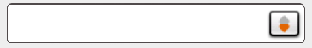
Solution 4
look at below code. create spinner_bg.xml under drawable folder
<?xml version="1.0" encoding="utf-8"?>
<selector xmlns:android="http://schemas.android.com/apk/res/android">
    <item><layer-list>
            <item><shape>
                    <gradient android:angle="270" android:centerColor="#d0d0d0" android:endColor="#c5c6c6" android:startColor="#dbdadb" android:type="linear" />
                    <stroke android:width="1dp" android:color="#7a7a7a" />
                    <corners android:radius="1dp" />
                    <padding android:left="3dp" android:right="3dp" />
                </shape></item>
            <item><bitmap android:gravity="center|right" android:src="@drawable/dropdown_icon_black" />
            </item>
        </layer-list></item>
</selector>
write down below code in styles.xml
<style name="spinner_style">
        <item name="android:background">@drawable/spinner_bg</item>
</style>
Apply style to spinner
<Spinner
    android:id="@+id/spinner"
    style="@style/spinner_style"
    android:layout_width="fill_parent"
    android:layout_height="40dp"
    android:layout_centerHorizontal="true"
    android:layout_centerVertical="true"
    android:focusable="true"
    android:overlapAnchor="false"
    android:paddingRight="10dp"
    android:spinnerMode="dropdown"
    android:textColor="@android:color/white" />
use this image for spinner drawable

Solution 5
you could tint it with the attribute tint color.
<Spinner android:id="@+id/spinner"
         android:layout_width="wrap_content"
         android:layout_height="match_parent"
         android:backgroundTint="@color/white"
/>
Related videos on Youtube
 10 : 44
 11 : 57
 08 : 36
 12 : 42
 09 : 39
![Thực hiện Custom Spinner trong Android - [Android Customize - #04]](https://i.ytimg.com/vi/v3n0SFA7g14/hq720.jpg?sqp=-oaymwEcCNAFEJQDSFXyq4qpAw4IARUAAIhCGAFwAcABBg==&rs=AOn4CLA0ElKKM89Wc9oDq4ZNCOb0-7foZw) 14 : 11
14 : 11
 01 : 24
 08 : 50
 01 : 01
Charaf Eddine Mechalikh
i am new android developper,i created my first application this year (2015) and i'am here to help people if i can ,and of course te be helped by them
Updated on October 14, 2022Comments
-
Charaf Eddine Mechalikh over 1 year
i have activities which i themed with my custom theme, but for spinner i choosed to style it with Appcompat v21 but i got this :

So how to change the Spinner arrow to be black or blue if is there a way ?
i found this as similar question but doesn't have any answer : https://stackoverflow.com/questions/28561105/add-custom-spinner-arrow here is my spinner :
<Spinner
        android:layout_width="fill_parent"
        android:layout_height="wrap_content"
        android:id="@+id/spinner2"
        android:layout_marginTop="10dp"
        android:layout_centerInParent="true" />
i used this to style the spinner:
 <style name="MyTheme.SpinnerAppTheme" parent="Widget.AppCompat.Spinner">
    </style>
this is how i use the adapter
   ArrayAdapter<CharSequence> adapter = ArrayAdapter.createFromResource(
                getBaseContext(), R.array.listMedRes, android.R.layout.simple_spinner_item);
i just want to theme the spinner , thanks alot
-
Charaf Eddine Mechalikh about 9 yearsthis worked using appcompat theme to the entire activity, is ther a way to use it only in spinner ?
-
Charaf Eddine Mechalikh over 8 yearsin is never too late to share knowledge , thank you ,may this will help others
-
Tyler Pfaff about 8 yearsHow can I set the background color of the spinner within that style?
-
 HendraWD about 8 years@TylerPfaff refer to this solution stackoverflow.com/questions/13703233/style-android-spinner
 -
Junaid over 7 yearsone elegant solution there!
-
HendraWD almost 6 yearsTo response of @Charaf Eddine Mechalikh question about how to use the style directly to the spinner, refer to my answer here stackoverflow.com/a/34542490/3940133