Chrome ignoring flex-basis in column layout
Three items to consider:
-
Sum of all heights greater than 100%
In your
.columnlayout, you have three flex items. Their heights are75% + 25% + 50px. This by itself exceeds theheight: 100%you applied. This does not cause an overflow because you haveflex-shrinkset to1. -
Margin space
You have specified
margin: 10pxfor both layouts. So there's an extra 20px of height from the top and bottom margins. In the.columnlayout, this does indeed cause an overflow on Chrome.Adjust for those extra 20px, and the overflow is gone:
.column {
  flex-direction: column;
  height: calc(100% - 20px);   /* new */
}
.container { width: 400px; height: 200px; display: flex; background: #666; position: relative; } .layout { flex: 1 1 100%; /* within .container */ margin: 10px; display: flex; } .row { flex-direction: row; } .column { flex-direction: column; height: calc(100% - 20px); /* NEW */ } .exact { flex: 1 1 50px; background: #ffc; } .small { flex: 1 1 25%; background: #cff; } .large { flex: 1 1 75%; background: #fcf; }<div class="container"> <div class="layout column"> <div class="exact">50px</div> <div class="small">25%</div> <div class="large">75%</div> </div> <div class="layout row"> <div class="exact">50px</div> <div class="small">25%</div> <div class="large">75%</div> </div> </div> -
Percentage Heights: Chrome / Safari vs Firefox / IE
The reason the flex items in Chrome / Safari don't recognize their percentage heights is because Webkit browsers are adhering to a more traditional interpretation of the spec:
percentage
Specifies a percentage height. The percentage is calculated with respect to the height of the generated box's containing block. If the height of the containing block is not specified explicitly and this element is not absolutely positioned, the value computes toauto.auto
The height depends on the values of other properties.In other words, if you want an element to have a percentage height, then you must specify a height on the parent.
The traditional interpretation of this language is that "height" means the value of the
heightproperty. Although it's unclear from the language exactly what "height" means, theheightproperty requirement has been the predominant implementation. I've never seenmin-height,max-heightor other forms of height work on a parent when dealing with percentage values.Recently, however, as noted in this question (and another one and another one and another one), Firefox (and IE, apparently) has broadened its interpretation to accept
flexheights, as well.It's not clear which browser is more compliant with the standard.
It doesn't help matters that the
heightdefinition hasn't been updated since 1998 (CSS2).Bottom line, Chrome and Safari resolve percentage heights based on the value of the parent's
heightproperty. Firefox and IE11/Edge use the parent's computed flex height.For now, the simplest cross-browser solution to this problem would be, in my view, using the
heightproperty across the board for percentage heights.UPDATE: More solutions here: Chrome / Safari not filling 100% height of flex parent
medmunds
Co-founder: Planapple travel-planning app (Django, JavaScript, etc.) Maintainer: Anymail Django bindings for transactional email service providers like Mailgun, Postmark, SendGrid and SparkPost Past lives: Eyefi, Macromedia, and more
Updated on June 16, 2022Comments
-
medmunds almost 2 years
I'm having trouble getting Chrome to pay attention to the flex-basis part of
flex: 1 1 25%in aflex-direction: columnlayout. It works fine in arowlayout.The snippet below demonstrates the problem: the yellow, blue, and pink bars are flex-basis 50px, 25%, and 75%, shown in both column and row flex directions.
If you run it in Firefox (or IE11 or Edge) both column and row divide up the area as expected:
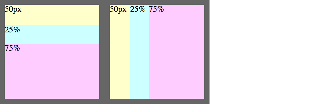
But if you run it in Chrome (47) or Safari (9.0.3), the column layout on the left seems to ignore the flex-basis entirely -- the heights of the bars seem to have no relation to the flex-basis:

The only difference between left and right is the
flex-direction..container { width: 400px; height: 200px; display: flex; background: #666; position: relative; } .layout { flex: 1 1 100%; /* within .container */ margin: 10px; display: flex; } .row { flex-direction: row; } .column { flex-direction: column; } .exact { flex: 1 1 50px; background: #ffc; } .small { flex: 1 1 25%; background: #cff; } .large { flex: 1 1 75%; background: #fcf; }<div class="container"> <div class="layout column"> <div class="exact">50px</div> <div class="small">25%</div> <div class="large">75%</div> </div> <div class="layout row"> <div class="exact">50px</div> <div class="small">25%</div> <div class="large">75%</div> </div> </div>I tried adding
height: 100%to.column, which makes Chrome pay attention to the flex-basis, but causes a different problem -- the flex gets bigger than its container:.column { flex-direction: column; height: 100%; }
I gather this is a long-standing webkit bug. Is there any way to work around it? (I'm trying to create some generalized layout components, so hard-coding specific numbers of children or specific pixel heights isn't workable.)
[EDIT] Here's an additional example showing the general problem (and avoiding the margin and total-greater-than-100% issues in the example above):

.container {
  width: 300px;
  height: 300px;
  display: flex;
}

.layout {
  flex: 1 1 100%; /* within its flex parent */
  display: flex;
  background: #ffc;
}

.row {
  flex-direction: row;
}
.column {
  flex-direction: column;
  height: 100%; /* attempted workaround for webkit */
}

.small {
  flex: 1 1 30%;
  background: #cff;
}
.large {
  flex: 1 1 70%;
  background: #fcf;
}

div {
  /* border/padding just makes divs easier to see --
     you can remove all of this without changing the problem */
  box-sizing: border-box;
  border: 1px solid #999;
  padding: 10px;
}
<div class="container"> <div class="layout row"> <div class="small">row: 30%</div> <div class="large layout column"> <div class="small">row: 70%; col: 30%</div> <div class="large">row: 70%; col: 70%</div> </div> </div> </div>