CSS gradient checkerboard pattern
Solution 1
Just modify the background-position like in the below snippet to get the required output. This works fine in Firefox, Chrome, Opera, IE11 and Edge.
body {
background-image: linear-gradient(45deg, #808080 25%, transparent 25%), linear-gradient(-45deg, #808080 25%, transparent 25%), linear-gradient(45deg, transparent 75%, #808080 75%), linear-gradient(-45deg, transparent 75%, #808080 75%);
background-size: 20px 20px;
background-position: 0 0, 0 10px, 10px -10px, -10px 0px;
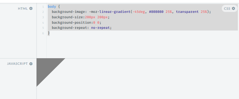
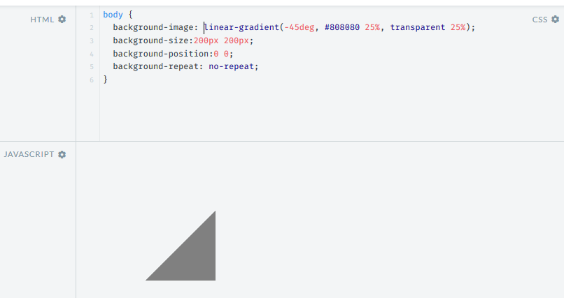
}The problem seems to be happening because of a difference in the way the angles are handled by the -moz linear gradient and the standard one. -45deg in the -moz linear gradient seems to be equal to 135deg in the standard gradient (but changing the angle is resulting in a strange dot in the middle).
The below screenshots show the difference (both taken in the latest Firefox v44.0).
Output with -moz-linear-gradient:
Output with linear gradient:
Solution 2
The 45deg version works nicely, but can end up showing a line between the triangles at different zoom levels or on retina screens. Depending on what browsers you need to support you can also use background-blend-mode: difference (Caniuse currently shows support nearly everywhere except IE), you can tint the checks using an additional background image:
body {
    background-image: /* tint image */
                      linear-gradient(to right, rgba(192, 192, 192, 0.75), rgba(192, 192, 192, 0.75)),
                      /* checkered effect */
                      linear-gradient(to right, black 50%, white 50%),
                      linear-gradient(to bottom, black 50%, white 50%);
    background-blend-mode: normal, difference, normal;
    background-size: 2em 2em;
}
Solution 3
It's 2020 and this can now be created with a single CSS gradient (if you don't need to support IE/ pre-Chromium Edge).
html {
  background: repeating-conic-gradient(#808080 0% 25%, transparent 0% 50%)
              50% / 20px 20px
}
I wrote a detailed explanation on CSS Tricks for how this works.
Solution 4
This was Chrome's implementation for when you opened an image with transparency for a while (though they later removed it in favor of just using a solid background).
body {
    background-position: 0px 0px, 10px 10px;
    background-size: 20px 20px;
    background-image: linear-gradient(45deg, #eee 25%, transparent 25%, transparent 75%, #eee 75%, #eee 100%),linear-gradient(45deg, #eee 25%, white 25%, white 75%, #eee 75%, #eee 100%);
}
Solution 5
Thanks Harry for the inspiration - here's an scss mixin to do that
@mixin checkers($size: 50px, $contrast: 0.07) {
  $checkerColor: rgba(#000, $contrast);
  $angle: 45deg;
  $tp: 25%;

  background-image: linear-gradient($angle, $checkerColor $tp, transparent $tp),
    linear-gradient(-$angle, $checkerColor $tp, transparent $tp),
    linear-gradient($angle, transparent 3 * $tp, $checkerColor 3 * $tp),
    linear-gradient(-$angle, transparent 3 * $tp, $checkerColor 3 * $tp);
  background-size: $size $size;
  background-position: 0 0, 0 $size/2, $size/2 -1 * $size/2, -1 * $size/2 0;
}
Comments
-
Maciej Krawczyk over 3 years
I want to create a checkerboard pattern using gradients. I've found an example and modified it to my needs, however it only works with
-mozprefix. When I remove the-mozprefix, the pattern is completely different.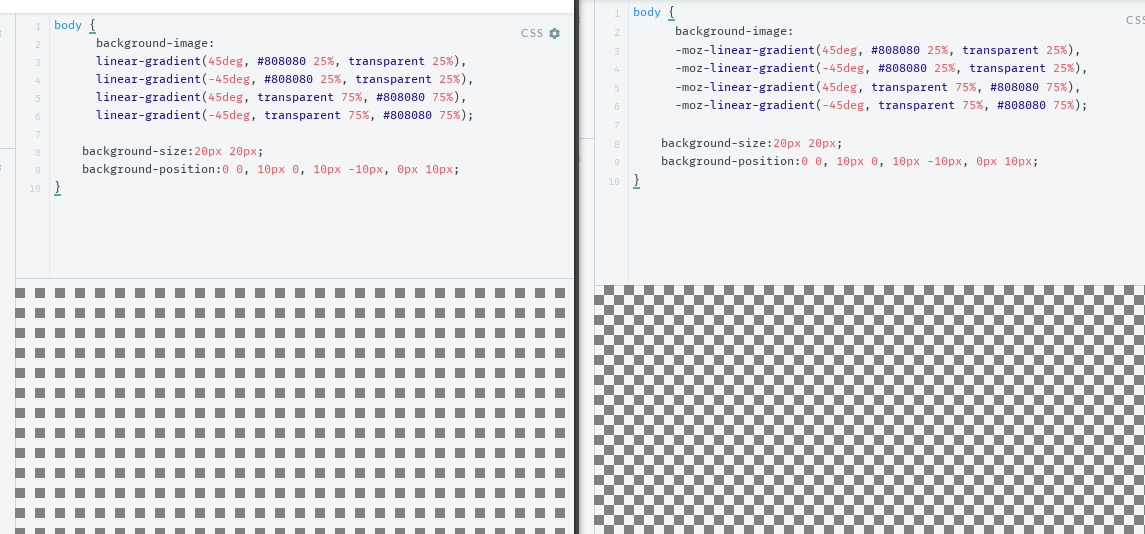
How can I make this
-mozcheckerboard pattern work with unprefixedlinear-gradient?body { background-image: linear-gradient(45deg, #808080 25%, transparent 25%), linear-gradient(-45deg, #808080 25%, transparent 25%), linear-gradient(45deg, transparent 75%, #808080 75%), linear-gradient(-45deg, transparent 75%, #808080 75%); background-size:20px 20px; background-position:0 0, 10px 0, 10px -10px, 0px 10px; } -
 Lorenzo over 3 yearsCool way to make it.Is there a fallback for IE and non support browser ?
 -
 TylerH over 3 years@mix3d When I first looked at this change, my laptop's brightness was apparently too dim to show the background effect, so it didn't appear "how it would look". Now that I'm on a desktop monitor, I see the slight checkered effect; rolled back.
 -
TylerH over 3 years@Lorenzo Judging from what Ana wrote I would guess the fallback is just to use multiple CSS gradients like all the other answers do.