CSS Grid Layout: how to make background colour span multiple cells?
Solution 1
-
To fix the borders and background of
nested-3, you could set the background and borders using:background: #888; grid-gap: 1px;and for all the children of
nested-3you could set background:.nested-3 > div { background: #ddd; } -
Instead of
paddingon.operationsyou could add this tonested-3 > div:.nested-3 > div {/* ADDED */ background: #ddd; display: flex; justify-content: center; align-items: center; padding: 1.3rem; }and you might have to remove
justify-items: centerandpadding: 1remfrom thenested-3div.
I tried out the design too - rearranged the markup like so:
<div class="nested-3 keys">
    <!-- MODIFIED HERE -->
    <div class="operations bg-grey">C</div>
    <div class="operations bg-grey">+/-</div>
    <div class="operations bg-grey">%</div>
    <div>7</div>
    <div>8</div>
    <div>9</div>
    <div>4</div>
    <div>5</div>
    <div>6</div>
    <div>1</div>
    <div>2</div>
    <div>3</div>
    <div class="zero">0</div>
    <div>.</div>
    <div class="operations bg-grey op-right">/</div>
    <div class="op-right">x</div>
    <div class="op-right">-</div>
    <div class="op-right">+</div>
    <div class="op-right">=</div>
</div>
and added these styles:
.nested-3>.op-right {
  grid-column-start: 4;
  grid-row-start: 1;
  background: #fd8a0d;
}

.nested-3>.op-right+.op-right {
  grid-row-start: 2;
}

.nested-3>.op-right+.op-right+.op-right {
  grid-row-start: 3;
}

.nested-3>.op-right+.op-right+.op-right+.op-right {
  grid-row-start: 4;
}

.nested-3>.op-right+.op-right+.op-right+.op-right+.op-right {
  grid-row-start: 5;
}

.zero {
  grid-column: span 2;
}
See the snippet below:
html {
  font-size: 20px;
}

.wrapper {
  display: grid;
  grid-template-columns: 1.2fr 1fr 1.2fr;
  grid-auto-rows: minmax(700px, auto);
}

.wrapper>div {
  padding: 0;
}

.nested-1 {
  display: grid;
  grid-template-columns: repeat(3, 1fr);
  justify-items: center;
}

.nested-1>div {
  font-family: "Roboto", sans-serif;
  font-size: 0.6rem;
  color: white;
}

.top-bar {
  padding-top: 0.3rem;
}

.flight-modus {
  justify-self: start;
  padding-left: 0.3rem;
}

.charge-status {
  justify-self: end;
  padding-right: 0.3rem;
}

.nested-2 {
  display: grid;
  grid-auto-rows: minmax(200px, auto);
  justify-items: end;
}

.nested-2>div {
  font-family: "Roboto", sans-serif;
  font-size: 5rem;
  font-weight: lighter;
  color: white;
  padding-left: 0.2rem;
  padding-right: 0.2rem;
  align-self: end;
}

.nested-3 {
  display: grid;
  grid-template-columns: repeat(4, 1fr);
  grid-template-rows: repeat(5, 1fr);
  /*justify-items: center;*/
  font-size: 2.2rem;
  color: black;
  background: #888;/* CHANGED */
  grid-gap: 1px;/* ADDED */
  font-family: "Roboto", sans-serif;
  font-weight: lighter;
  /*padding: 1rem;*/
}

.nested-3>div { /* ADDED */
  background: #ddd;
  display: flex;
  justify-content: center;
  align-items: center;
  padding: 1.3rem;
}

.operations {
  font-size: 1.5rem;
  /*padding: 1.3rem;*/
}

.bg-grey {
  background: #ccc;
}

.left-cell {
  background: black;
}

.right-cell {
  background: black;
}

.calculator {
  background: #333333;
}

/* ADDED THESE BELOW */

.nested-3>.op-right {
  grid-column-start: 4;
  grid-row-start: 1;
  background: #fd8a0d;
}

.nested-3>.op-right+.op-right {
  grid-row-start: 2;
}

.nested-3>.op-right+.op-right+.op-right {
  grid-row-start: 3;
}

.nested-3>.op-right+.op-right+.op-right+.op-right {
  grid-row-start: 4;
}

.nested-3>.op-right+.op-right+.op-right+.op-right+.op-right {
  grid-row-start: 5;
}

.zero {
  grid-column: span 2;
}
<body class="">
<div class="wrapper">
<div class="left-cell">
</div>
<div class="calculator">
<div class="nested-1 top-bar">
<div class="flight-modus"><img src="http://i63.tinypic.com/sebv9j.png" alt="flight mode">
<img src="http://i67.tinypic.com/5zqf4k.png" alt="wifi signal at full strength"></div>
<div>10:10 am</div>
<div class="charge-status">96% <img src="http://i67.tinypic.com/30ldxtx.png" alt="battery at near full charge"></div>
</div>
<div class="nested-2 result">
<div>3,658.8</div>
</div>
<div class="nested-3 keys">
<!-- MODIFIED HERE -->
<div class="operations bg-grey">C</div>
<div class="operations bg-grey">+/-</div>
<div class="operations bg-grey">%</div>
<div>7</div>
<div>8</div>
<div>9</div>
<div>4</div>
<div>5</div>
<div>6</div>
<div>1</div>
<div>2</div>
<div>3</div>
<div class="zero">0</div>
<div>.</div>
<div class="operations bg-grey op-right">/</div>
<div class="op-right">x</div>
<div class="op-right">-</div>
<div class="op-right">+</div>
<div class="op-right">=</div>
</div>
</div>
<div class="right-cell">
</div>
</div>Solution 2
It's very good that you try to use grid but just do it carefully (https://rachelandrew.co.uk/archives/2016/03/30/should-i-use-grid-or-flexbox/). For your issue I would use the grid only for the 3 cells (left, center and right). But I have used Flexbox for your "nested-3"-box here with intent so you can try it out and play with it a bit.
html{
	font-size: 20px;
}

.wrapper{
	display:grid;
	grid-template-columns: 1.2fr 1fr 1.2fr;
	grid-auto-rows: minmax(700px, auto);
}

.wrapper > div{
	padding: 0;
}

.nested-1{
	display:grid;
	grid-template-columns: repeat(3, 1fr);
	justify-items: center;
}
.nested-1 > div{
	font-family: "Roboto", sans-serif;
	font-size: 0.6rem;
	color: white;
}

	.top-bar{
	padding-top: 0.3rem;
	}

	.flight-modus{
		justify-self:start;
		padding-left: 0.3rem;
	}

	.charge-status{
		justify-self:end;
		padding-right: 0.3rem;
	}

.nested-2{
	display: grid;
	grid-auto-rows: minmax(200px, auto);
	justify-items: end;
}
	.nested-2 > div{
		font-family: "Roboto", sans-serif;
		font-size: 5rem;
		font-weight: lighter;
		color: white;
		padding-left: 0.2rem;
		padding-right: 0.2rem;
		align-self: end;
	}

.nested-3{
	display: flex;
	font-size: 2.2rem;
	color: black;
	background: #ddd;
	font-family: "Roboto", sans-serif;
	font-weight: lighter;
}
  .keys {
    display: flex;
  }

  .wrapper1 {
    flex: 1 0 75%;
    display: flex;
    flex-wrap: wrap;
  }

  .wrapper1 > div {
    flex: 1 0 25%;
    height: 94px;
    border: 1px solid #777;
    display: flex;
    justify-content: center;
    align-items: center;
  }

  .wrapper1 > div.null {
    flex-basis:58%;
  }
  .wrapper2 {
    flex: 1 0 25%;
    display: flex;
    flex-wrap: wrap;
    align-items: center;
    justify-content: center;
    background-color: orange;
    color: #fff;
  }

  .wrapper2 > div {
    height: 94px;
    border: 1px solid #777;
    flex: 1 0 100%;
    display: flex;
    justify-content: center;
    align-items: center;
  }
.bg-grey{
	background: #ccc;
}

.left-cell{
	background: black;
}
.right-cell{
	background: black;
}

.calculator{
	background: #333333;
}
<!DOCTYPE html>
<html lang="en">
<!-- EDIT HEAD INFO INSIDE CODEPEN PREFS -->
<head>
<meta charset="UTF-8">
<meta http-equiv="X-UA-Compatible" content="IE=edge">
<meta name="viewport" content="width=device-width, initial-scale=1">
<link href="https://fonts.googleapis.com/css?family=Roboto:100,300" rel="stylesheet">
<link rel="stylesheet" href="styles.css">
</head>
<body class="">
<div class="wrapper">
<div class="left-cell">
</div>
<div class="calculator">
<div class="nested-1 top-bar">
<div class="flight-modus"><img src="http://i63.tinypic.com/sebv9j.png" alt="flight mode">
<img src="http://i67.tinypic.com/5zqf4k.png" alt="wifi signal at full strength"></div>
<div>10:10 am</div>
<div class="charge-status">96% <img src="http://i67.tinypic.com/30ldxtx.png" alt="battery at near full charge"></div>
</div>
<div class="nested-2 result">
<div>3,658.8</div>
</div>
<div class="nested-3 keys">
<div class="wrapper1">
<div>C</div>
<div>+/-</div>
<div>%</div>
<div>7</div>
<div>8</div>
<div>9</div>
<div>4</div>
<div>5</div>
<div>6</div>
<div>3</div>
<div>2</div>
<div>1</div>
<div class="null">0</div>
<div>.</div>
</div>
<div class="wrapper2">
<div>/</div>
<div>X</div>
<div>-</div>
<div>+</div>
<div>=</div>
</div>
</div>
</div>
<div class="right-cell">
</div>
</div>
</body>
</html>Hope this will help! But as I said, try to think about if it does make sense to use grid or flex for small things. Have a look at the performance, too.
Solution 3
Tile Borders
A simple way to make the black borders would be to give the container a black background color.
.nested-3 {
  background: black;
}
Then apply your foreground color to each key.
.nested-3 > div {
  background: #ddd;
  display: flex;
  align-items: center;
  justify-content: center;
}
(Use flexbox to center the content.)
Then use the grid-gap property to create small gutters, which will simulate borders.
.nested-3 {
  grid-gap: 1px;
}
html {
  font-size: 20px;
}

.wrapper {
  display: grid;
  grid-template-columns: 1.2fr 1fr 1.2fr;
  grid-auto-rows: minmax(700px, auto);
}

.wrapper>div {
  padding: 0;
}

.nested-1 {
  display: grid;
  grid-template-columns: repeat(3, 1fr);
  justify-items: center;
}

.nested-1>div {
  font-family: "Roboto", sans-serif;
  font-size: 0.6rem;
  color: white;
}

.top-bar {
  padding-top: 0.3rem;
}

.flight-modus {
  justify-self: start;
  padding-left: 0.3rem;
}

.charge-status {
  justify-self: end;
  padding-right: 0.3rem;
}

.nested-2 {
  display: grid;
  grid-auto-rows: minmax(200px, auto);
  justify-items: end;
}

.nested-2>div {
  font-family: "Roboto", sans-serif;
  font-size: 5rem;
  font-weight: lighter;
  color: white;
  padding-left: 0.2rem;
  padding-right: 0.2rem;
  align-self: end;
}

.nested-3 {
  display: grid;
  grid-template-columns: repeat(4, 1fr);
  grid-template-rows: repeat(5, 1fr);
  /* justify-items: center; */
  text-align: center;
  font-size: 2.2rem;
  color: black;
  background: black;
  font-family: "Roboto", sans-serif;
  font-weight: lighter;
  padding: 1rem;
  grid-gap: 1px;
}

.nested-3>* {
  background: #ddd;
  display: flex;
  align-items: center;
  justify-content: center;
}

.operations {
  font-size: 1.5rem;
  padding: 1.3rem;
}

.left-cell {
  background: black;
}

.right-cell {
  background: black;
}

.calculator {
  background: #333333;
}
<div class="wrapper">
<div class="left-cell">
</div>
<div class="calculator">
<div class="nested-1 top-bar">
<div class="flight-modus"><img src="http://i63.tinypic.com/sebv9j.png" alt="flight mode">
<img src="http://i67.tinypic.com/5zqf4k.png" alt="wifi signal at full strength"></div>
<div>10:10 am</div>
<div class="charge-status">96% <img src="http://i67.tinypic.com/30ldxtx.png" alt="battery at near full charge"></div>
</div>
<div class="nested-2 result">
<div>3,658.8</div>
</div>
<div class="nested-3 keys">
<div class="operations">C</div>
<div class="operations">+/-</div>
<div class="operations">%</div>
<div class="operations">/</div>
<div>5</div>
<div>5</div>
<div>5</div>
<div>5</div>
<div>5</div>
<div>5</div>
<div>5</div>
<div>5</div>
<div>5</div>
<div>5</div>
<div>5</div>
<div>5</div>
<div>5</div>
<div>5</div>
<div>5</div>
<div>5</div>
</div>
</div>
<div class="right-cell">
</div>
</div>Row / Column Background Color
Standard CSS selectors can handle the task of setting background colors on rows and columns.
Row
.operations {
  font-size: 1.5rem;
  padding: 1.3rem;
  background-color: orange;
}
html {
  font-size: 20px;
}

.wrapper {
  display: grid;
  grid-template-columns: 1.2fr 1fr 1.2fr;
  grid-auto-rows: minmax(700px, auto);
}

.wrapper>div {
  padding: 0;
}

.nested-1 {
  display: grid;
  grid-template-columns: repeat(3, 1fr);
  justify-items: center;
}

.nested-1>div {
  font-family: "Roboto", sans-serif;
  font-size: 0.6rem;
  color: white;
}

.top-bar {
  padding-top: 0.3rem;
}

.flight-modus {
  justify-self: start;
  padding-left: 0.3rem;
}

.charge-status {
  justify-self: end;
  padding-right: 0.3rem;
}

.nested-2 {
  display: grid;
  grid-auto-rows: minmax(200px, auto);
  justify-items: end;
}

.nested-2>div {
  font-family: "Roboto", sans-serif;
  font-size: 5rem;
  font-weight: lighter;
  color: white;
  padding-left: 0.2rem;
  padding-right: 0.2rem;
  align-self: end;
}

.nested-3 {
  display: grid;
  grid-template-columns: repeat(4, 1fr);
  grid-template-rows: repeat(5, 1fr);
  /* justify-items: center; */
  text-align: center;
  font-size: 2.2rem;
  color: black;
  background: black;
  font-family: "Roboto", sans-serif;
  font-weight: lighter;
  padding: 1rem;
  grid-gap: 1px;
}

.nested-3>* {
  background: #ddd;
  display: flex;
  align-items: center;
  justify-content: center;
}

.operations {
  font-size: 1.5rem;
  padding: 1.3rem;
  background-color: orange;
}

.left-cell {
  background: black;
}

.right-cell {
  background: black;
}

.calculator {
  background: #333333;
}
<div class="wrapper">
<div class="left-cell">
</div>
<div class="calculator">
<div class="nested-1 top-bar">
<div class="flight-modus"><img src="http://i63.tinypic.com/sebv9j.png" alt="flight mode">
<img src="http://i67.tinypic.com/5zqf4k.png" alt="wifi signal at full strength"></div>
<div>10:10 am</div>
<div class="charge-status">96% <img src="http://i67.tinypic.com/30ldxtx.png" alt="battery at near full charge"></div>
</div>
<div class="nested-2 result">
<div>3,658.8</div>
</div>
<div class="nested-3 keys">
<div class="operations">C</div>
<div class="operations">+/-</div>
<div class="operations">%</div>
<div class="operations">/</div>
<div>5</div>
<div>5</div>
<div>5</div>
<div>5</div>
<div>5</div>
<div>5</div>
<div>5</div>
<div>5</div>
<div>5</div>
<div>5</div>
<div>5</div>
<div>5</div>
<div>5</div>
<div>5</div>
<div>5</div>
<div>5</div>
</div>
</div>
<div class="right-cell">
</div>
</div>Column
.nested-3 > div:nth-child(4n) {
  background-color: orange;
}

.nested-3 > div:not(:nth-child(3)):nth-child(4n + 3) {
  background-color: red;
}
html {
  font-size: 20px;
}

.wrapper {
  display: grid;
  grid-template-columns: 1.2fr 1fr 1.2fr;
  grid-auto-rows: minmax(700px, auto);
}

.wrapper>div {
  padding: 0;
}

.nested-1 {
  display: grid;
  grid-template-columns: repeat(3, 1fr);
  justify-items: center;
}

.nested-1>div {
  font-family: "Roboto", sans-serif;
  font-size: 0.6rem;
  color: white;
}

.top-bar {
  padding-top: 0.3rem;
}

.flight-modus {
  justify-self: start;
  padding-left: 0.3rem;
}

.charge-status {
  justify-self: end;
  padding-right: 0.3rem;
}

.nested-2 {
  display: grid;
  grid-auto-rows: minmax(200px, auto);
  justify-items: end;
}

.nested-2>div {
  font-family: "Roboto", sans-serif;
  font-size: 5rem;
  font-weight: lighter;
  color: white;
  padding-left: 0.2rem;
  padding-right: 0.2rem;
  align-self: end;
}

.nested-3 {
  display: grid;
  grid-template-columns: repeat(4, 1fr);
  grid-template-rows: repeat(5, 1fr);
  /* justify-items: center; */
  text-align: center;
  font-size: 2.2rem;
  color: black;
  background: black;
  font-family: "Roboto", sans-serif;
  font-weight: lighter;
  padding: 1rem;
  grid-gap: 1px;
}

.nested-3>* {
  background: #ddd;
  display: flex;
  align-items: center;
  justify-content: center;
}

.operations {
  font-size: 1.5rem;
  padding: 1.3rem;
}

.nested-3>div:nth-child(4n) {
  background-color: orange;
}

.nested-3>div:not(:nth-child(3)):nth-child(4n + 3) {
  background-color: red;
}

.left-cell {
  background: black;
}

.right-cell {
  background: black;
}

.calculator {
  background: #333333;
}
<div class="wrapper">
<div class="left-cell">
</div>
<div class="calculator">
<div class="nested-1 top-bar">
<div class="flight-modus"><img src="http://i63.tinypic.com/sebv9j.png" alt="flight mode">
<img src="http://i67.tinypic.com/5zqf4k.png" alt="wifi signal at full strength"></div>
<div>10:10 am</div>
<div class="charge-status">96% <img src="http://i67.tinypic.com/30ldxtx.png" alt="battery at near full charge"></div>
</div>
<div class="nested-2 result">
<div>3,658.8</div>
</div>
<div class="nested-3 keys">
<div class="operations">C</div>
<div class="operations">+/-</div>
<div class="operations">%</div>
<div class="operations">/</div>
<div>5</div>
<div>5</div>
<div>5</div>
<div>5</div>
<div>5</div>
<div>5</div>
<div>5</div>
<div>5</div>
<div>5</div>
<div>5</div>
<div>5</div>
<div>5</div>
<div>5</div>
<div>5</div>
<div>5</div>
<div>5</div>
</div>
</div>
<div class="right-cell">
</div>
</div>
Juchtmans Chris
I am a Personal trainer, company owner, linguist, non-practicing lawyer and re-orienting into the world of code. Having started with front end web development, javascript is the first language I am thoroughly learning. Next, I want to do back end development, using JS and other languages for server-side applications. A huge fan of the mountains, high-quality work, a clean environment, and with family living in the country, my ultimate work destination would have to be CH!
Updated on July 09, 2022Comments
-
Juchtmans Chris almost 2 years
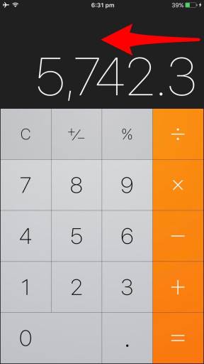
For a FreeCodeCamp assignment I am making an iOS Calculator clone in CSS Grid Layout. The JavaScript to run it is work for later; I'm now focusing on a the design.
The final result should look something like this:
html {
  font-size: 20px;
}

.wrapper {
  display: grid;
  grid-template-columns: 1.2fr 1fr 1.2fr;
  grid-auto-rows: minmax(700px, auto);
}

.wrapper>div {
  padding: 0;
}

.nested-1 {
  display: grid;
  grid-template-columns: repeat(3, 1fr);
  justify-items: center;
}

.nested-1>div {
  font-family: "Roboto", sans-serif;
  font-size: 0.6rem;
  color: white;
}

.top-bar {
  padding-top: 0.3rem;
}

.flight-modus {
  justify-self: start;
  padding-left: 0.3rem;
}

.charge-status {
  justify-self: end;
  padding-right: 0.3rem;
}

.nested-2 {
  display: grid;
  grid-auto-rows: minmax(200px, auto);
  justify-items: end;
}

.nested-2>div {
  font-family: "Roboto", sans-serif;
  font-size: 5rem;
  font-weight: lighter;
  color: white;
  padding-left: 0.2rem;
  padding-right: 0.2rem;
  align-self: end;
}

.nested-3 {
  display: grid;
  grid-template-columns: repeat(4, 1fr);
  grid-template-rows: repeat(5, 1fr);
  justify-items: center;
  font-size: 2.2rem;
  color: black;
  background: #ddd;
  font-family: "Roboto", sans-serif;
  font-weight: lighter;
  padding: 1rem;
}

.operations {
  font-size: 1.5rem;
  padding: 1.3rem;
}

.bg-grey {
  background: #ccc;
}

.left-cell {
  background: black;
}

.right-cell {
  background: black;
}

.calculator {
  background: #333333;
}
<body class=""> <div class="wrapper"> <div class="left-cell"> </div> <div class="calculator"> <div class="nested-1 top-bar"> <div class="flight-modus"><img src="http://i63.tinypic.com/sebv9j.png" alt="flight mode"> <img src="http://i67.tinypic.com/5zqf4k.png" alt="wifi signal at full strength"></div> <div>10:10 am</div> <div class="charge-status">96% <img src="http://i67.tinypic.com/30ldxtx.png" alt="battery at near full charge"></div> </div> <div class="nested-2 result"> <div>3,658.8</div> </div> <div class="nested-3 keys"> <div class="operations bg-grey">C</div> <div class="operations bg-grey">+/-</div> <div class="operations bg-grey">%</div> <div class="operations bg-grey">/</div> <div>5</div> <div>5</div> <div>5</div> <div>5</div> <div>5</div> <div>5</div> <div>5</div> <div>5</div> <div>5</div> <div>5</div> <div>5</div> <div>5</div> <div>5</div> <div>5</div> <div>5</div> <div>5</div> </div> </div> <div class="right-cell"> </div> </div>What I did:
I have made a general grid with several nested grids. No.3 of these nested grids has to hold the calculator keys (digits 0-9, basic math operations, result, clear).
How do I set a continuous
background-coloracross a certain number ofcellse.g. darker grey, orange etc.? Now, setting thebgon my individualdivsis leaving gaps. Next, thecell-bordersshould also get a 1px solid color, as per the example.Having searched around on SO and in CSS Grid layout / CSS Flexbox tutorials, I could not find a simple solution to this obviously simple task. Should I bring Flexbox into my Grid here?
As much as I appreciate the wonderful new dynamics Grid brings, and its compatibility with Flexbox, I am still very much new to both.
Any tips and remarks on my code structure are welcome! Thanks, Chris