CSS infinite horizontal scroll with keyframe?
10,700
I just cropped your image so the end lines up with the start. Then, I modified the animatedBackground keyframes to end at the opposite end of the image.
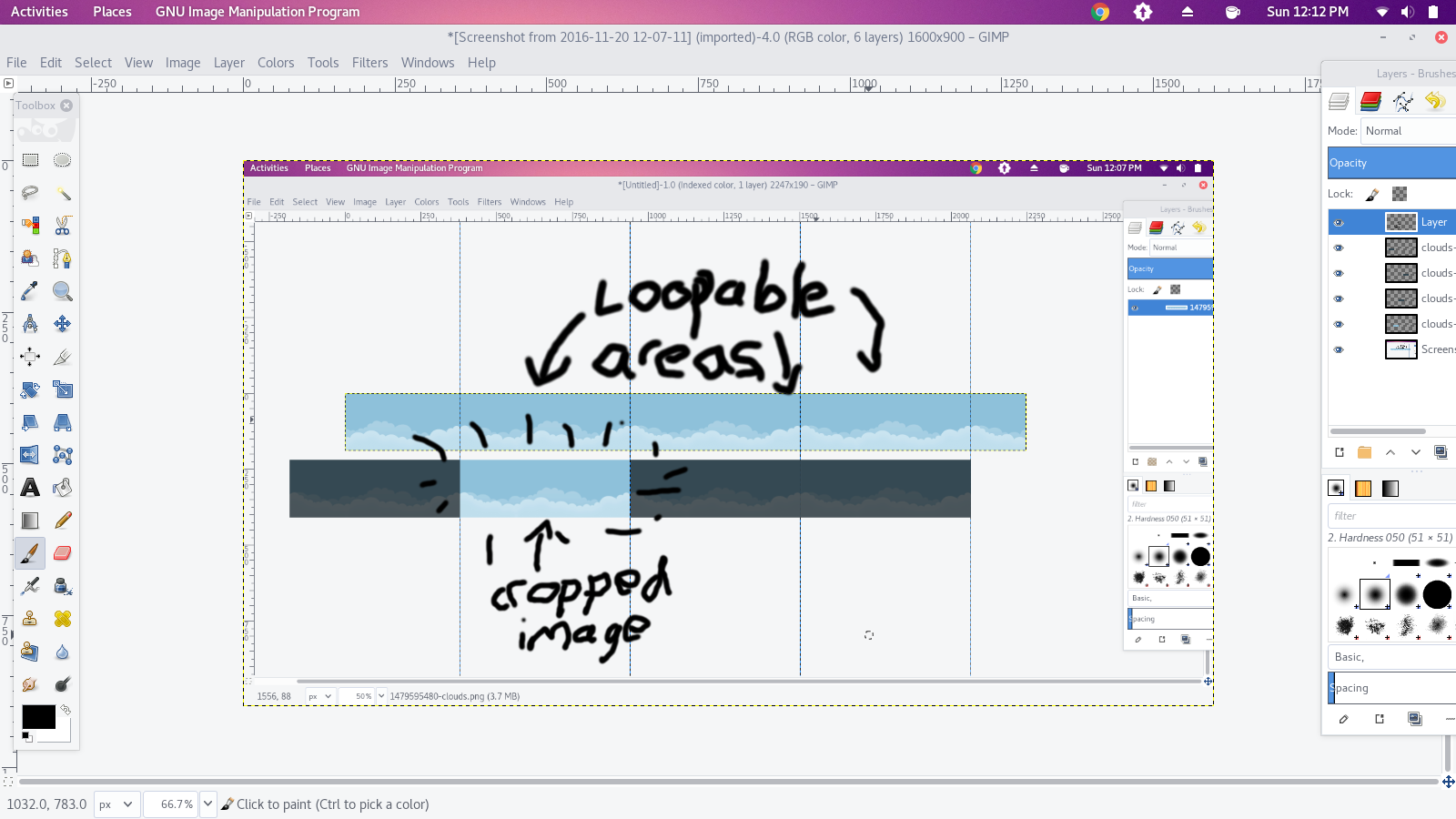
Cropped image:

How it works
@keyframes animatedBackground {
  from {
    left: 0px;
  }
  90% {
    left: -562px;
  }
  100%{left: 0px;}
}
#header-top {
  height: 190px;
  width: 562px;
  overflow-x: auto;
  overflow-y: hidden;
}
* {
  margin: 0;
  padding: 0;
  font-family:sans-serif;
}
.inner-cont {
  width: 1126px;
  position: relative;
  animation: animatedBackground 4s linear infinite;
}
img{
  border-right:1px solid black;
  box-sizing:border-box;
}
<div id="header-top">
<div class='inner-cont'>
<img src="https://archive.org/download/clouds-tiled/clouds-tiled.png" /><img src="https://archive.org/download/clouds-tiled/clouds-tiled.png" />
</div>
</div>
<h3>^ How it actually works(almost) ^</h3>
<h4>The spinback doesn't actually get animated, but it happens <br/>(The line separates the looped images from each other)</h4>Final result
@keyframes animatedBackground {
  from { background-position: 0px 0; }
  to { background-position: -562px 0; }
}
#header-top {
  height: 190px;
  width:100%;
  background-image: url('https://archive.org/download/clouds-tiled/clouds-tiled.png');
  background-repeat: repeat-x;
  animation: animatedBackground 2s linear infinite;
  line-height: 400px;

}
<div id="header-top">
</div>
Author by
Admin
Updated on June 12, 2022Comments
-
Admin almost 2 years
As a student, I'm actually making my own portfolio.
For the header, I tried to create a sky effect, with an image scrolling horizontally. I used CSS and keyframes, the problem I have is that when the image come to the end, it "resets" and doesn't continue to scroll smoothly.
Is there any way to make it continue "indefinitely" ? (I changed the duration to 5s just to not make you wait the 40s :p)@keyframes animatedBackground { from { background-position: 0 0; } to { background-position: 100% 0; } } #header-top { height: 190px; background-image: url('http://image.noelshack.com/fichiers/2016/46/1479595480-clouds.png'); background-repeat: repeat-x; animation: animatedBackground 5s linear infinite; line-height: 400px; }<div id="header-top"> </div> -
Mugé almost 3 yearsExcellent, thank you! To add to your solution because it took me a while to figure some CSS and where the image gets cut. Lets say, there are 5 images side-by-side. The first image gets cut into half. The last image gets cut into half. Your image is 562px wide. My image is 2000px wide. Inside the @keyframes, your 'to {background-position: -562px 0;) is at the width of your one image, running from right-to-left. I needed from left-to-right, so I solved it as 'to {background-position: 2000px 0;}. Just putting it out there, perhaps someone stumbles across similar scenario as mine.