CSS Skew only container, not content
Solution 1
Need to tweak the positioning and the size of the container so you can crop it, and apply the backface-visibility rule:
.skew {
    -webkit-backface-visibility : hidden; /* the magic ingredient */
    -webkit-transform           : skew(16deg, 0);
    overflow                    : hidden;
    width                       : 300px;
    height                      : 260px;
    position                    : relative;
    left                        : 50px;
    border                      : 1px solid #666
}

.skew img {
    -webkit-transform : skew(-16deg, 0);
    position          : relative;
    left              : -40px;
}
http://codepen.io/anon/pen/HLtlG <- before (aliased)
http://codepen.io/anon/pen/wnlpt <- after (anti-aliased)
Solution 2
In lieu of a CSS solution, you could also achieve the effect by using a canvas and some JS; and compositing a series of cropped images onto that canvas. The benefit of the canvas method being that you'll potentially get smoother edges on the crops, and it is potentially a bit better supported.
A canvas element in HTML;
<canvas id="mycanvas"></canvas>
And JS;
var img1 = new Image();
var img2 = new Image();
var img3 = new Image();
img1.src = '../my/image1.jpg';
img2.src = '../my/image2.jpg';
img3.src = '../my/image3.jpg';

var can = document.getElementById("mycanvas");
var ctx = can.getContext('2d');

var imgs = [img1, img2, img3]; //array of JS image objects that you've set up earlier

can.width = 1000;
can.height = 100;

for (var i=0; i < imgs.length; i++) {
    ctx.beginPath();
    ctx.moveTo(0, 0);
    ctx.lineTo(800 - (200 * i), 0);
    ctx.lineTo(900 - (200 * i), 100);
    ctx.lineTo(0, 100);
    ctx.closePath();
    ctx.clip();

    ctx.drawImage(imgs[i], 0, 0);
}
The code is just off the top of my head - I haven't tested it. But basically - lets say you have a canvas that is a maximum of 1000px wide and 100px high. What happens above is, you set up a clipping area with a diagonal line across the canvas from point (800,0) to (900,100) and then draw the image into that clipping area... Then set up a new clipping path 200 pixels shorter for each image (note the '200 * i' bit). Obviously the math needs to be adjusted for an arbitrary number of images and so on... But the idea is there.
A bit trickier than pure CSS maybe - but as I said - possibly a bit better supported cross-browser (IE's notwithstanding...).
EDIT
Did a quick test - looks like you need to set the canvas dimensions - and also obviously wait for all images to load properly before you can composite them on the canvas.
briteweb
Updated on January 31, 2020Comments
-
briteweb about 4 years
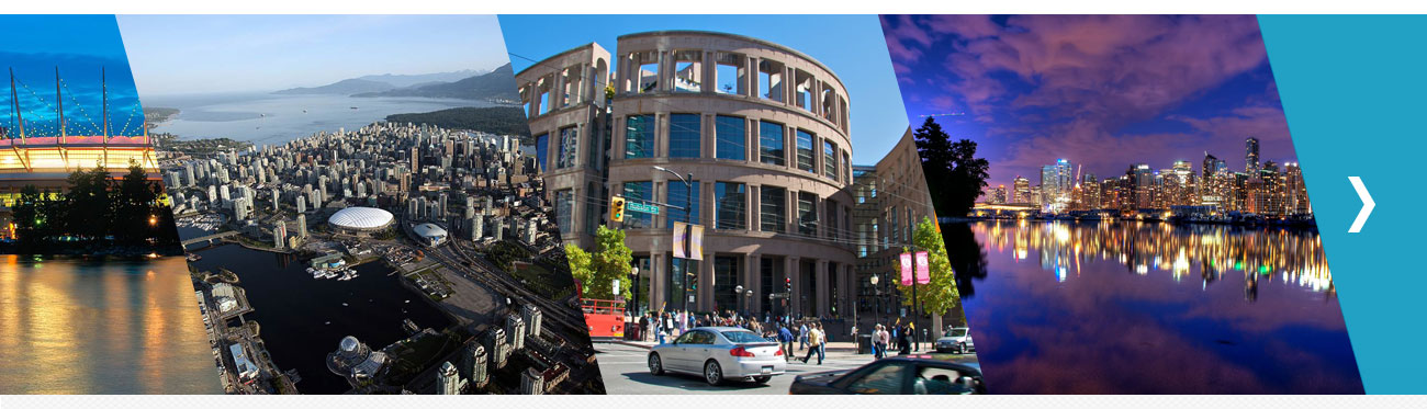
I'm having trouble figuring out how to make the following layout work. I'm not restricted to pure CSS - I know JS will be involved to make it cross-browser - but a CSS solution would be awesome. Here's what I am trying to achieve:
I've tried the following code, skewing the container and then skewing the image in the opposite direction, but it just gives me a square image. Chrome inspector shows me that the container is being skewed properly, but skewing the image back makes it square again. Adding an overflow:hidden to the container kind of works but the edges of the angle become jagged. Here's what I have tried:
http://codepen.io/anon/pen/ubrFz
Please help! :)
-
briteweb about 11 yearsGenius!!! Works perfectly across all good browsers. Now to figure out a solution for IE (8+).
-
briteweb about 11 yearsThanks for this solution. I've used canvas in IE so this might be the solution I need for IE!
-
 aleXela about 10 yearsGreat! But I made it without backface. working as king! Thanks a lot!