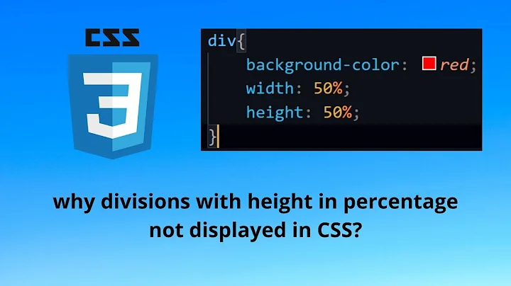
CSS – why doesn’t percentage height work?
Solution 1
The height of a block element defaults to the height of the block's content. So, given something like this:
<div id="outer">
    <div id="inner">
        <p>Where is pancakes house?</p>
    </div>
</div>
#inner will grow to be tall enough to contain the paragraph and #outer will grow to be tall enough to contain #inner.
When you specify the height or width as a percentage, that's a percentage with respect to the element's parent. In the case of width, all block elements are, unless specified otherwise, as wide as their parent all the way back up to <html>; so, the width of a block element is independent of its content and saying width: 50% yields a well defined number of pixels.
However, the height of a block element depends on its content unless you specify a specific height. So there is feedback between the parent and child where height is concerned and saying height: 50% doesn't yield a well defined value unless you break the feedback loop by giving the parent element a specific height.
Solution 2
A percentage value in a height property has a little complication, and the width and height properties actually behave differently to each other. Let me take you on a tour through the specs.
height property:
Let's have a look at what CSS Snapshot 2010 spec says about height:
The percentage is calculated with respect to the height of the generated box's containing block. If the height of the containing block is not specified explicitly (i.e., it depends on content height), and this element is not absolutely positioned, the value computes to 'auto'. A percentage height on the root element is relative to the initial containing block. Note: For absolutely positioned elements whose containing block is based on a block-level element, the percentage is calculated with respect to the height of the padding box of that element.
OK, let's take that apart step by step:
The percentage is calculated with respect to the height of the generated box's containing block.
What's a containing block? It's a bit complicated, but for a normal element in the default static position, it's:
the nearest block container ancestor box
or in English, its parent box. (It's well worth knowing what it would be for fixed and absolute positions as well, but I'm ignoring that to keep this answer short.)
So take these two examples:
<div   id="a"  style="width: 100px; height: 200px; background-color: orange">
  <div id="aa" style="width: 100px; height: 50%;   background-color: blue"></div>
</div>
<div id="b" style="width: 100px; background-color: orange">
<div id="bb" style="width: 100px; height: 50%; background-color: blue"></div>
</div>In this example, the containing block of #aa is #a, and so on for #b and #bb. So far, so good.
The next sentence of the spec for height is the complication I mentioned in the introduction to this answer:
If the height of the containing block is not specified explicitly (i.e., it depends on content height), and this element is not absolutely positioned, the value computes to 'auto'.
Aha! Whether the height of the containing block has been specified explicitly matters!
- 50% of
height:200pxis 100px in the case of#aa - But 50% of
height:autoisauto, which is 0px in the case of#bbsince there is no content forautoto expand to
As the spec says, it also matters whether the containing block has been absolutely positioned or not, but let's move on to width.
width property:
So does it work the same way for width? Let's take a look at the spec:
The percentage is calculated with respect to the width of the generated box's containing block.
Take a look at these familiar examples, tweaked from the previous to vary width instead of height:
<div   id="c"  style="width: 200px; height: 100px; background-color: orange">
  <div id="cc" style="width: 50%;   height: 100px; background-color: blue"></div>
</div>
<div id="d" style=" height: 100px; background-color: orange">
<div id="dd" style="width: 50%; height: 100px; background-color: blue"></div>
</div>- 50% of
width:200pxis 100px in the case of#cc - 50% of
width:autois 50% of whateverwidth:autoends up being, unlikeheight, there is no special rule that treats this case differently.
Now, here's the tricky bit: auto means different things, depending partly on whether its been specified for width or height! For height, it just meant the height needed to fit the contents*, but for width, auto is actually more complicated. You can see from the code snippet that's in this case it ended up being the width of the viewport.
What does the spec say about the auto value for width?
The width depends on the values of other properties. See the sections below.
Wahey, that's not helpful. To save you the trouble, I've found you the relevant section to our use-case, titled "calculating widths and margins", subtitled "block-level, non-replaced elements in normal flow":
The following constraints must hold among the used values of the other properties:
'margin-left' + 'border-left-width' + 'padding-left' + 'width' + 'padding-right' + 'border-right-width' + 'margin-right' = width of containing block
OK, so width plus the relevant margin, border and padding borders must all add up to the width of the containing block (not descendents the way height works). Just one more spec sentence:
If 'width' is set to 'auto', any other 'auto' values become '0' and 'width' follows from the resulting equality.
Aha! So in this case, 50% of width:auto is 50% of the viewport. Hopefully everything finally makes sense now!
Footnotes
* At least, as far it matters in this case. spec All right, everything only kind of makes sense now.
Solution 3
I think you just need to give it a parent container... even if that container's height is defined in percentage. This seams to work just fine: JSFiddle
html, body {
    margin: 0;
    padding: 0;
    width: 100%;
    height: 100%;
}
.wrapper {
    width: 100%;
    height: 100%;
}
.container {
    width: 100%;
    height: 50%;
}
Solution 4
You need to give it a container with a height. width uses the viewport as the default width
Solution 5
Another option is to add style to div
<div style="position: absolute; height:somePercentage%; overflow:auto(or other overflow value)">
 //to be scrolled
</div>
And it means that an element is positioned relative to the nearest positioned ancestor.
Related videos on Youtube
 08 : 38
 02 : 35
 01 : 20
 01 : 09
 01 : 20
 01 : 04
Web_Designer
Warning: Stack overflow was a deep pit for me. I wanted to be esteemed by others. But what is highly esteemed by others is detestable in the sight of God. Jesus said, "What would it profit you to gain the whole world and forfeit your soul?" God is patient, but He never fails to fulfill His word. Judgement will come where everyone will be repaid for their deeds. Read the Bible and give up everything to obey Jesus.
Updated on March 03, 2020Comments
-
Web_Designer about 4 years
How come a percentage value for
heightdoesn’t work but a percentage value forwidthdoes?<div id="working"></div> <div id="not-working"></div>#working{ width:80%; height:140px; background:orange; } #not-working{ width:80%; height:30%; background:green; }The width of
#workingends up being 80% of the viewport, but the height of#not-workingends up being 0.-
 Admin about 13 yearsNot an expert, but I'd imagine it has something to do with the assumption that you're going to be scrolling up and down a web page, but not sideways...
 -
Michael Benjamin over 8 yearsHere's a simple and clear explanation of the CSS
heightproperty with percentage values: stackoverflow.com/a/31728799/3597276
-
-
nchpmn about 13 yearsCorrect, but also see @mu's answer for an explanation as to why.
-
arthur over 11 yearscorrect and well explained. the difference between them is that width by default is defined by the value of its parents element, whereas heigth is define by the "value" of its content. parent's value vs content's value
-
 MilkyTech almost 10 yearsso is there no way to have height that is responsive? i.e. - you have a row of colored squares created with css background color and you want the squares to resize with the screen. jjsFiddle
 -
Joshua Coady over 9 years@ChrisM - Depending on how you want to use it, just set equal paddings to half the width you want the box: jsfiddle.net/en9xyv30/1 If you want content in the box, it'll likely need to be absolutely positioned -- just set top, right, bottom, and left all to 0 (or the same value other than 0 if you want some padding) and the content will resize along with the box.
-
Joshua Coady over 9 yearsYou can also use the vw unit. vw is a unit that is a percent of the viewport width. So, something like height: 10vw; width: 10vw; would scale to screen width and remain square. See caniuse.com/#feat=viewport-units for browser compatibility.
-
 Kishore Kumar almost 8 yearsthanks works for me :)
 -
 Tomasz Mularczyk over 7 yearsBe careful with replacing percentages with
vwunit as it will make your life really hard if you decide to put the element into another container.