CSS3 flexbox layout max 3 child items on one line
Solution 1
Instead of using display: flex you could use float: left and clear every 3rd child node like this:
.child {
    background: #000;
    height: 300px;
    float: left;
    margin:15px 0 0 15px;
    width:150px;
}
.child:nth-child(3n+1) {
    clear: left;
}
I created a fiddle for you: fiddle example
In the case that the parent can hold only two children, you could use this short jQuery fix:
var child = $('.child'),
    parent = $('.child').parent();
if( child.width() > (parent.width()/3) ) {
     child.css('clear', 'none');
}
Fiddle with fix: fiddle example2
Solution 2
Use flex-basis.
.child {
flex-basis: 33%;
}
The percentage must be adapted according to you box-sizing model, and the use of margins and/or padding.
Solution 3
Or you could use CSS Grid for this:
Your HTML:
<div class="parent">
    <div class="child"></div>
    <div class="child"></div>
    <div class="child"></div>
    <div class="child"></div>
</div>
Your CSS:
.parent {
    display: grid; // activate grid
    grid-template-columns: repeat(4, 1fr); //make 4 cols with size 1fr
    grid-gap: 20px; //gap between the rows
}
.child { //thats written with less. Just unnest for vanilla css
    &:nth-child(3n+1) {
      grid-column: 1;
    }
    &:nth-child(3n+2) {
      grid-column: 2;
    }
    &:nth-child(3n+3) {
      grid-column: 3;
    }
    &:nth-child(3n+4) {
      grid-column: 1; //put the fourth item in a new row
    }
}
I'm sure there are more efficient ways to write this with grid. But this does the job.
Solution 4
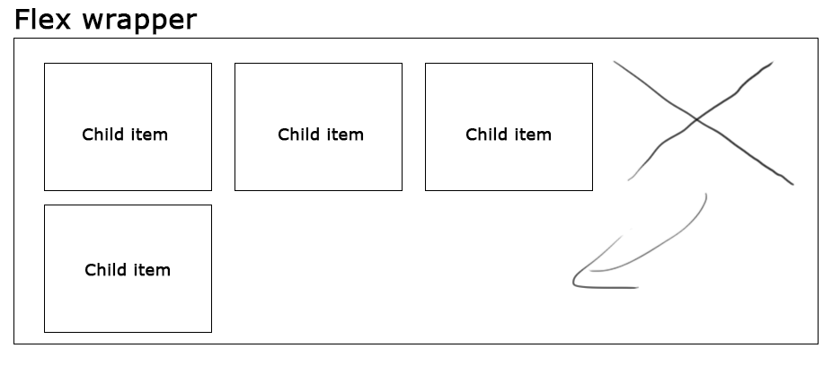
#container {
  display: flex;
  flex-wrap: wrap;
  justify-content: space-around;
}
#container>div {
  margin: 15px;
  width: 150px;
  height: 150px;
}
/* negative paddings are treated as 0 so woohoo */
#container>div {
  /* up to 3 boxes in a row */
  padding: 0 calc((100% - 180px * 3) / 6);
}
#container>div {
  /* up to 4 boxes in a row */
  //padding: 0 calc((100% - 180px * 4) / 8);
}
#container>div {
  /* up to 5 boxes in a row */
  //padding: 0 calc((100% - 180px * 5) / 10);
}
/* 180px = width + horizontal margins */
Related videos on Youtube
 15 : 33
Cristian Matthias Ambæk
Updated on September 16, 2022Comments
-
Cristian Matthias Ambæk 3 months
Is their an simple way in CSS to have a fixed maximum of child items on the same line, before you push the next child elements to a new line?
As i understand flexbox, child items only get pushed to a new line if their isint enough available space on the line above it. But i am seeking a CSS rule or function that let me say "i want a maximum of 3 child items on any given line, and even if space is available for a 4'th one push it to a new line".
-
 FelipeAls almost 8 yearsParent, children: do they have a known width? If yes for children, are they of the same width?
-
-
 Oriol almost 8 yearsThis has the problem that if the parent is narrow and can only have 2 children in each row, your solution will alternate rows of 2 and 1 children, instead of all rows having 2 children.
 -
 Roumelis George almost 8 yearsI don't know if you want to use jQuery, but I updated my answer with a quick fix for the case you mentioned. Hope it helps.
 -
 Playdome.io over 5 yearsThe question asks for flex solution and not for floating
 -
 KSPR almost 5 yearsIn the year 2018 this shouldn't be the accepted answer anymore.
 -
 Joseph about 4 yearsTotally worth it to ditch flexbox for grid.