CSS3 transform order matters: rightmost operation first
Solution 1
Yes, the first operation done is the one the most on the right., i.e. here operation2 is done before operation1.
This MDN article states indeed:
The transform functions are multiplied in order from left to right, meaning that composite transforms are effectively applied in order from right to left.
Here is the documentation : http://www.w3.org/TR/css-transforms-1/.
Example 1
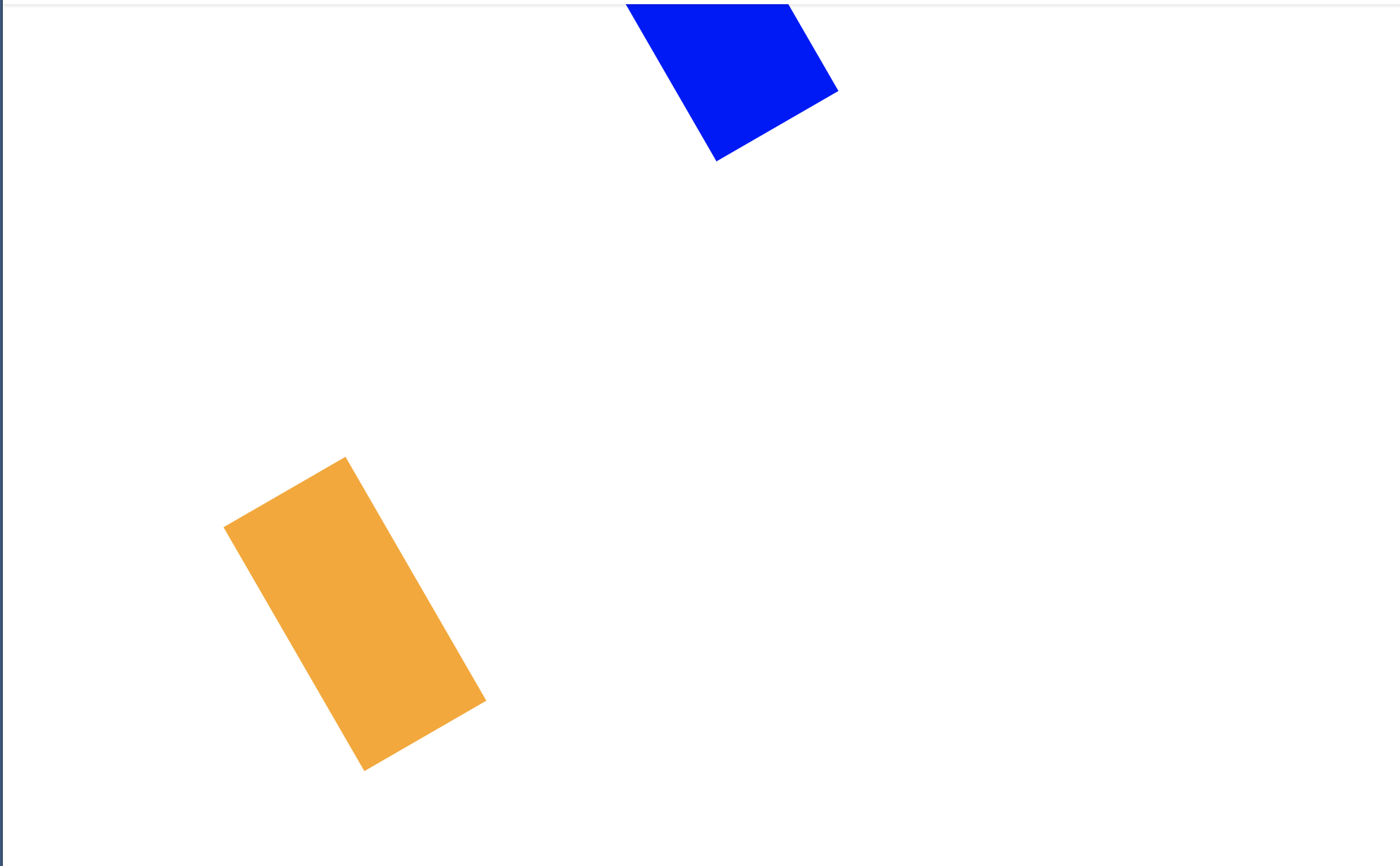
Here the scaling is done first, and then the translation of 100px vertically (if translation was done first, the scaling would make the translation of 500px!)
#container {
  	position: absolute;
  	transform: translate(0,100px) scale(5);
  	transform-origin: 0 0; }
<div id="container"><img src="https://i.stack.imgur.com/xb47Y.jpg"></img></div>Example 2
Here the translation is done first, and then the scaling (the scaling done after makes that the translation looks like a 500px-translation!)
#container {
  	position: absolute;
  	transform: scale(5) translate(0,100px);
  	transform-origin: 0 0; }
<div id="container"><img src="https://i.stack.imgur.com/xb47Y.jpg"></img></div>Solution 2
Transforms are performed left to right. Transforms correspond to matrix operations, and these are performed left to right.
There is intuition behind it, it's not just that this is literally in the spec as a normative rule (point 3 here: https://drafts.csswg.org/css-transforms-1/#transform-rendering)
Here's a pen to try: https://codepen.io/monfera/pen/YLWGrM
Explanation:
Each transform step establishes its own coordinate system. So
transform: translateX(500px);
establishes a new coordinate system 500px along the X axis of its parent, and the element will be rendered there.
Similarly,
background-color: blue;
transform: translateX(500px) rotate(60deg);
first establishes a new coordinate system 500px along the X axis (to the right) of its parent, and only then, within that (translated, but it's now irrelevant) coordinate system does it perform the rotation. So it'll be a shape that's 500px to the right, and rotated in place (around the so-called transform-origin which is interpreted in the local coordinate system, and the default 50% 50% for rotation means, rotation around the center of the rectangle, but it's an aside).
The reverse order
background-color: orange;
transform: rotate(60deg) translateX(500px);
first establishes a new coordinate system that's rotated 60 degrees relative to the parent, and then translates 100px along the X axis of the now rotated coordinate system, in a direction that is not actually to the right from the global viewpoint of the document (or user). So, in this case, it's as if you first rotated the paper, and then slid the shape 500 units along the side of the paper (from the origin, which is in this case the top left corner).
For a more advanced discussion, and understanding of how it's possible to intuitively understand it for both directions, check out Composing Transformations - CSS transforms follow the post-multiplication model, so look for the page with the heading "Think of transformations as transforming the local coordinate frame" (illustrations seem to be a little off though)

Solution 3
This has been mentioned in other answers and comments, but not with enough emphasis in my opinion: the short answer is both ways are valid.
It all depends whether you consider your coordinates attached to your element (left to right) or fixed to the page based on the initial element position (right to left).
Here is an article showing the difference with animations (which makes it easier to understand): Chaining transforms.
Here is a snippet showing the animations from the article:
html, body { height: 100%; }
body {
  background: #aaa;
  color: #000;
  font-family: Calibri,Candara,Segoe,"Segoe UI",Optima,Arial,sans-serif;
  overflow: hidden;
  margin: 0;
}
.info {
  text-align: center;
  font-family: Consolas,monaco,monospace;
  font-size: 20px;
  font-weight: bold;
  margin-bottom: 4px;
  color: #fff;
}
.split { white-space: nowrap; }
.side {
  display: inline-block;
  width: 50%;
}
.label {
  text-align: center;
  font-size: 20px;
}
.container {
  position: relative;
  font-size: 50px;
  margin: .6em auto 0;
  width: 0; height: 0;
  transform: translateX(-1em);
}
.ltr .object {
  position: absolute;
  left: 0; top: 0;
  width: 1em; height: 1em;
  margin: -.5em 0 0 -.5em;
  background: rgb(114,34,34);
  animation: ltrObj 5s infinite;
}
@keyframes ltrObj {
  from, 10% { transform: rotate( 0deg) translateX(0em); }
  40%       { transform: rotate(45deg) translateX(0em); }
  70%, to   { transform: rotate(45deg) translateX(2em); }
}
.object.shadow {
  animation: none;
  opacity: .2;
}

.ltr .axes {
  position: absolute;
  left: .5em; top: .5em;
  width: 1em; height: 1em;
  color: #111;
  box-sizing: border-box;
  border-left: 2px solid;
  border-top: 2px solid;
}
.ltr .axes::before, .ltr .axes::after {
  content: '';
  position: absolute;
  width: .2em; height: .2em;
  box-sizing: border-box;
  border-left: 2px solid;
  border-top: 2px solid;
  transform-origin: top left;
}
.ltr .axes::before { top: 100%; left: 0; margin-left: -1px; margin-top: 1px; transform: rotate(225deg); }
.ltr .axes::after { top: 0; left: 100%; margin-top: -1px; margin-left: 1px; transform: rotate(135deg); }

.rtl .axes {
  position: absolute;
  left: 0; top: 0;
  width: 2.5em; height: 2.3em;
  color: #111;
  box-sizing: border-box;
  border-left: 2px solid;
  border-top: 2px solid;
}
.rtl .axes::before, .rtl .axes::after {
  content: '';
  position: absolute;
  width: .2em; height: .2em;
  box-sizing: border-box;
  border-left: 2px solid;
  border-top: 2px solid;
  transform-origin: top left;
}
.rtl .axes::before { top: 100%; left: 0; margin-left: -1px; margin-top: 1px; transform: rotate(225deg); }
.rtl .axes::after { top: 0; left: 100%; margin-top: -1px; margin-left: 1px; transform: rotate(135deg); }

.rtl .object {
  position: absolute;
  left: 0; top: 0;
  width: 1em; height: 1em;
  margin: -.5em 0 0 -.5em;
  background: rgba(100,0,0,0.8);
  animation: rtlObj 5s infinite;
}
@keyframes rtlObj {
  from, 10% { transform: rotate( 0deg) translateX(0em); }
  40%       { transform: rotate( 0deg) translateX(2em); }
  70%, to   { transform: rotate(45deg) translateX(2em); }
}

.helper-mask {
  position: absolute;
  left: 0; top: 0;
  width: 3em; height: 3em;
  overflow: hidden;
}
.helper {
  position: absolute;
  left: 0; top: -2em;
  width: 0; height: 2em;
  margin-top: 2px;
  box-sizing: border-box;
  border: 2px solid #00c;
  border-left: none;
  border-radius: 0 100% 0 0;
  transform-origin: bottom left;
  animation: helper 5s infinite;
}
@keyframes helper {
  from, 10% { width: 0em; transform: rotate( 0deg); }
  40%       { width: 2em; transform: rotate( 0deg);}
  70%, to   { width: 2em; transform: rotate(45deg);}
}
<div class="info">rotate(45deg) translateX(2em)</div>
<div class="split">
<div class="side ltr">
<div class="label">Left to Right</div>
<div class="container">
<div class="object shadow"></div>
<div class="object">
<div class="axes"></div>
</div>
</div>
</div>
<div class="side rtl">
<div class="label">Right to Left</div>
<div class="container">
<div class="axes"></div>
<div class="object"></div>
<div class="helper-mask">
<div class="helper"></div>
</div>
</div>
</div>
</div>Whether the actual implementation uses left to right or right to left is irrelevant, both are equally valid when creating an animation, as long as you keep the difference in mind.
Solution 4
It applies the leftmost transformation first.
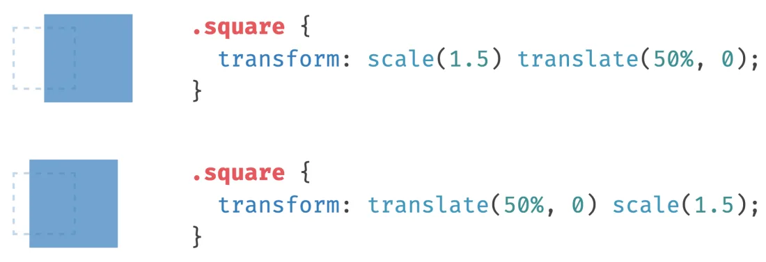
As you can see in the image above, the first transformation takes a longer distance as compared to the second. The reason is the first example undergoes scale first and then it takes the distance specified by translate based on its new width on the x-axis. Because it is wider now, 50% will cause it to take a longer distance. The measure specified by 50% is calculated by taking half of the width of itself.
Basj
I work on R&D involving Python, maths, machine learning, deep learning, data science, product design, and MacGyver solutions to complex problems. I love prototyping, building proofs-of-concept. For consulting/freelancing inquiries : [email protected]
Updated on June 06, 2022Comments
-
Basj about 2 years
When we use CSS3
transform: operation1(...) operation2(...), which one is done first?The first operation done seems to be the one the most on the right., i.e. here
operation2is done beforeoperation1. Just to be sure, is it true?Note: I have read one thing and its contrary in some places (answers, articles on the internet), thus the question here.
-
T3rm1 almost 7 yearsThis answer is wrong. It is done from left to right as the other answer states. This answer should be removed.
-
Basj almost 7 years@T3rm1 Please run the code snippets, you will see by yourself that it's true.
-
 Jeff Klein over 6 yearsThis should be removed or updated to say left to right. The spec says itself that transformations are applied left to right: drafts.csswg.org/css-transforms-1/#transform-rendering
 -
Basj over 6 yearsPlease provide an answer @JeffreyKlein with a runnable code snippet so that we can all test your claim in various browsers. Also can you cite the sentence from your link that says this?
-
Jeff Klein over 6 years"3. Multiply by each of the transform functions in transform property from left to right"
-
Basj over 6 years@JeffreyKlein If you run my example 1, you will see that
scale(5)is run first. Then it is translated of 100px to the south. And not the contrary. If it was the contrary, i.e. translation first, and then scaling x5, then we would see 100*5 = 500px white on top. It's not the case. So I confirm it is right to left, at least according to the math definitions of plane transformations and composition of such operations. If you disagree, please provide another answer with a runnable code snippet, so we can test what you suggest. -
Jeff Klein over 6 yearsDid you miss the part where I provided the official CSS specification?
-
Basj over 6 years@JeffreyKlein Ok I see your confusion now. In fact the sentence you are referring confirms my answer ;) See a linear algebra course and composition of functions (it's the same about matrix seen as transformation function on the plane). In short here is the idea: when you write
(g ∘ f)(x) = g(f(x)), even if g is on the left, the first function that you apply on the input (x) is f, and then g. -
Basj about 6 yearsIt seems we use different terminology for the same thing. When we speak about
f(g(x))in math or with matrices:A B X, where X is a vector and A, B matrices of the transforms, the first thing applied to X is B, and then A is applied to the result. So when applyingA Bto X, B is the first transform applied -
 Robert Monfera about 6 years@Basj let's take the blue example. The first matrix is the translation matrix, let's call it
A. The second is rotation, let's call itB. The input vector isx(matrices are denoted with uppercase, vectors with lowercase). Then the result is(A B) x, ie. first we multiply A with B, then we multiply the result with x. Left to right. You can use your way if it helps, but the question was, in what order is it done. I tried to answer the question. Even if we forget about the spec, implementations usually combine all matrices into one, and only then multiply it with the vector. -
Basj about 6 yearsBy associativity of matrix multiplication,
(A B) x = A (B x), so I notice "left to right" terminology is ambiguous. When you say "left to right", you say "we first multiply A with B". When I say "right to left", I mean : "we can apply B on x first, and then apply A to the result of B x". I think we are both correct with different understanding of the expression "left to right" or "right to left" :) -
Robert Monfera about 6 yearsMath-wise, sure. But the spec spells out the op (mmult) and its order (left to right), so it's not ambiguous. Implementations need to follow some order. I can think of a few possible reasons why it's spelled out, eg. limited numerical precision means that the result can differ, depending on the order. The difference can be non-negligible, so, without the rule, there would be browser differences. But possible reasons don't matter as much, because your question was, which transform is done first?". Spec: go left to right, in case of
A B C x,Ais taken first, multiplied (A B) etc. -
Basj about 6 yearsPlease add a runnable code snippet in the answer, so that we can test in our browser which operation is made fist.
-
Basj about 6 yearsSee "Example 1 code snippet" in the accepted answer, you will see that the scaling is done first (the operation the most on the right), and the translation of 100px vertically after. If the 100px translation was done first, the 5x scaling would make the image at a distance 500px from the origin, which is obviously not the case.
-
Robert Monfera about 6 yearsYour example doesn't show what is done first. Superficially you can do the math in either direction, but fixed precision floating point operations aren't associative. The standard is clear. To answer your question, it's sufficient. I also included a codepen with intuitive explanation. I won't have time to make examples for FP precision loss, and the burden of proof is on the person who claims it's not working in the way the standard specifies, so, until you add code to your own-accepted answer that shows, the spec is a better guide (and because I ran into FP mmult precision bugs before).
-
Basj about 6 yearsI disagree on this: floating point precision and its minor differences of order of magnitude 10^(-5) (or even it was 10^(-1) or 10^(-10)) has nothing to do with 500px offset when doing one operation before another.
-
Basj about 6 years
until you add code to your own-accepted answer that shows: please run the already-existing code snippet "Example 1" of my accepted answer: you will see that the scaling is done first (the operation the most on the right), and the translation of 100px vertically after. If the 100px translation was done first, the 5x scaling would make the image at a distance 500px from the origin (0,0), which is obviously not the case :) Please run it, you will see what I mean. -
Robert Monfera about 6 yearsYou yourself said it can be interpreted in both directions. I already explained how you can intuitively interpret it left to right: via the notion of local coordinate transforms. The standard says it also, besides specifying how it's done: left to right. Maybe you're clinging to your own answer - despite admitting both directions make sense in pure math - because you think that the ops are done to the shape. It's not the case. The ops are done to local coordinate spaces (L->R). Then their composition gets applied to the shape. Check the standard, if that doesn't convince you, I won't either.
-
Basj about 6 yearsAs long as people can try and experiment with code snippets, they will understand (no matter the wording "right to left" or "left to right"), so I think the case is solved.
-
Robert Monfera about 6 yearsSince answering your question needs it, awareness of local coordinate systems would be key. Your Example 2 starts with
scale(5). The reason the thing then gets 5x farther is because this first transform isn't done to the thing: it establishes a new local coordinate system (direct quote from the standard). Since it's a scaling, of course each unit you move in subsequently, will be magnified 5x; you stretched the axes. That's why it'll be 5x farther away. As you say these mmults are associative so the standard's ((AB)C)x and your A(B(Cx)) equal in math, but: spec is clear; also, precision. -
Basj about 6 yearsI suggest you include all these comments in your answer, then we can move this discusison to chat (if we keep only comments here it will make re-reading later difficult). Also please include your example in a runnable SO code snippet, it's much more handier than using a third-party website like codepen (that, by the way doesn't display well, because the rendered part is too small).
-
Robert Monfera about 6 yearsMy reply gave the answer, supported it via the standard, and an explanation of linked examples, even said "...first establishes a new coordinate system 500px along the X axis (to the right) of its parent, and only then, within that (translated, but it's now irrelevant) coordinate system does it perform the rotation...", I feel like you're giving me tasks without appreciating my time and what you might have learned so far, so I'll consider your otherwise sensible (if minor) suggestions when there's more feedback.
-
Basj about 6 yearsIt's not about me, we don't write answers for ourselves. It's about having an answer useful for the community. Reading an answer, jumping to codepen (rendering part very small on bottom), back to SO, reading 15 comments in discussion-style, including comments about unrelated things (floating point precision) etc. will not be easy for future readers. We all spent time on writing answers (on that one it required days of work, trial and error), it's nothing personal about appreciating my time or yours.
-
Basj about 6 yearsLet us continue this discussion in chat.
-
Robert Monfera about 6 yearsI think what's useful to the community doesn't start with nit picks about the answer, it starts first and foremost with not misleading people with an answer that goes against the standard, and even if maybe few folks follow convos, you may have already have sufficient info on what the answer is to your question. The reply even has a screenshot and people can scroll. Let's not turn it into meta SO style guidance on small details when an answer contrary to the standard is accepted, that's not how the community is served, tbh some feedback feels like excuses. It's late here, need to check out
-
Basj about 6 yearsI suggest we stop the discusison here, these comments are not a place to debate about meta things. Can we please stop the endless discussion now and move on? All the best and I wish you a good day.
-
manafi over 5 yearsIt seems the confusion here is that function composition order and sequential order of operations are exact opposites of each other. Sequentially, CSS transforms are performed right to left. If you're not convinced, try
translateX(100%) rotate(90deg)vsrotate(90deg) translateX(100%)and see whether the element ends up to the right or below its original position. -
manafi over 5 yearsAlso just noticed this line in the MDN article on CSS Transforms: "The transform functions are multiplied in order from left to right, meaning that composite transforms are effectively applied in order from right to left."
-
 hoangfin about 4 yearsYour apple image is first translated 100px down then scaled 5 times. Here the operation started from left to right. If you are still in doubt, test
translateX rotateandrotate translateXyou will see the point more clearly -
Basj about 4 years@meteorzero With a mathematic/geometry point of view, your assertion is wrong. Let's taxe
x=(0,0). If you do a translation of (0,100) calledffirst, and then a homothetic transformation of factor 5 calledg, then(g o f)(x) = g(f(x))would be(0,500). You will see that it's not the case here. Here we are doingf(g(x)), i.e.(0, 100). You can see here that top left corner of the apple has coords (0,100). See: en.wikipedia.org/wiki/Geometric_transformation -
hoangfin about 4 years@Basj scroll down and read
skewing and translatingfrom MDN developer.mozilla.org/en-US/docs/Web/CSS/CSS_Transforms/…. It clearly saysHere is the MDN logo, skewed by 10 degrees and translated by 150 pixels on the X-axis. -
hoangfin about 4 years@Basj I care more about the final result of transformation rather than your geometry theory with f(x) and g(x)
-
Basj about 4 years@meteorzero If you want to make an assertion "the transformations are done in order ... and ...", then you are speaking about geometric transformations, and then you need to use math conventions. If not, it's like speaking about nothing and just hand-waving. If you prefer an argument from authority (rather than mine, which I can understand!) to close this question: developer.mozilla.org/en-US/docs/Web/CSS/transform: "The transform functions are multiplied in order from left to right, meaning that composite transforms are effectively applied in order from right to left".
-
 devfieldnotes almost 4 yearsThis article needs a lot more exposure than it has now. Thank you! P.S. Basically, this has to be marked as an answer.
 -
ibrahim koz over 2 yearsThe answer is spurious. stefanjudis.com/blog/… In the link I cited, you see the example in which the scale is written first takes more distance as compared to the second one since it uses percentage as a distance unit. Because it is applied to
scalefirst, it will take more distance. -
Basj over 2 yearsThe conclusion after long discussions (see other answers' comments) in this topic was: it depends what we understand by "left to right" or "right to left". It's a terminology question. Both are correct, depending if we speak about the matrix multiplication (matrix associated to each transform), or "which function is applied first". MDN states "The transform functions are multiplied in order from left to right, meaning that composite transforms are effectively applied in order from right to left.". This sums it up very well.
-
Robert Monfera over 2 years@ibrahimkoz I'm not sure what you mean by spurious. The page you cite agrees with my answer to the question: "Look at the Rendering Model sections of the CSS Transforms Module Level 1 spec and see that transform functions (translate(), rotate(), etc.) are applied from left to right"
-
 Yuns over 2 yearsAwesome! Just like differences of the frame of reference in physics.