drop-down checkbox input in shiny
Solution 1
EDIT : This function (and others) is available in package shinyWidgets
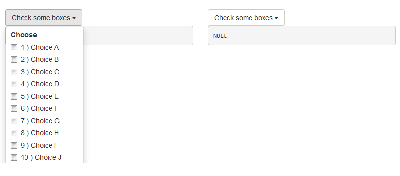
Hi I wrote this dropdownButton function once, it create a bootstrap dropdown button (doc here), the results looks like :
Here is the code :
# func --------------------------------------------------------------------

dropdownButton <- function(label = "", status = c("default", "primary", "success", "info", "warning", "danger"), ..., width = NULL) {

  status <- match.arg(status)
  # dropdown button content
  html_ul <- list(
    class = "dropdown-menu",
    style = if (!is.null(width))
      paste0("width: ", validateCssUnit(width), ";"),
    lapply(X = list(...), FUN = tags$li, style = "margin-left: 10px; margin-right: 10px;")
  )
  # dropdown button apparence
  html_button <- list(
    class = paste0("btn btn-", status," dropdown-toggle"),
    type = "button",
    `data-toggle` = "dropdown"
  )
  html_button <- c(html_button, list(label))
  html_button <- c(html_button, list(tags$span(class = "caret")))
  # final result
  tags$div(
    class = "dropdown",
    do.call(tags$button, html_button),
    do.call(tags$ul, html_ul),
    tags$script(
      "$('.dropdown-menu').click(function(e) {
      e.stopPropagation();
});")
  )
  }
And an example :
# app ---------------------------------------------------------------------

library("shiny")
ui <- fluidPage(
  tags$h1("Example dropdown button"),
  br(),
  fluidRow(
    column(
      width = 6,
      dropdownButton(
        label = "Check some boxes", status = "default", width = 80,
        checkboxGroupInput(inputId = "check1", label = "Choose", choices = paste(1:26, ") Choice ", LETTERS))
      ),
      verbatimTextOutput(outputId = "res1")
    ),
    column(
      width = 6,
      dropdownButton(
        label = "Check some boxes", status = "default", width = 80,
        actionButton(inputId = "a2z", label = "Sort A to Z", icon = icon("sort-alpha-asc")),
        actionButton(inputId = "z2a", label = "Sort Z to A", icon = icon("sort-alpha-desc")),
        br(),
        actionButton(inputId = "all", label = "(Un)select all"),
        checkboxGroupInput(inputId = "check2", label = "Choose", choices = paste(1:26, ") Choice ", LETTERS))
      ),
      verbatimTextOutput(outputId = "res2")
    )
  )
)
server <- function(input, output, session) {
  output$res1 <- renderPrint({
    input$check1
  })

  # Sorting asc
  observeEvent(input$a2z, {
    updateCheckboxGroupInput(
      session = session, inputId = "check2", choices = paste(1:26, ") Choice ", LETTERS), selected = input$check2
    )
  })
  # Sorting desc
  observeEvent(input$z2a, {
    updateCheckboxGroupInput(
      session = session, inputId = "check2", choices = paste(26:1, ") Choice ", rev(LETTERS)), selected = input$check2
    )
  })
  output$res2 <- renderPrint({
    input$check2
  })
  # Select all / Unselect all
  observeEvent(input$all, {
    if (is.null(input$check2)) {
      updateCheckboxGroupInput(
        session = session, inputId = "check2", selected = paste(1:26, ") Choice ", LETTERS)
      )
    } else {
      updateCheckboxGroupInput(
        session = session, inputId = "check2", selected = ""
      )
    }
  })
}
shinyApp(ui = ui, server = server)
In bonus I put the ascending/descending sorting thingy in the second dropdown buttons.
EDIT Mar 22 '16
To split yours checkboxes into multiple columns you can do the split yourself with fluidRow and columns and multiples checkboxes, you just have to bind the values server-side.
To implement scrolling put your checkboxes into a div with style='overflow-y: scroll; height: 200px;'.
Look at this example :
library("shiny")
ui <- fluidPage(
  tags$h1("Example dropdown button"),
  br(),
  fluidRow(
    column(
      width = 6,
      dropdownButton(
        label = "Check some boxes", status = "default", width = 450,
        tags$label("Choose :"),
        fluidRow(
          column(
            width = 4,
            checkboxGroupInput(inputId = "check1a", label = NULL, choices = paste0(1:10, ") ", LETTERS[1:10]))
          ),
          column(
            width = 4,
            checkboxGroupInput(inputId = "check1b", label = NULL, choices = paste0(11:20, ") ", LETTERS[11:20]))
          ),
          column(
            width = 4,
            checkboxGroupInput(inputId = "check1c", label = NULL, choices = paste0(21:26, ") ", LETTERS[21:26]))
          )
        )
      ),
      verbatimTextOutput(outputId = "res1")
    ),
    column(
      width = 6,
      tags$style(".container { border:2px solid steelblue; width: 100%; height: 200px; overflow-y: scroll; }"),
      dropdownButton(
        label = "Check some boxes", status = "default", width = 120,
        tags$div(
          class = "container",
          checkboxGroupInput(inputId = "check2", label = "Choose", choices = paste0(1:26, ") ", LETTERS))
        )
      ),
      verbatimTextOutput(outputId = "res2")
    )
  )
)
server <- function(input, output, session) {

  valuesCheck1 <- reactiveValues(x = NULL)
  observeEvent(input$check1a, valuesCheck1$x <- unique(c(valuesCheck1$x, input$check1a)))
  observeEvent(input$check1b, valuesCheck1$x <- unique(c(valuesCheck1$x, input$check1b)))
  observeEvent(input$check1c, valuesCheck1$x <- unique(c(valuesCheck1$x, input$check1c)))

  output$res1 <- renderPrint({
    valuesCheck1$x
  })

  output$res2 <- renderPrint({
    input$check2
  })

}
shinyApp(ui = ui, server = server)
Solution 2
Firstly, lot of thanks for this dropdownButton function. It's very useful!
Secondly, i tried to use it into shiny dashboard sidebarmenu, but the default characters' style is "color:white" (because of dark background). That takes me a couple of hour to understand that can be changed inside your function, more precisly in html_ul stuff. Here's the line of interest, with color:black :
lapply(X = list(...), FUN = tags$li, style = "margin-left: 10px; margin-right: 10px; color:black")
Quite simple... But when you don't know it (R is the only language I know)... So, I hope this will help any other css-ignorant (and/or HTML?) like me!
Cheers!
Solution 3
There are a couple questions in the comments related the the dropdownButton (worked great for me, thank you) about how to create a scrolling bar on the dropdown. Sorry I don't have reputation to reply in the comments directly.
Try tweaking the relevant ID in your styles.css, for whatever object you put in the dropdownButton. So for the example, the checkboxGroupInput ID needs to have:
#check1
{
   height: 200px;
   overflow: auto;
}
Edit:
To call the styles.css in the ui.R:
navbarPage("Superzip", id="nav",

  tabPanel("Interactive map",
    div(class="outer",

      tags$head(
        # Include our custom CSS
        includeCSS("styles.css")
      ),

      leafletOutput("map", width="100%", height="100%"),
      ...
And the styles.css, with the auto overflow for the inputID ttype and chain:
input[type="number"] {


max-width: 80%;
}

div.outer {
  position: fixed;
  top: 41px;
  left: 0;
  right: 0;
  bottom: 0;
  overflow: hidden;
  padding: 0;
}

/* Customize fonts */
body, label, input, button, select {
  font-family: 'Helvetica Neue', Helvetica;
  font-weight: 200;
}
h1, h2, h3, h4 { font-weight: 400; }

#controls {
  /* Appearance */
  background-color: white;
  padding: 0 20px 20px 20px;
  cursor: move;
  /* Fade out while not hovering */
  opacity: 0.65;
  zoom: 0.9;
  transition: opacity 500ms 1s;
}
#controls:hover {
  /* Fade in while hovering */
  opacity: 0.95;
  transition-delay: 0;
}

#data_inputs {
  /* Appearance */
  background-color: white;
  padding: 0 20px 20px 20px;
  cursor: move;
  /* Fade out while not hovering */
  opacity: 0.65;
  zoom: 0.9;
  transition: opacity 500ms 1s;
}
#data_inputs:hover {
  /* Fade in while hovering */
  opacity: 0.95;
  transition-delay: 0;
}

/* Position and style citation */
#cite {
  position: absolute;
  bottom: 10px;
  left: 10px;
  font-size: 12px;
}

#cite {
  position: absolute;
  bottom: 10px;
  left: 10px;
  font-size: 12px;
}

#ttype
{
   height: 200px;
   overflow: auto;
}

#chain
{
   height: 200px;
   overflow: auto;
}


."form-group shiny-input-checkboxgroup shiny-input-container"
{
   height: 50px;
   overflow: auto;
}

/* If not using map tiles, show a white background */
.leaflet-container {
  background-color: white !important;
}
Tim_Utrecht
Updated on June 07, 2022Comments
-
Tim_Utrecht about 2 years
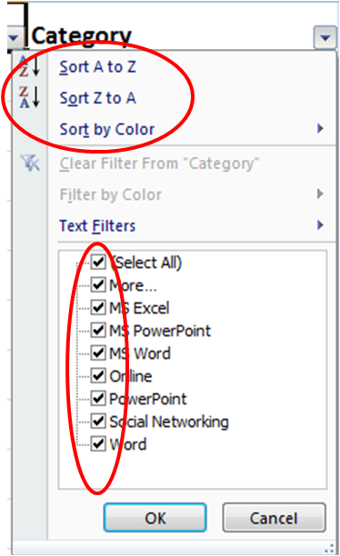
Is it possible to have a dropdown list in Shiny where you can select multiple values? I know
selectInputhas the option to setmultiple = Tbut I don't like it that all selected option are visible in the screen, especially since I have over 40. The same holds forcheckboxGroupInput(), which I like more but still all selected values are shown. Isn't it just possible to get a drop-down like the one I copied from Excel below, rather than the examples of ShinysselectInputandcheckboxGroupInput()thereafter?