Finetuning a forest plot with ggplot2
10,336
This seems like what you had in mind:
data$beta <- as.numeric(as.character(data$beta))
data$lower95 <- as.numeric(as.character(data$lower95))
data$upper95 <- as.numeric(as.character(data$upper95))
data$population <- as.numeric(as.character(data$population))
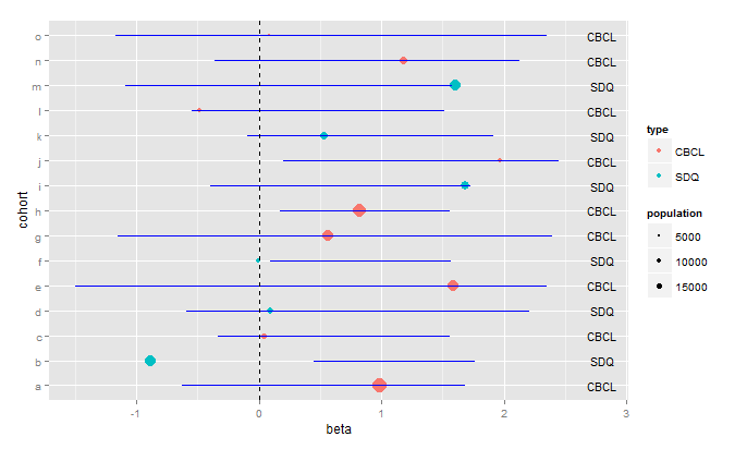
ggplot(data=data,aes(x=beta,y=cohort))+
geom_point(aes(size=population,fill=type), colour="black",shape=21)+
geom_errorbarh(aes(xmin=lower95,xmax=upper95),height=0.667)+
geom_vline(xintercept=0,linetype="dashed")+
scale_size_continuous(breaks=c(5000,10000,15000))+
geom_text(aes(x=2.8,label=type),size=4)

You'll have to play around with the arguments to geom_text(...) to get the labels positioned as you want them, and to get the size you want.
As far as making the plot prettier, I prefer this:
ggplot(data=data,aes(x=beta,y=cohort))+
  geom_point(aes(size=population,color=type),shape=16)+
  geom_errorbarh(aes(xmin=lower95,xmax=upper95),height=0.0, colour="blue")+
  geom_vline(xintercept=0,linetype="dashed")+
  scale_size_continuous(breaks=c(5000,10000,15000))+
  geom_text(aes(x=2.8,label=type),size=4)
Related videos on Youtube
05 : 33
How to Interpret a Forest Plot
12 : 06
Microsoft Excel - Forest Plots (Odds Ratios and Confidence Intervals)
 10 : 09
Forest Plot Interpretation - Clearly Explained
12 : 13
Forest plot in R | English || by Easy Stat
02 : 28
Forest Plot Using R (Meta Analysis)
14 : 26
ForestPlotVideo
09 : 57
Meta Analysis in SPSS
 22 : 51
You will need this for your meta analysis | Forest plot in RStudio
Author by
KJ_
Updated on September 14, 2022Comments
-
KJ_ 9 months
I am trying to make a forest plot in R, displaying results from a meta-analysis. However, I run into problems using ggplot2. I have not found similar questions on stackoverflow so far and would really appreciate some help.
The code I am using now looks like this (I changed it a bit to make it self-containing):
cohort <- letters[1:15]
population <- c(  runif(15, min=2000, max=50000)) #hit1$N
beta <-  c(  runif(15, min=-1, max=2))
lower95 <- c(runif(15, min=-1.5, max=0.5))
upper95 <- c(runif(15, min=1.5, max=2.5))
type <- c("CBCL","SDQ","CBCL","SDQ","CBCL","SDQ","CBCL")
data <- as.data.frame(cbind(cohort, population, beta ,lower95,upper95,type))
ggplot(data=data, aes(x=cohort, y=beta))+
  geom_errorbar(aes(ymin=lower95, ymax=upper95), width=.667) +
  geom_point(aes(size=population, fill=type), colour="black",shape=21)+
  geom_hline(yintercept=0, linetype="dashed")+
  scale_x_discrete(name="Cohort")+
  coord_flip()+
  scale_shape(solid=FALSE)+
  scale_fill_manual(values=c( "CBCL"="white", "SDQ"="black"))+
  labs(title="Forest Plot") +
  theme_bw()
Now, I have the following issues:
- The x-axis is unreadable because all the values are overlapping.
- The legend to the right ('population') displays all the values, but I want it solely to display some arbitrary values, like 5000, 10000 and 15000.
- The plot should have a dashed line at y=0, but this line is displayed to the far right of the plot, which can't be right.
- I would like to add additional text columns to the right of each bar (to display additional info for each specific cohort).
- Any modifications to make the plot 'prettier' is always welcome.
Thanks in advance!
-
aosmith over 9 yearsYour first three issues are because all of your variables are factors due to combining
cbindandas.data.frame. If you maketypea vector of the same length as the others you can just dodata <- data.frame(cohort, population, beta ,lower95,upper95,type).