Floating elements within a div, floats outside of div. Why?
Solution 1
The easiest is to put overflow:hidden on the parent div and don't specify a height:
#parent { overflow: hidden }
Another way is to also float the parent div:
#parent { float: left; width: 100% }
Another way uses a clear element:
<div class="parent">
   <img class="floated_child" src="..." />
   <span class="clear"></span>
</div>
CSS
span.clear { clear: left; display: block; }
Solution 2
Reason
The problem is that floating elements are out-of-flow:
An element is called out of flow if it is floated, absolutely positioned, or is the root element.
Therefore, they don't impact surrounding elements as an in-flow element would.
This is explained in 9.5 Floats:
Since a float is not in the flow, non-positioned block boxes created before and after the float box flow vertically as if the float did not exist. However, the current and subsequent line boxes created next to the float are shortened as necessary to make room for the margin box of the float.
html {
width: 550px;
border: 1px solid;
}
body {
font-family: sans-serif;
color: rgba(0,0,0,.15);
}
body:after {
content: '';
display: block;
clear: both;
}
div {
position: relative;
}
div:after {
font-size: 200%;
position: absolute;
left: 0;
right: 0;
top: 0;
text-align: center;
}
.block-sibling {
border: 3px solid green;
}
.block-sibling:after {
content: 'Block sibling';
color: green;
}
.float {
float: left;
border: 3px solid red;
height: 90px;
width: 150px;
z-index: 1;
}
.float:after {
content: 'Float';
color: red;
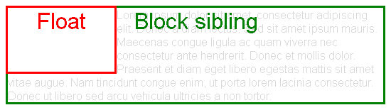
}<div class="float"></div>
<div class="block-sibling">
Lorem ipsum dolor sit amet, consectetur adipiscing elit. Donec a diam lectus. Sed sit amet ipsum mauris. Maecenas congue ligula ac quam viverra nec consectetur ante hendrerit. Donec et mollis dolor. Praesent et diam eget libero egestas mattis sit amet vitae augue. Nam tincidunt congue enim, ut porta lorem lacinia consectetur. Donec ut libero sed arcu vehicula ultricies a non tortor.
</div>This is also specified in 10.6 Calculating heights and margins. For "normal" blocks,
Only children in the normal flow are taken into account (i.e., floating boxes and absolutely positioned boxes are ignored […])
html {
width: 550px;
border: 1px solid;
}
body {
font-family: sans-serif;
color: rgba(0,0,0,.15);
}
body:after {
content: '';
display: block;
clear: both;
}
div {
position: relative;
}
div:after {
font-size: 200%;
position: absolute;
left: 0;
right: 0;
top: 0;
text-align: center;
}
.block-parent {
border: 3px solid blue;
}
.block-parent:after {
content: 'Block parent';
color: blue;
}
.float {
float: left;
border: 3px solid red;
height: 130px;
width: 150px;
}
.float:after {
content: 'Float';
color: red;
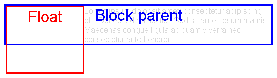
}<div class="block-parent">
<div class="float"></div>
Lorem ipsum dolor sit amet, consectetur adipiscing elit. Donec a diam lectus. Sed sit amet ipsum mauris. Maecenas congue ligula ac quam viverra nec consectetur ante hendrerit.
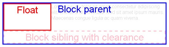
</div>Hacky solution: clearance
A way to solve the problem is forcing some in-flow element to be placed below all floats. Then, the height of the parent will grow to wrap that element (and thus the floats too).
This can be achieved using the clear property:
This property indicates which sides of an element's box(es) may not be adjacent to an earlier floating box.
html {
  width: 550px;
  border: 1px solid;
}
body {
  font-family: sans-serif;
  color: rgba(0,0,0,.15);
}
body:after {
  content: '';
  display: block;
  clear: both;
}
div {
  position: relative;
}
div:after {
  font-size: 200%;
  position: absolute;
  left: 0;
  right: 0;
  top: 0;
  text-align: center;
}
.block-parent {
  border: 3px solid blue;
}
.block-parent:after {
  content: 'Block parent';
  color: blue;
}
.float {
  float: left;
  border: 3px solid red;
  height: 84px;
  width: 150px;
}
.float:after {
  content: 'Float';
  color: red;
}
.clear {
  clear: both;
  text-align: center;
  height: 37px;
  border: 3px dashed pink;
}
.clear:after {
  position: static;
  content: 'Block sibling with clearance';
  color: pink;
}
<div class="block-parent">
<div class="float"></div>
Lorem ipsum dolor sit amet, consectetur adipiscing elit. Donec a diam lectus. Sed sit amet ipsum mauris. Maecenas congue ligula ac quam viverra.
<div class="clear"></div>
</div>So a solution is adding an empty element with clear: both as the last sibling of the floats
<div style="clear: both"></div>
However, that is not semantic. So better generate a pseudo-element at the end of the parent:
.clearfix::after {
  clear: both;
  display: block;
}
There are multiple variants of this approach, e.g. using the deprecated single colon syntax :after to support old browsers, or using other block-level displays like display: table.
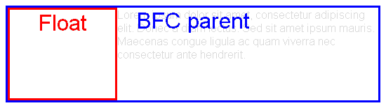
Solution: BFC roots
There is an exception to the problematic behavior defined at the beginning: if a block element establishes a Block Formatting Context (is a BFC root), then it will also wrap its floating contents.
According to 10.6.7 'Auto' heights for block formatting context roots,
If the element has any floating descendants whose bottom margin edge is below the element's bottom content edge, then the height is increased to include those edges.
html {
  width: 550px;
  border: 1px solid;
}
body {
  font-family: sans-serif;
  color: rgba(0,0,0,.15);
}
body:after {
  content: '';
  display: block;
  clear: both;
}
div {
  position: relative;
}
div:after {
  font-size: 200%;
  position: absolute;
  left: 0;
  right: 0;
  top: 0;
  text-align: center;
}
.block-parent {
  border: 3px solid blue;
}
.block-parent.bfc-root:after {
  content: 'BFC parent';
  color: blue;
}
.float {
  float: left;
  border: 3px solid red;
  height: 127px;
  width: 150px;
}
.float:after {
  content: 'Float';
  color: red;
}
.bfc-root {
  overflow: hidden;
}
<div class="block-parent bfc-root">
<div class="float"></div>
Lorem ipsum dolor sit amet, consectetur adipiscing elit. Donec a diam lectus. Sed sit amet ipsum mauris. Maecenas congue ligula ac quam viverra nec consectetur ante hendrerit.
</div>Additionally, as explained 9.5 Floats, BFC roots are also useful because of the following:
The border box of a table, a block-level replaced element, or an element in the normal flow that establishes a new block formatting context […] must not overlap the margin box of any floats in the same block formatting context as the element itself.
html {
width: 550px;
border: 1px solid;
}
body {
font-family: sans-serif;
color: rgba(0,0,0,.15);
}
body:after {
content: '';
display: block;
clear: both;
}
div {
position: relative;
}
div:after {
font-size: 200%;
position: absolute;
left: 0;
right: 0;
top: 0;
text-align: center;
}
.block-sibling {
border: 3px solid green;
}
.block-sibling.bfc-root:after {
content: 'BFC sibling';
color: green;
}
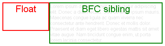
.float {
float: left;
border: 3px solid red;
height: 90px;
width: 150px;
z-index: 1;
}
.float:after {
content: 'Float';
color: red;
}
.bfc-root {
overflow: hidden;
}<div class="float"></div>
<div class="block-sibling bfc-root">
Lorem ipsum dolor sit amet, consectetur adipiscing elit. Donec a diam lectus. Sed sit amet ipsum mauris. Maecenas congue ligula ac quam viverra nec consectetur ante hendrerit. Donec et mollis dolor. Praesent et diam eget libero egestas mattis sit amet vitae augue. Nam tincidunt congue enim, ut porta lorem lacinia consectetur.
</div>A block formatting context is established by
-
Block boxes with
overflowother thanvisible, e.g.hidden.bfc-root { overflow: hidden; /* display: block; */ } -
Block containers that are not block boxes: when
displayis set toinline-block,table-cellortable-caption..bfc-root { display: inline-block; } -
Floating elements: when
floatis set toleftorright..bfc-root { float: left; } -
Absolutely positioned elements: when
positionis set toabsoluteorfixed..bfc-root { position: absolute; }
Note those may have undesired collateral effects, like clipping overflowing content, calculating auto widths with the shrink-to-fit algorithm, or becoming out-of-flow. So the problem is that it's not possible to have an in-flow block-level element with visible overflow that establishes a BFC.
Display L3 addresses these issues:
Created the
flowandflow-rootinner display types to better express flow layout display types and to create an explicit switch for making an element a BFC root. (This should eliminate the need for hacks like::after { clear: both; }andoverflow: hidden[…])
Sadly, there is no browser support yet. Eventually we may be able to use
.bfc-root {
  display: flow-root;
}
Solution 3
Put your floating div(s) in a div and in CSS give it overflow:hidden;
it will work fine.
Solution 4
Here's more modern approach:
.parent {display: flow-root;}
No more clearfixes.
p.s. Using overflow: hidden; hides the box-shadow so...
Solution 5
W3Schools recommendation:
put overflow: auto on parent element and it will "color" whole background including elements margins. Also floating elements will stay inside of border.
http://www.w3schools.com/css/tryit.asp?filename=trycss_layout_clearfix
Related videos on Youtube
 55 : 24
 10 : 13
 15 : 50
 06 : 03
 03 : 17
 03 : 01
 01 : 16
 07 : 22
 03 : 42
 01 : 05
 01 : 03
DavidR
Updated on March 12, 2021Comments
-
DavidR about 3 years
Say you have a
div, give it a definitewidthand put elements in it, in my case animgand anotherdiv.The idea is that the content of the container
divwill cause the containerdivto stretch out, and be a background for the content. But when I do this, the containingdivshrinks to fit the non-floating objects, and the floating objects will be either all the way out, or half out, half in, and not have any bearing on the size of the bigdiv.Why is this? Is there something I'm missing, and how can I get floated items to stretch out the
heightof a containingdiv? -
DavidR over 14 yearsIt works, but now I'm twice as confused: is there an explanation for this or is this just how it is?
-
Doug Neiner over 14 yearsYes, there is an explanation but I have since forgotten it :( Its just how it is. The
overflow:hiddenforces the browser the best it can to contain the child elements of the parent. Thats why it fixes it. -
 Vikas Arora about 10 yearsI think explanation for
overflow: hiddenis here: link. And thanks alot, it worked for me -
SearchForKnowledge over 9 yearsI tried that but it didn't solve me issue: stackoverflow.com/questions/25329349/…
-
Slight about 9 years@DavidR The easiest explanation is that html/css is a dated, poorly thought out, and poorly implemented piece of technology. In fact, this reasoning actually explains a lot of html/css quirks you've no doubt encountered since you made this post.
-
Slight about 9 yearsHow does that have anything to do with the floated element properly stretching the height of the parent?
-
Michael Benjamin over 8 yearsThis answer offers nothing in terms of an explanation, which is 90% of the question.
-
symlink about 8 yearsSo floated boxes aren't recognized by their parent containers, hence the height collapse, but are recognized by their siblings, hence the clearfix?
-
Oriol about 8 years@symlink Yes, parent containers don't grow to enclose floats, unless they are BFC roots. Siblings which are not BFC roots are not directly affected by blocks (but their line boxes are). However, clearance moves them below any previous float.
-
symlink about 8 years"Siblings which are not BFC roots are not directly affected by blocks (but their line boxes are)." - Can you clarify this please? Do you mean that In this jsFiddle: jsfiddle.net/aggL3Lk7/2, the floated inline image is not affecting the span (hence the span's border underlaps it) but the image is affecting the text (which is the line box) as is shown by the fact that the text is not underlapping the image?
-
Oriol about 8 years@symlink Yes, exactly. Well, in your fiddle the border belongs to the parent, but it would be basically the same for siblings: jsfiddle.net/aggL3Lk7/3
-
 DR01D about 7 yearsI concur. This should be the accepted answer. It's interesting to me that the W3 is calling the way we are forced to code a "hack". Somebody screwed up bad.
 -
pendingfox over 6 yearsWorks in Safari 11 as well
-
 Top Cat about 6 yearsKeep in mind that
overflow: hiddenwill just hide any part of an element which flow out of the parent container. For me, this caused certain bits of text to become unreadable. -
Sashko almost 6 yearsoverflow: hidden and auto both worked for me but here the difference between these two. w3schools.com/cssref/pr_pos_overflow.asp hidden - The overflow is clipped, and the rest of the content will be invisible. auto - If overflow is clipped, a scroll-bar should be added to see the rest of the content
-
ChrisW almost 5 years@VikasArora's link is broken but I think this is another link to the same article: The magic of “overflow: hidden”
-
 WISERDIVISOR almost 3 yearsThanks! This helped.
 -
abdul qayyum over 2 years@ChrisW link is also broken on your end, developer.mozilla.org/en-US/docs/Web/CSS/overflow this one may keep working
-
ChrisW over 2 yearsHere's Colin Aarts' article on Wayback machine: web.archive.org/web/20160331194800/http://colinaarts.com/…
-
Capstone over 2 yearsUpdate 2021. display: flow-root; works now and it seems to be supported in firefox and chrome at least. Maybe the answer needs updating.