Flutter : Custom Radio Button
Solution 1
Here is the full code
class CustomRadio extends StatefulWidget {
  @override
  createState() {
    return new CustomRadioState();
  }
}

class CustomRadioState extends State<CustomRadio> {
  List<RadioModel> sampleData = new List<RadioModel>();

  @override
  void initState() {
    // TODO: implement initState
    super.initState();
    sampleData.add(new RadioModel(false, 'A', 'April 18'));
    sampleData.add(new RadioModel(false, 'B', 'April 17'));
    sampleData.add(new RadioModel(false, 'C', 'April 16'));
    sampleData.add(new RadioModel(false, 'D', 'April 15'));
  }

  @override
  Widget build(BuildContext context) {
    return new Scaffold(
      appBar: new AppBar(
        title: new Text("ListItem"),
      ),
      body: new ListView.builder(
        itemCount: sampleData.length,
        itemBuilder: (BuildContext context, int index) {
          return new InkWell(
            //highlightColor: Colors.red,
            splashColor: Colors.blueAccent,
            onTap: () {
              setState(() {
                sampleData.forEach((element) => element.isSelected = false);
                sampleData[index].isSelected = true;
              });
            },
            child: new RadioItem(sampleData[index]),
          );
        },
      ),
    );
  }
}

class RadioItem extends StatelessWidget {
  final RadioModel _item;
  RadioItem(this._item);
  @override
  Widget build(BuildContext context) {
    return new Container(
      margin: new EdgeInsets.all(15.0),
      child: new Row(
        mainAxisSize: MainAxisSize.max,
        children: <Widget>[
          new Container(
            height: 50.0,
            width: 50.0,
            child: new Center(
              child: new Text(_item.buttonText,
                  style: new TextStyle(
                      color:
                          _item.isSelected ? Colors.white : Colors.black,
                      //fontWeight: FontWeight.bold,
                      fontSize: 18.0)),
            ),
            decoration: new BoxDecoration(
              color: _item.isSelected
                  ? Colors.blueAccent
                  : Colors.transparent,
              border: new Border.all(
                  width: 1.0,
                  color: _item.isSelected
                      ? Colors.blueAccent
                      : Colors.grey),
              borderRadius: const BorderRadius.all(const Radius.circular(2.0)),
            ),
          ),
          new Container(
            margin: new EdgeInsets.only(left: 10.0),
            child: new Text(_item.text),
          )
        ],
      ),
    );
  }
}

class RadioModel {
  bool isSelected;
  final String buttonText;
  final String text;

  RadioModel(this.isSelected, this.buttonText, this.text);
}
To use :
void main() {
  runApp(new MaterialApp(
    home: new CustomRadio(),
  ));
}
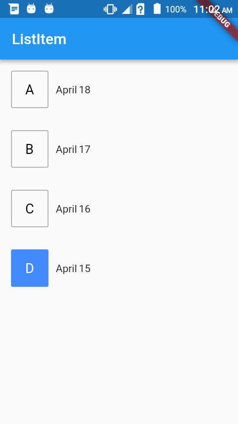
Screenshot :
Solution 2
Screenshot (Null safe)

Full code:
-
Create this custom class.
class MyRadioListTile<T> extends StatelessWidget { final T value; final T groupValue; final String leading; final Widget? title; final ValueChanged<T?> onChanged; const MyRadioListTile({ required this.value, required this.groupValue, required this.onChanged, required this.leading, this.title, }); @override Widget build(BuildContext context) { final title = this.title; return InkWell( onTap: () => onChanged(value), child: Container( height: 56, padding: EdgeInsets.symmetric(horizontal: 16), child: Row( children: [ _customRadioButton, SizedBox(width: 12), if (title != null) title, ], ), ), ); } Widget get _customRadioButton { final isSelected = value == groupValue; return Container( padding: EdgeInsets.symmetric(horizontal: 12, vertical: 8), decoration: BoxDecoration( color: isSelected ? Colors.blue : null, borderRadius: BorderRadius.circular(4), border: Border.all( color: isSelected ? Colors.blue : Colors.grey[300]!, width: 2, ), ), child: Text( leading, style: TextStyle( color: isSelected ? Colors.white : Colors.grey[600]!, fontWeight: FontWeight.bold, fontSize: 18, ), ), ); } } -
Use it in your widget like a regular
RadioListTile.class _MyPageState extends State<MyPage> { int _value = 1; @override Widget build(BuildContext context) { return Scaffold( body: Column( children: [ MyRadioListTile<int>( value: 1, groupValue: _value, leading: 'A', title: Text('One'), onChanged: (value) => setState(() => _value = value!), ), MyRadioListTile<int>( value: 2, groupValue: _value, leading: 'B', title: Text('Two'), onChanged: (value) => setState(() => _value = value!), ), MyRadioListTile<int>( value: 3, groupValue: _value, leading: 'C', title: Text('Three'), onChanged: (value) => setState(() => _value = value!), ), ], ), ); } }
Solution 3
I achieved that with the following logic. reply if you need a detailed explanation
    import 'package:flutter/material.dart';

    class Parent extends StatefulWidget {
      Parent({
        Key key,
      }) : super(key: key);

      @override
      _ParentState createState() => _ParentState();
    }

    class _ParentState extends State<Parent> {
      int _selectedItem = 0;

      selectItem(index) {
        setState(() {
          _selectedItem = index;
          print(selectItem.toString());
        });
      }

      @override
      Widget build(BuildContext context) {
        //...YOUR WIDGET TREE HERE

        return ListView.builder(
          shrinkWrap: true,
          itemCount: 5,
          itemBuilder: (context, index) {
            return CustomItem(
              selectItem, // callback function, setstate for parent
              index: index,
              isSelected: _selectedItem == index,
              title: index.toString(),
            );
          },
        );
      }
    }

    class CustomItem extends StatefulWidget {
      final String title;
      final int index;
      final bool isSelected;
      Function(int) selectItem;

      CustomItem(
        this.selectItem, {
        Key key,
        this.title,
        this.index,
        this.isSelected,
      }) : super(key: key);

      _CustomItemState createState() => _CustomItemState();
    }

    class _CustomItemState extends State<CustomItem> {
      @override
      Widget build(BuildContext context) {
        return Row(
          children: <Widget>[
            Text("${widget.isSelected ? "true" : "false"}"),
            RaisedButton(
              onPressed: () {
                widget.selectItem(widget.index);
              },
              child: Text("${widget.title}"),
            )
          ],
        );
      }
    }
Solution 4
You can create it with ListView and List Item with one local variable to store the selected item. And you can render the selected the ListItem based on the variable.
P.S. Let me know if you need code snippet.
[EDIT]
As you have requested, Here is code snipper which will show you how you can maintain the state of each ListView item.
Now you can play with it and make it the way you want. If you want only one selected item you can write the logic that way.
void main() {
  runApp(new MaterialApp(
    home: new ListItemDemo(),
  ));
}

class ListItemDemo extends StatelessWidget {
  @override
  Widget build(BuildContext context) {
    return new Scaffold(
      appBar: new AppBar(
        title: new Text("ListItem"),
      ),
      body: new ListView.builder(
          itemCount: 10,
          itemBuilder: (BuildContext context, int index) {
            return new MyListItem(
              title: "Hello ${index + 1}",
            );
          }),
    );
  }
}

class MyListItem extends StatefulWidget {
  final String title;

  MyListItem({this.title});

  @override
  _MyListItemState createState() => new _MyListItemState();
}

class _MyListItemState extends State<MyListItem> {
  bool isSelected;

  @override
  void initState() {
    super.initState();
    isSelected = false;
  }

  @override
  Widget build(BuildContext context) {
    return new Row(
      children: <Widget>[
        new Text("${widget.title} ${isSelected ? "true" : "false"}"),
        new RaisedButton(
          onPressed: () {
            if (isSelected) {
              setState(() {
                isSelected = false;
              });
            } else {
              setState(() {
                isSelected = true;
              });
            }
          },
          child: new Text("Select"),
        )
      ],
    );
  }
}
Solution 5
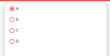
https://i.stack.imgur.com/Hq0O2.png
Here is Custom Radio Group Button Widget. You can easily customize all property as per your requirement. Use:
GroupRadioButton(
              label: [Text("A"), Text("B"), Text("C"), Text("D")],
              padding: EdgeInsets.symmetric(vertical: 10),
              spaceBetween: 5,
              radioRadius: 10,
              color: Const.mainColor,
              onChanged: (listIndex) {
                 print(listIndex);
              },
),
This is GroupRadioButton widget
import 'package:flutter/material.dart';

class GroupRadioButton extends StatefulWidget {
  GroupRadioButton({
    @required this.label,
    @required this.padding,
    @required this.onChanged,
    this.color = Colors.blue,
    this.radioRadius = 14.0,
    this.spaceBetween = 5.0,
    this.mainAxisAlignment = MainAxisAlignment.start,
    this.crossAxisAlignment = CrossAxisAlignment.start,
  });

  final Color color;
  final List<Widget> label;
  final EdgeInsets padding;
  final Function(int) onChanged;
  final double radioRadius;
  final double spaceBetween;
  final MainAxisAlignment mainAxisAlignment;
  final CrossAxisAlignment crossAxisAlignment;

  @override
  _GroupRadioButtonState createState() => _GroupRadioButtonState();
}

class _GroupRadioButtonState extends State<GroupRadioButton> {
  int selectedIndex = 0;
  @override
  Widget build(BuildContext context) {
    return ListView.builder(
        shrinkWrap: true,
        itemCount: widget.label != null ? widget.label.length : 0,
        itemBuilder: (context, index) {
          return LabeledRadio(
            selectedIndex: selectedIndex,
            color: widget.color,
            onChanged: (value) {
              setState(() {
                selectedIndex = value;
                widget.onChanged(value);
                // print(value);
              });
            },
            index: index,
            label: widget.label[index],
            crossAxisAlignment: widget.crossAxisAlignment,
            mainAxisAlignment: widget.mainAxisAlignment,
            radioRadius: widget.radioRadius,
            spaceBetween: widget.spaceBetween,
            padding: widget.padding,
          );
        });
  }
}

class LabeledRadio extends StatelessWidget {
  LabeledRadio({
    @required this.label,
    @required this.index,
    @required this.color,
    //@required this.groupValue,
    //@required this.value,
    @required this.onChanged,
    @required this.radioRadius,
    @required this.padding,
    @required this.spaceBetween,
    @required this.mainAxisAlignment,
    @required this.crossAxisAlignment,
    this.selectedIndex,
  });

  final Color color;
  final int selectedIndex;
  final Widget label;
  final index;
  final EdgeInsets padding;
  //final bool groupValue;
  //final bool value;
  final Function(int) onChanged;
  final double radioRadius;
  final double spaceBetween;
  final MainAxisAlignment mainAxisAlignment;
  final CrossAxisAlignment crossAxisAlignment;

  @override
  Widget build(BuildContext context) {
    return InkWell(
      onTap: () {
        onChanged(index);
      },
      child: Padding(
        padding: padding,
        child: Row(
          mainAxisAlignment: mainAxisAlignment,
          crossAxisAlignment: crossAxisAlignment,
          children: <Widget>[
            Container(
              decoration: BoxDecoration(
                //color: Const.mainColor,
                shape: BoxShape.circle,
                border: Border.all(color: color, width: 2),
              ),
              padding: EdgeInsets.all(2),
              child: selectedIndex == index
                  ? Container(
                      height: radioRadius,
                      width: radioRadius,
                      decoration: BoxDecoration(
                        color: color,
                        shape: BoxShape.circle,
                      ),
                    )
                  : Container(
                      height: radioRadius,
                      width: radioRadius,
                    ),
            ),
            SizedBox(
              width: spaceBetween,
            ),
            label,
          ],
        ),
      ),
    );
  }
}
Shyju M
Flutter | Xamarin forms | Xamarin Android | Tornado | Firebase | Elastic Search | Python
Updated on January 21, 2022Comments
-
Shyju M over 2 years
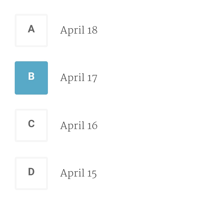
How can I create a custom radio button group like this in flutter