Flutter responsiveness problem on various mobile devices
Solution 1
The reason behind this problem is the sizedbox widget with height 100px. removing that and using mainaxisalignment as spaceevenly gives the required output. Here is the modified code:
 @override
  Widget build(BuildContext context) {
    return Scaffold(
      resizeToAvoidBottomPadding: false,
      body: Stack(
        fit: StackFit.expand,
        children: <Widget>[
          bgimage,
         Column(
           mainAxisAlignment: MainAxisAlignment.spaceEvenly,
              children: <Widget>[
                logoimage,
                userName(),
                password(),
                forgotPassword(),
                loginButton(),
                googleSignIn(),
                signUp()
              ],
            ),
        ],
      ),
    );
  }
This solves the problem.
Solution 2
You can use SingleChildScrollView as parent,
SingleChildScrollView(
      child: Container(
        width: MediaQuery.of(context).size.width,
        height: MediaQuery.of(context).size.height,
        child: Stack(
        ),
      ),
    );
Edit: Also remove fit: StackFit.expand, from Stack widget.
Solution 3
Best easiest way to make responsive UI for different screen size is Sizer plugin.
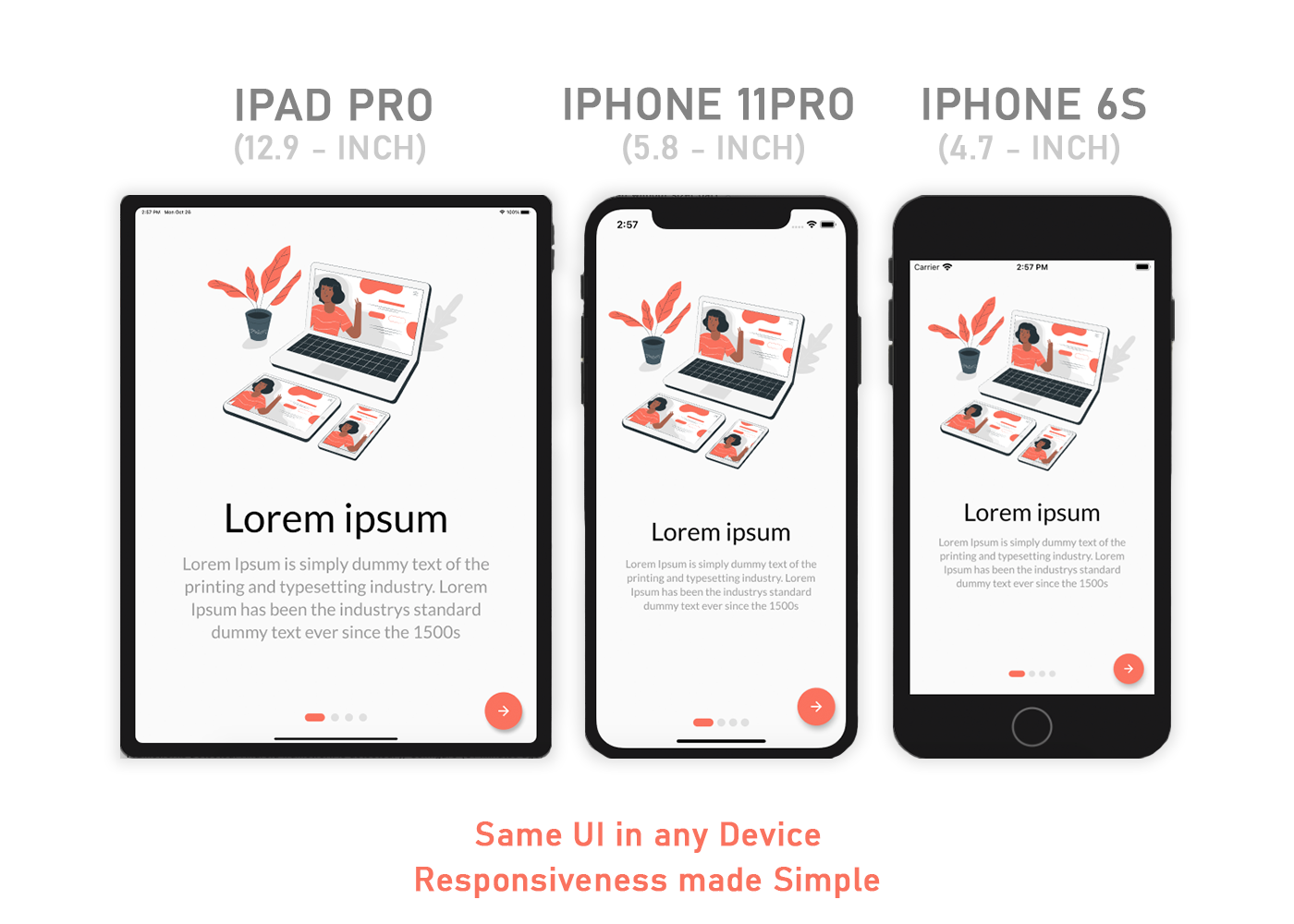
Responsive UI in any screen size device also tablet.
Check it this plugin ⬇️
https://pub.dev/packages/sizer
.h  - for widget height
.w  - for widget width
.sp - for font size
Use .h, .w, .sp after value like this ⬇️
Example:
Container(
  height: 10.0.h,  //10% of screen height
  width: 80.0.w,   //80% of screen width
  child: Text('Sizer', style: TextStyle(fontSize: 12.0.sp)),
);
I have build many responsive UI with this plugin.
Bala Ganesh
Updated on December 16, 2022Comments
-
Bala Ganesh over 1 year
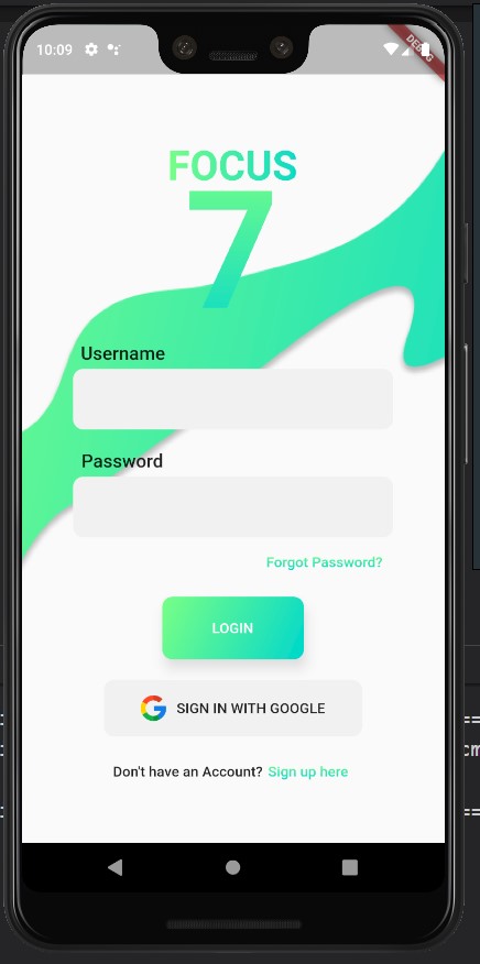
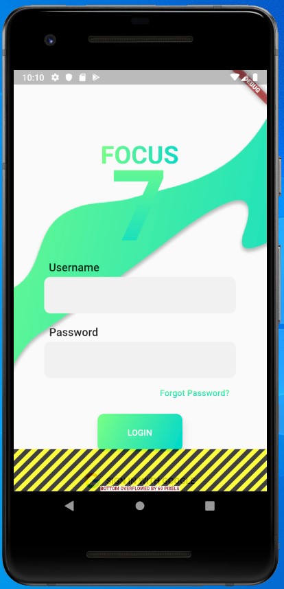
I am a beginner to Flutter and I tried creating a dummy login page. When I tried to run the app it was flawless on Pixel 3 XL but it was not good in Pixel 2 XL. How would I manage the responsiveness? I came across the
MediaQuerywidget, but how could I create a completely responsive app for each device? There are many variations among today's mobile devices (like notched display, fullscreen, etc) and thereafter comes the tablets. How could I manage this? Should I write code for each and every resolution?Here is my design on Pixel 3 XL and Pixel 2 XL
-
Bala Ganesh over 4 yearsI tried that but it did not change anything...take a look at my code and make suggestions if possible codeshare.io/GqVWrx
-
 Ravinder Kumar over 4 yearscreate a git repo of your complete code, I will look into it
 -
Bala Ganesh over 4 yearshere is my repo: github.com/bala0406/focus7 I pushed the master so the changes you said will not be available.
-
Ravinder Kumar over 4 yearsalthough I could not able to run your project but removing
fit: StackFit.expand,fromStackmust help you. -
Bala Ganesh over 4 yearsThanks for your response. I tried removing the fit property, but still, the problem persists