Force each row in Bootstrap table to be a one-liner when table is wider than screen
Try adding this css to your table elements:
white-space: nowrap
jsFiddle
Related videos on Youtube
 11 : 35
 07 : 11
Comments
-
Beauvais 3 months
I am building up a dynamic table which consists of 1-50 columns depending what the user selects. When the user selects 1-6 colums there is no problem showing all the data on the screen but when the user selects more than 6 columns the table tries to squeeze the view together on the screen resulting in each row being expanded to multiple lines.
I want it to always show the text in one line as this (OK):
But having many columns will wrap the text in to two or more lines (not OK):
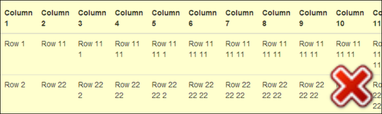
The column width is not defined as it also varies depending on the text to show.
How can I make sure the row will always be a one-liner like ex.1 no matter how many columns the user selects?
I have this JSFiddle demo with the code for the two above examples:
<table class='table'> <thead> <tr> <th>Column 1</th> <th>Column 2</th> <th>Column 3</th> <th>Column 4</th> <th>Column 5</th> <th>Column 6</th> </tr> </thead> <tbody> <tr> <td>Row 1</td> <td>Row 11</td> <td>Row 11 1</td> <td>Row 11 11</td> <td>Row 11 11 1</td> <td>Row 11 11 11</td> </tr> <tr> <td>Row 2</td> <td>Row 22</td> <td>Row 22 2</td> <td>Row 22 22</td> <td>Row 22 22 2</td> <td>Row 22 22 22</td> </tr> </tbody> </table> -
Beauvais almost 9 yearsThis works - is there a proper Bootstrap class for this? If not, I will accept this answer within a couple of days.
-
 jchnxu about 7 yearsI'll give you 100 thumbs up!
 -
 solidau almost 7 yearsthere is a bootstrap class:
text-nowrap -
huli over 6 yearsThanks. You save me day.