Greyscale Background Css Images
Solution 1
Here you go:
<html xmlns="http://www.w3.org/1999/xhtml">
<head runat="server">
<title>bluantinoo CSS Grayscale Bg Image Sample</title>
<style type="text/css">
    div {
        border: 1px solid black;
        padding: 5px;
        margin: 5px;
        width: 600px;
        height: 600px;
        float: left;
        color: white;
    }
     .grayscale {
         background: url(yourimagehere.jpg);
         -moz-filter: url("data:image/svg+xml;utf8,<svg xmlns=\'http://www.w3.org/2000/svg\'><filter id=\'grayscale\'><feColorMatrix type=\'matrix\' values=\'0.3333 0.3333 0.3333 0 0 0.3333 0.3333 0.3333 0 0 0.3333 0.3333 0.3333 0 0 0 0 0 1 0\'/></filter></svg>#grayscale");
         -o-filter: url("data:image/svg+xml;utf8,<svg xmlns=\'http://www.w3.org/2000/svg\'><filter id=\'grayscale\'><feColorMatrix type=\'matrix\' values=\'0.3333 0.3333 0.3333 0 0 0.3333 0.3333 0.3333 0 0 0.3333 0.3333 0.3333 0 0 0 0 0 1 0\'/></filter></svg>#grayscale");
         -webkit-filter: grayscale(100%);
         filter: gray;
         filter: url("data:image/svg+xml;utf8,<svg xmlns=\'http://www.w3.org/2000/svg\'><filter id=\'grayscale\'><feColorMatrix type=\'matrix\' values=\'0.3333 0.3333 0.3333 0 0 0.3333 0.3333 0.3333 0 0 0.3333 0.3333 0.3333 0 0 0 0 0 1 0\'/></filter></svg>#grayscale");
     }

    .nongrayscale {
        background: url(yourimagehere.jpg);
    }
</style>
</head>
<body>
    <div class="nongrayscale">
        this is a non-grayscale of the bg image
    </div>
    <div class="grayscale">
        this is a grayscale of the bg image
    </div>
</body>
</html>
Tested it in FireFox, Chrome and IE. I've also attached an image to show my results of my implementation of this.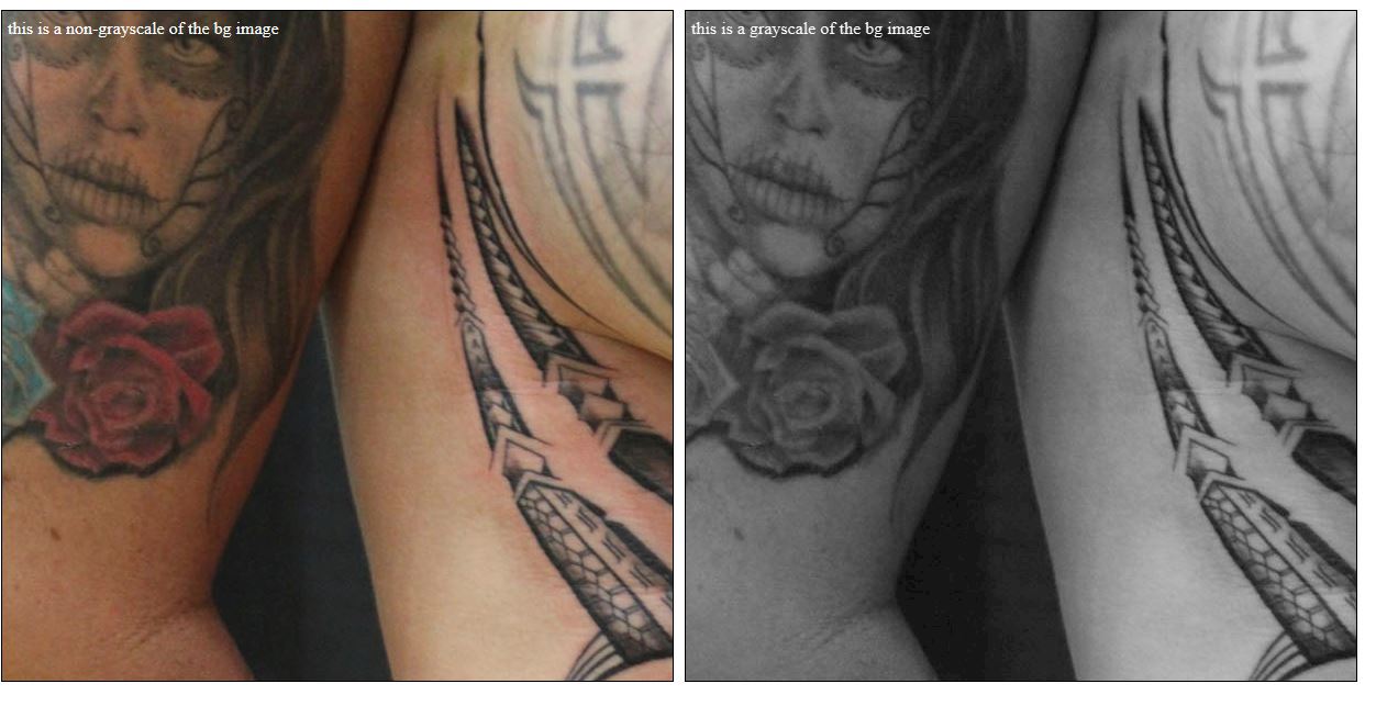
EDIT: Also, if you want the image to just toggle back and forth with jQuery, here's the page source for that...I've included the web link to jQuery and and image that's online so you should just be able to copy/paste to test it out:
<html xmlns="http://www.w3.org/1999/xhtml">
<head runat="server">
<title>bluantinoo CSS Grayscale Bg Image Sample</title>
<script src="http://code.jquery.com/jquery-1.11.0.min.js"></script>
<style type="text/css">
    div {
        border: 1px solid black;
        padding: 5px;
        margin: 5px;
        width: 600px;
        height: 600px;
        float: left;
        color: white;
    }
     .grayscale {
         background: url(http://www.polyrootstattoo.com/images/Artists/Buda/40.jpg);
         -moz-filter: url("data:image/svg+xml;utf8,<svg xmlns=\'http://www.w3.org/2000/svg\'><filter id=\'grayscale\'><feColorMatrix type=\'matrix\' values=\'0.3333 0.3333 0.3333 0 0 0.3333 0.3333 0.3333 0 0 0.3333 0.3333 0.3333 0 0 0 0 0 1 0\'/></filter></svg>#grayscale");
         -o-filter: url("data:image/svg+xml;utf8,<svg xmlns=\'http://www.w3.org/2000/svg\'><filter id=\'grayscale\'><feColorMatrix type=\'matrix\' values=\'0.3333 0.3333 0.3333 0 0 0.3333 0.3333 0.3333 0 0 0.3333 0.3333 0.3333 0 0 0 0 0 1 0\'/></filter></svg>#grayscale");
         -webkit-filter: grayscale(100%);
         filter: gray;
         filter: url("data:image/svg+xml;utf8,<svg xmlns=\'http://www.w3.org/2000/svg\'><filter id=\'grayscale\'><feColorMatrix type=\'matrix\' values=\'0.3333 0.3333 0.3333 0 0 0.3333 0.3333 0.3333 0 0 0.3333 0.3333 0.3333 0 0 0 0 0 1 0\'/></filter></svg>#grayscale");
     }

    .nongrayscale {
        background: url(http://www.polyrootstattoo.com/images/Artists/Buda/40.jpg);
    }
</style>
    <script type="text/javascript">
        $(document).ready(function () {
            $("#image").mouseover(function () {
                $(".nongrayscale").removeClass().fadeTo(400,0.8).addClass("grayscale").fadeTo(400, 1);
            });
            $("#image").mouseout(function () {
                $(".grayscale").removeClass().fadeTo(400, 0.8).addClass("nongrayscale").fadeTo(400, 1);
            });
        });
</script>
</head>
<body>
    <div id="image" class="nongrayscale">
        rollover this image to toggle grayscale
    </div>
</body>
</html>
EDIT 2 (For IE10-11 Users): The solution above will not work with the changes Microsoft has made to the browser as of late, so here's an updated solution that will allow you to grayscale (or desaturate) your images.
<svg>
  <defs>
    <filter xmlns="http://www.w3.org/2000/svg" id="desaturate">
      <feColorMatrix type="saturate" values="0" />
    </filter>
  </defs>
  <image xlink:href="http://www.polyrootstattoo.com/images/Artists/Buda/40.jpg" width="600" height="600" filter="url(#desaturate)" />
</svg>
Solution 2
I know it's a really old question, but it's the first result on duckduckgo, so I wanted to share what I think it's a better and more modern solution.
You can use background-blend-mode property to achieve a greyscale image:
#something {
  background-color: #fff;
  background-image: url("yourimage");
  background-blend-mode: luminosity;
}
If you want to remove the effect, just change the blend-mode to initial.
You may need to play a little bit with the background-color if this element is over something with a background. What I've found is that the greyscale does not depend on the actual color but on the alpha value. So, if you have a blue background on the parent, set the same background on #something.
You can also use two images, one with color and the other without and set both as background and play with other blend modes.
https://www.w3schools.com/cssref/pr_background-blend-mode.asp
It won't work on Edge though.
EDIT: I've missed the "fade" part of the question.
If you want to make it fade from/to grayscale, you can use a css transition on the background color changing its alpha value:
#something {
  background-color: rgba(255, 255, 255, 1);
  background-image: url("yourimage");
  background-blend-mode: luminosity;
  transition: background-color 1s ease-out;
}
#something:hover {
  background-color: rgba(255, 255, 255, 0);
}
I'm also adding a codepen example for completeness https://codepen.io/anon/pen/OBKKVZ
Solution 3
Using current browsers you can use it like this:
img {
  -webkit-filter: grayscale(100%); /* Chrome, Safari, Opera */
  filter: grayscale(100%);
}
and to remedy it:
img:hover{
   -webkit-filter: grayscale(0%); /* Chrome, Safari, Opera */
   filter: grayscale(0%);
}
worked with me and is much shorter. There is even more one can do within the CSS:
filter: none | blur() | brightness() | contrast() | drop-shadow() | grayscale() |
        hue-rotate() | invert() | opacity() | saturate() | sepia() | url();
For more information and supporting browsers see this: http://www.w3schools.com/cssref/css3_pr_filter.asp
bluantinoo
Updated on June 20, 2021Comments
-
bluantinoo about 3 years
I've searched a lot on the web but I cannot find a cross browser solution to fade a css backgrund image to greyscale and back.
The only working solution is to apply CSS3 filter greyscale:
-webkit-filter: grayscale(100%);but this works just with Chrome v.15+ and Safari v.6+ (as you can see here: http://css3.bradshawenterprises.com/filters/)
Many pages online speaks about this solution to grey out elements:
filter: url("data:image/svg+xml;utf8,<svg xmlns=\'http://www.w3.org/2000/svg\'><filter id=\'grayscale\'><feColorMatrix type=\'matrix\' values=\'0.3333 0.3333 0.3333 0 0 0.3333 0.3333 0.3333 0 0 0.3333 0.3333 0.3333 0 0 0 0 0 1 0\'/></filter></svg>#grayscale"); /* Firefox 10+, Firefox on Android */
filter: gray; /* IE6-9 */
(as you can see here:http://www.karlhorky.com/2012/06/cross-browser-image-grayscale-with-css.html)
But actually it does not seem to work for css background images, as the webkit filter do.
Are there any solution (maybe with jquery?) to hack this lack of support for filter on less advanced browsers?