Grid layout - fixed column width and responsive grid-gap
10,256
Solution 1
You could add some wrapping elements and give a fixed width to the items like so:
.container {
  display: grid;
  grid-template-columns: repeat(auto-fit, minmax(100px, 1fr));
  grid-auto-rows: 20px;
  grid-gap: 5px;
}

.item {
  background: yellow;
  text-align: center;
  border: 1px solid red;
  width: 100px;
  margin: auto;
}
<div class="container">
<div>
<div class="item">1</div>
</div>
<div>
<div class="item">2</div>
</div>
<div>
<div class="item">3</div>
</div>
<div>
<div class="item">4</div>
</div>
<div>
<div class="item">5</div>
</div>
<div>
<div class="item">6</div>
</div>
<div>
<div class="item">7</div>
</div>
<div>
<div class="item">8</div>
</div>
<div>
<div class="item">9</div>
</div>
<div>
<div class="item">10</div>
</div>
</div>You could then position the items in their wrapping parent however you see fit.
Solution 2
You could set a fixed item width along with justify-items or place-items depending on if you want this to happen in one axis or both:
.container {
  display: grid;
  grid-template-columns: repeat(auto-fit, minmax(100px, 1fr));
  grid-auto-rows: 20px;
  grid-gap: 5px;
  place-items: center;
}

.item {
  background: yellow;
  text-align: center;
  border: 1px solid red;
  width: 100px;
}
<div class="container">
<div class="item">1</div>
<div class="item">2</div>
<div class="item">3</div>
<div class="item">4</div>
<div class="item">5</div>
<div class="item">6</div>
<div class="item">7</div>
<div class="item">8</div>
<div class="item">9</div>
<div class="item">10</div>
</div>Related videos on Youtube
 02 : 17
CSS Grid-gap property with CSS Grid layout
 17 : 14
Responsive CSS Grid Tutorial
 11 : 10
Figma Tutorial: Setup a Responsive Grid Layout for UI & Web Design (IN 11 MINUTES)
 05 : 05
#59 CSS Grid Layout Properties | Grid-Gap | Justify-Content | Align-Content | CSS Tutorial
 11 : 50
Bootstrap Grid System Tutorial | Bootstrap 5
 09 : 42
Webflow Grids: A Beginners Tutorial In How To Use Grids In Webflow
 02 : 22
CSS Grid Layout Course #12: Set Grid Gap for Gutters
Author by
gfels
Updated on June 04, 2022Comments
-
gfels about 2 years
I have a layout that fills up the whole horizontal space and the items in the last row are still the same width as other rows thanks to grid layout.
Right now when resizing screen the width of items changes so that the whole row is filled. Is it possible to have the items fixed in width and have the grid-gaps be the ones that adjust?
https://jsfiddle.net/c60ymrfu/
Current CSS:
.container {
  display: grid;
  grid-template-columns: repeat(auto-fit, minmax(100px, 1fr));
  grid-auto-rows: 20px;
  grid-gap: 5px;
}
Current behavior:
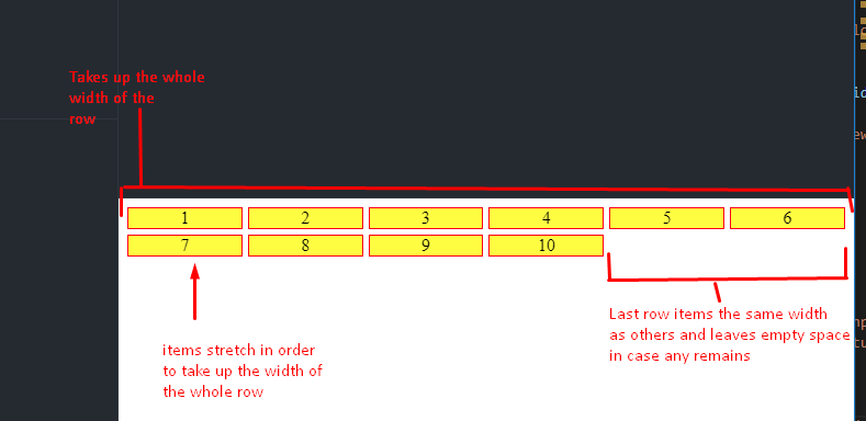
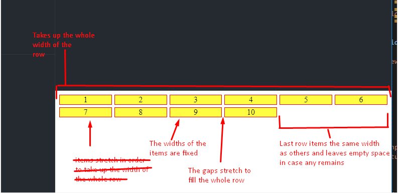
Desired behavior:
-
 Paulie_D about 5 yearsNo...CSS-Grid can't do that. Flexbox would be the solution.
-
-
gfels about 5 yearsThe gap between the most-right item and the edge of the page is changing, so the full width of row is not always taken :/
-
gfels about 5 yearsThis also changes the sizes of gaps between left and right edges of the page. :/
-
 James Coyle about 5 yearsYou just need to center the items in their parent. Updated the above example to add
margin: auto. -
James Coyle about 5 yearsThere isn't really a way to fix that and still keep the last row in line with the others.
-
gfels about 5 yearsStill changing. :/