How do I convert CSS to Styled-Components with input[type="submit"] attribute?
12,401
I guess you can achieve that by:
const Input = styled.input.attrs({
  type: 'submit',
  value: 'Submit'
})`
  background: #00aec9;
  color: #fff;
  cursor: pointer;
  margin-bottom: 0;
  text-transform: uppercase;
  width: 100%;
  border-radius: 5px;
  height: 35px;
  border-color: transparent;
  box-shadow: 0px;
  outline: none;
  transition: 0.15s;
  text-align: center;
  &:active {
    background-color: #f1ac15;
  }
`
And replace
<input type="submit" value="Submit" />
with
<Input />
More informations on attrs here
Author by
Stephan Du Toit
Updated on June 15, 2022Comments
-
Stephan Du Toit almost 2 years
How do I convert standard CSS with special attributes like "type" and "active", to Styled-Components consts?
.box {
  position: absolute;
  top: 50%;
  left: 50%;
  transform: translate(-50%, -50%);
  width: 400px;
  background: #fff;
  padding: 40px;
  border: 1px solid rgba(0, 0, 0, 0.1);
  box-shadow: 0 5px 10px rgba(0, 0, 0, 0.2);
}

input[type='submit'] {
  background: #00aec9;
  color: #fff;
  cursor: pointer;
  margin-bottom: 0;
  text-transform: uppercase;
  width: 100%;
  border-radius: 5px;
  height: 35px;
  border-color: transparent;
  box-shadow: 0px;
  outline: none;
  transition: 0.15s;
  text-align: center;
}

input[type='submit']:active {
  background-color: #f1ac15;
}
I managed to create the const for the .box CSS class but not sure how to achieve this with "input[type='submit']" and "input[type='submit']:active"
//---- .box class ------ //
const DivBox = styled.div`
  position: absolute;
  top: 50%;
  left: 50%;
  transform: translate(-50%, -50%);
  width: 400px;
  background: #fff;
  padding: 40px;
  border: 1px solid rgba(0, 0, 0, 0.1);
  box-shadow: 0 5px 10px rgba(0, 0, 0, 0.2);
`
Any assistance would be greatly appreciated
PS, I am using React and Nextjs
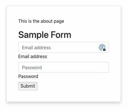
What I currently have:
What I want:

My current Component Code:
import Layout from '../components/MyLayout.js'
import styled from 'styled-components'

const DivBox = styled.div`
  position: absolute;
  top: 50%;
  left: 50%;
  transform: translate(-50%, -50%);
  width: 400px;
  background: #fff;
  padding: 40px;
  border: 1px solid rgba(0, 0, 0, 0.1);
  box-shadow: 0 5px 10px rgba(0, 0, 0, 0.2);
`

const Input = styled.input.attrs({ type: 'submit' })`
  background: #00aec9;
  color: #fff;
  cursor: pointer;
  margin-bottom: 0;
  text-transform: uppercase;
  width: 100%;
  border-radius: 5px;
  height: 35px;
  border-color: transparent;
  box-shadow: 0px;
  outline: none;
  transition: 0.15s;
  text-align: center;
  &:active {
    background-color: #f1ac15;
  }
`

export default function About() {
  return (
    <Layout>
      <DivBox>
        <p>This is the about page</p>
        <h2>Sample Form</h2>
        <div className="form-label-group">
          <input
            type="email"
            id="inputEmail"
            className="form-control"
            placeholder="Email address"
            required
            autoFocus
          />
          <label htmlFor="inputEmail">Email address</label>
        </div>

        <div className="form-label-group">
          <input
            type="password"
            id="inputPassword"
            className="form-control"
            placeholder="Password"
            required
          />
          <label htmlFor="inputPassword">Password</label>
        </div>
        <div>
          <input type="submit" value="Submit" />
        </div>
      </DivBox>
    </Layout>
  )
}
Additional CSS:
.form-control:focus {
  border-color: #00aec9;
  box-shadow: 0 0 0 0.2rem rgba(19, 162, 228, 0.25);
}

.form-label-group input:not(:placeholder-shown) ~ label {
  color: #00aec9;
}