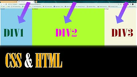
How do I keep CSS floats in one line?
Solution 1
Wrap your floating <div>s in a container <div> that uses this cross-browser min-width hack:
.minwidth { min-width:100px; width: auto !important; width: 100px; }
You may also need to set "overflow" but probably not.
This works because:
- The
!importantdeclaration, combined withmin-widthcause everything to stay on the same line in IE7+ - IE6 does not implement
min-width, but it has a bug such thatwidth: 100pxoverrides the!importantdeclaration, causing the container width to be 100px.
Solution 2
Another option is, instead of floating, to set the white-space property nowrap to a parent div:
.parent {
     white-space: nowrap;
}
and reset the white-space and use an inline-block display so the divs stay on the same line but you can still give it a width.
.child {
    display:inline-block;
    width:300px;
    white-space: normal;
}
Here is a JSFiddle: https://jsfiddle.net/9g8ud31o/
Solution 3
Wrap your floaters in a div with a min-width greater than the combined width+margin of the floaters.
No hacks or HTML tables needed.
Solution 4
Solution 1:
display:table-cell (not widely supported)
Solution 2:
tables
(I hate hacks.)
Solution 5
Another option: Do not float your right column; just give it a left margin to move it beyond the float. You'll need a hack or two to fix IE6, but that's the basic idea.
Related videos on Youtube
Jiaaro
Always working to be a fuller stack developer. Interested in expanding my understanding up into design (how it works, visual, and otherwise), the business model and strategy, and in terms of tech: a level or two below where I'm working. So far I've mostly worked on web apps using Python and Javascript (a lot of it with django, react, and backbone). I've done a little with cython, swift and go.
Updated on April 25, 2020Comments
-
Jiaaro about 4 years
I want to have two items on the same line using
float: leftfor the item on the left.I have no problems achieving this alone. The problem is, I want the two items to stay on the same line even when you resize the browser very small. You know... like how it was with tables.
The goal is to keep the item on the right from wrapping no matter what.
How to I tell the browser using CSS that I would rather stretch the containing
divthan wrap it so the thefloat: right;div is below thefloat: left;div?what I want:
\ +---------------+ +------------------------/ | float: left; | | float: right; \ | | | / | | |content stretching \ Screen Edge | | |the div off the screen / <--- +---------------+ +------------------------\ /-
JoeCool over 11 yearsHow cool would it be if StackOverlow added a little drawing widget so we could make these diagrams with the mouse? Might be more appropriate for design-oriented SE sites... but it would be awesome nevertheless.
-
frank hadder about 11 years@JoeCool The UX SE site actually has a tool to create mockups in it, already. meta.ux.stackexchange.com/questions/1291/…
-
-
Jiaaro over 15 yearswell it works for just about everything and the existing layout is based on it, I'm just trying to fix a problem with the layout breaking when you increase the text size too much OR resize the browser window smaller than 700px wide
-
tylerthemiler about 12 yearsThis works great for two floats, but not three. Can it work for three??
-
Matt Montag almost 12 yearsThe only problem is it forces a fixed minimum width.
-
Ryan Ore over 11 yearsDefinitely the best solution I've seen. It works for my use case but I wonder how well it's supported. Fortunately using floats for EVERYTHING is slowly becoming a thing of the past.
-
Sanne over 10 yearsThis isn't a solution, it's just a min-width, when your content gets really small (see question) so below the 100px you have the same issue. Specially with table cells, this stays an issue.
-
 Anirudhan J over 10 yearsCan you explain how this works? or any links atleast?
 -
Brian over 10 years@AnirudhanJ It's not too difficult. Inline-block makes the elements flow normally with inline text (but retains some of the padding/margin abilities of the block), and you literally just tell the CSS not to wrap the text with the white-space: nowrap option (applying "normal" again to the child, to avoid it propagating down into everything)
-
 Shawn J. Molloy almost 10 yearsAbsolutely shocking - solved my problem instantly. I have been wrangling with this problem in a simple two column bootstrap layout with more box hacks than I can name, but this worked perfectly. Thank you for the explanation of why this work - fascinating stuff, the dom is.
 -
AsGoodAsItGets almost 10 yearsThis may work with divs, but I just tested it with ul/li and it doesn't work :(
-
John about 9 yearsA framework for CSS? I have to -jquery for ALL JavaScript searches and because of a complete and utter disregard for quality we have to start explicitly searching for CSS with -jquery too? Do it right or don't do it at all.
-
 Andy almost 9 yearsIf the CSS standard were revised to eliminate the need for min/max size hacks, it would be a great day.
 -
 Andy almost 9 years@MattM. not to mention it's not guaranteed to work for arbitrary-length content
 -
 ahnbizcad almost 9 yearswow when you have to rely on a bug to ensure crossbrowser compatibility, you know the protocol is time to be updated.
 -
addMitt over 8 yearsHow do you get the div on the right to float to the right of the screen, though? This just puts two inline-blocks next to each other that won't line break.
-
 Claudiu over 7 yearsyou can also use letter-spacing: -3px (or whatever value works for you) to remove the space between the inline-block elements. PS: better than the accepted answer;


