How do I prevent my div layers from overlapping when the browser is resized?
Solution 1
as Walter said your CSS would be helpful. But, the main problem is that the content in the div is overflowing to other divs because the the content's div cannot contain all the content.
In your css, try setting the div's overflow property to either auto (shows scrolls bars) or hidden (to just hide the content if it goes outside's the div)
e.g.
overflow:auto;
or
overflow:hidden;
Solution 2
Express your widths and font-sizes in ems. Here's a good calculator: http://riddle.pl/emcalc/
Percentages will work, too.
Check the css in stackoverflow, and try resizing the zoom level in your browser here - you'll see everything resizes nicely at any zoom level.
Solution 3
you can also try the min-width. i am assuming the center div is fluid and sidebars are fixed-width.
Admin
Updated on September 01, 2020Comments
-
Admin over 3 years
I've just spent the last few weeks learning how to properly design a layout. I basically thought I had everything perfect with my website layout and was ready to go about transferring the coding to Wordpress... and then I accidentally resized my web browser and discovered that all of my
divlayers were overlapping each other.Here's what it looks like:
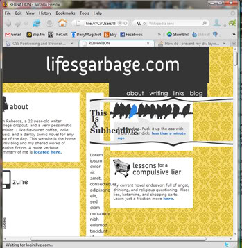
Basically it looks as though it's mainly my center content
divthat is being squeezed out, as well as my header image and navigation witch are in the same topdiv. My footer is also squeezed down as well. I've searched the internet for a solution to this problem and can't seem to find a thing.How do I fix it so that my
divs stay in place when the browser is resized?