How to add drop shadow to TextFormField In Flutter
Solution 1
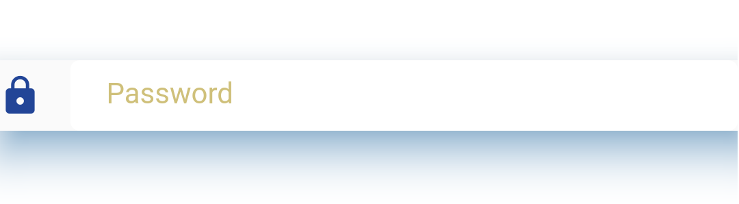
You can Wrap your TextFormField with a Material widget and edit its properties such as elevation and shadowColor.
Example:
Material(
              elevation: 20.0,
              shadowColor: Colors.blue,
                          child: TextFormField(
                obscureText: true,
                autofocus: false,
                decoration: InputDecoration(
                    icon: new Icon(Icons.lock, color: Color(0xff224597)),
                    hintText: 'Password',
                    fillColor: Colors.white,
                    filled: true,
                    contentPadding: EdgeInsets.fromLTRB(20.0, 10.0, 20.0, 10.0),
                    enabledBorder: OutlineInputBorder(borderRadius:BorderRadius.circular(5.0),
                    borderSide: BorderSide(color: Colors.white, width: 3.0))
                ),
              ),
            )
You will Get something similar to the image below.
Solution 2
Here is a possible solution where the BoxShadow is only displayed behind the TextField, but is not expanding vertically if an error text is displayed.

My solution was to use the Stack widget to create an additional Container behind the actual TextField that is responsible for displaying the shadow.
A TextPainter is used to determine the height of the error text depending on its style:
import 'package:flutter/material.dart';

class TextFieldWithBoxShadow extends StatelessWidget {
  final String? errorText;
  final String? labelText;
  final TextEditingController? controller;
  final double height;

  const TextFieldWithBoxShadow({
    Key? key,
    this.errorText,
    this.labelText,
    this.controller,
    this.height = 40,
  }) : super(key: key);

  @override
  Widget build(BuildContext context) {
    final errorStyle = const TextStyle(
      fontSize: 14,
    );

    // Wrap everything in LayoutBuilder so that the available maxWidth is taken into account for the height calculation (important if you error text exceeds one line)
    return LayoutBuilder(builder: (context, constraints) {
      // Use tp to calculate the height of the errorText
      final textPainter = TextPainter()
        ..text = TextSpan(text: errorText, style: errorStyle)
        ..textDirection = TextDirection.ltr
        ..layout(maxWidth: constraints.maxWidth);

      final heightErrorMessage = textPainter.size.height + 8;
      return Stack(
        children: [
          // Separate container with identical height of text field which is placed behind the actual textfield
          Container(
            height: height,
            decoration: BoxDecoration(
              boxShadow: const [
                BoxShadow(
                  color: Colors.black,
                  blurRadius: 3,
                  offset: Offset(3, 3),
                ),
              ],
              borderRadius: BorderRadius.circular(
                10.0,
              ),
            ),
          ),
          Container(
            // Add height of error message if it is displayed
            height: errorText != null ? height + heightErrorMessage : height,
            child: TextField(
              decoration: InputDecoration(
                fillColor: Colors.black,
                filled: true,
                errorStyle: errorStyle,
                errorText: errorText,
                border: OutlineInputBorder(
                  borderRadius: BorderRadius.circular(
                    10.0,
                  ),
                ),
                labelText: labelText,
              ),
              controller: controller,
            ),
          ),
        ],
      );
    });
  }
}
Solution 3
Drop Shadow Effect Using Container Widget
We can pass color and set the offset value, blurRadius and spreadRadius. Lets see the code
Container(
  child: TextField(
    decoration: InputDecoration(
      fillColor: Colors.white,
      filled: true,
    ),
  ),

  decoration: BoxDecoration(
    boxShadow: [
      BoxShadow(
        color: Colors.black38,
        blurRadius: 25,
        offset: const Offset(0, 10),
      ),
    ],
  ),
);
Solution 4
You can Use for PhysicalModel to add shadow on each widget like this:
PhysicalModel(
   borderRadius: BorderRadius.circular(25),
   color: Colors.white,
   elevation: 5.0,
   shadowColor: Color(0xff44BD32),
   child: CustomTextField(...
Solution 5
The problem when we use a Container, Material or any other Widget to wrap the input text field in order to apply the shadow is if we use the hint text, error text or any other property that change the size of our textbox, the design would be broken.
Intead of wrapping the input in another widget you could use custom painter extending the InputBorder class. For example:
class MyInputBorder extends OutlineInputBorder {}
Copy the following methods from the OutlineInputBorder implementation (Used for this example) to your new class: _gapBorderPath _cornersAreCircular paint
Then in the paint method you could add the following lines
Path path = Path();
path.addRRect(center);
canvas.drawShadow(path, Colors.black, 4, true);
The above lines must be included before the canvas.drawRRect line: Example:
if (gapStart == null || gapExtent <= 0.0 || gapPercentage == 0.0) {
  // paint the shadow for the outlined shape
  Path path = Path();
  path.addRRect(center);
  canvas.drawShadow(path, shadowColor!, elevation, true);

  canvas.drawRRect(center, paint);
} else {... other code omitted to keep simple}
Then, in your Widget, use the new Input border:
TextField(
         decoration: InputDecoration(
           border: MyInputBorder()
         ),
       )
The result produced looks like the following without any of the issues of wrapper solutions:
Here is a complete sample implementation, the post is in spanish but it has the idea explained: Full article for reference
NicoleZ
Updated on February 11, 2022Comments
-
NicoleZ over 2 years
I have a text form field in flutter I want to add a drop shadow to it. how should I do that?
 final password = TextFormField(
    obscureText: true,
    autofocus: false,
    decoration: InputDecoration(
        icon: new Icon(Icons.lock, color: Color(0xff224597)),
        hintText: 'Password',
        fillColor: Colors.white,
        filled: true,
        contentPadding: EdgeInsets.fromLTRB(20.0, 10.0, 20.0, 10.0),
        enabledBorder: OutlineInputBorder(borderRadius:BorderRadius.circular(5.0),
        borderSide: BorderSide(color: Colors.white, width: 3.0))
     ),
   );