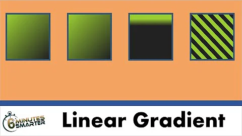
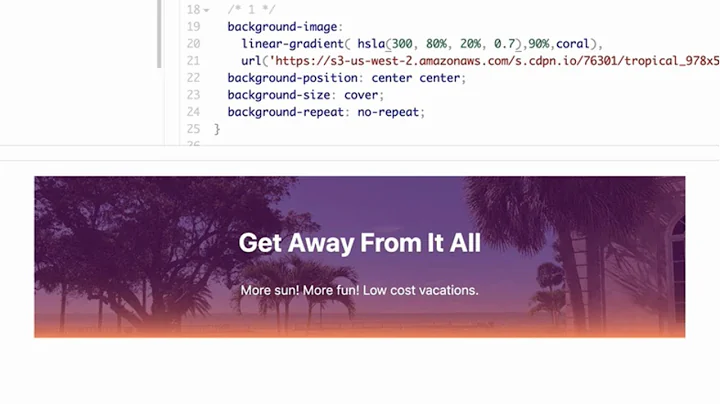
How to add gradient overlay to the <img> element with css?
11,607
You can add a pseudo-element with CSS that overlays the images and get shown on hover/focus which also has the gradient effect on it.
I modified your Code into the following example:
.image_row {
      position: relative;
      display: flex;
      flex-direction: row;
      justify-content: space-between;
    }

    .image_row img:hover,
    .image_row img:focus {
      transform: translate(-9px, -9px);
      box-shadow: 10px 10px #95e1d3;
    }

    img {
      display: block;
    }

    .image {
      position: relative;
    }

    .image::before {
      content: '';
      position: absolute;
      top: 0;
      left: 0;
      right: 0;
      bottom: 0;
      z-index: 1;
    }

    .image:hover,
    .image:focus {
      transform: translate(-9px, -9px);
      box-shadow: 10px 10px #95e1d3;
    }

    .image:hover::before,
    .image:focus::before {
      background-image: -moz-linear-gradient( 90deg, rgb(252, 227, 138) 0%, rgb(243, 129, 129) 100%);
      background-image: -webkit-linear-gradient( 90deg, rgb(252, 227, 138) 0%, rgb(243, 129, 129) 100%);
      background-image: -ms-linear-gradient( 90deg, rgb(252, 227, 138) 0%, rgb(243, 129, 129) 100%);
      mix-blend-mode: overlay;
    }
<!DOCTYPE html>
<html lang="en" dir="ltr">
<head>
<meta charset="utf-8">
<title></title>
</head>
<body>
<div class="image_row">
<div class="image">
<img src="http://via.placeholder.com/380x250" height="250" width="380" />
</div>
<div class="image">
<img src="http://via.placeholder.com/380x250" height="250" width="380" />
</div>
<div class="image">
<img src="http://via.placeholder.com/380x250" height="250" width="380" />
</div>
</div>
</body>
</html>Related videos on Youtube
Author by
AlexF
Updated on June 04, 2022Comments
-
 AlexF almost 2 years
I'm making html markup of this page section. As you can see here it is three images. When I set my mouse cursor on one of them the image is shifted and becomes overlayed with linear-gradient. The code of images
Code
.image_row {
  display: flex;
  flex-direction: row;
  justify-content: space-between;
}

.image_row img:hover,
.image_row img:focus {
  transform: translate(-9px, -9px);
  box-shadow: 10px 10px #95e1d3;
}
<div class="image_row"> <img src="image-1" height="250" width="380" /> <img src="image-2" height="250" width="380" /> <img src="image-3" height="250" width="380" /> </div>My problem is that I don't how to make gradient overlay for the image. I tried the follow code, but it didn't bring any effect:
.image_row img:hover, .image_row img:focus{ transform: translate(-9px, -9px); box-shadow: 10px 10px #95e1d3; background-image: -moz-linear-gradient( 90deg, rgb(252,227,138) 0%, rgb(243,129,129) 100%); background-image: -webkit-linear-gradient( 90deg, rgb(252,227,138) 0%, rgb(243,129,129) 100%); background-image: -ms-linear-gradient( 90deg, rgb(252,227,138) 0%, rgb(243,129,129) 100%); mix-blend-mode: normal; opacity: 0.9; } -
 AlexF almost 6 yearsThanks for solution. This code can be use used with little modifications to achieve needed effect and it solves gradient-overlay problem.
 -
 AlexF almost 6 yearsNice solution. The only thing to change here is gradient parameters. To follow psd prototype we need to use mix-blend-mode: normal with opacity:0,9.


