how to add percentages to a simple bar chart in excel. Data is a series of strings in cells, I want bar chart to show percentages rather than count
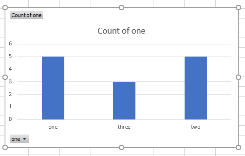
Excel has created a pivot chart and aggregates the data as a count. In order to show percentage, you need to change the way the values are displayed.
Select the pivot chart and make sure that you see the pivot field pane. If you don't see it, click on the PivotChart Analyze ribbon and then click the ribbon button Field List. Now you can
- Click the dropdown arrow for the Count aggregation in the Values area
- Click Value Field Settings
- in the dialog, click on the tab Show Values As
- Click % of Grand Total and OK
Now the chart value axis changes to a percentage scale and the values of the columns are displayed as percentages.
Related videos on Youtube
 09 : 52
thomas
Updated on September 18, 2022Comments
-
thomas about 1 year
I have been trying for hours to find a solution to this, but have not been able to.
Let's say I have this simple column in excel (a series of strings):
Now, what I want is a simple bar chart out of this, which shows the frequency (how many occurrences) of each string. When I go to Insert -> Recommended graph, excel comes up with a 'clustered column' graph, which is the following:
Now, I have figured out how to input values on each column, so it becomes:

Now the question is .. no matter how much I 've researched online and/or played with options, I can't find for the life of me, how to show percentages rather than 'count' values above each column. Ideally, I would like to have both - but if not possible, percentages is enough.
I guess I could make another column where I have a formula to calculate the percentage, perhaps from a pivot table etc - but because I need to create almost one hundred graphs out of such columns, I am really looking weather its possible to do it kind of automatically, or at least with a couple clicks...
It seems pretty reasonable to assume that there must be a way to have percentages, since its often needed in similar graphs .. Is there such a way, or am I just too optimistic?
Really, any help would be extremely appreciated, I 've lost far too many hours on this ...
-
thomas over 2 yearsThanks a lot for the detailed answer. I just saw it through mobile phone. As soon as i find some time to check it, i will definitely mark the answer, i will do it until the end of the week for sure. Thanks a lot for your help!