How to Customise the angular material date-picker?
38,050
Solution 1
Use the function for manipulate event and hide image of calendar as:
var app = angular.module('StarterApp', ['ngMaterial']);

app.controller('AppController', function($scope) {
    $scope.initDatepicker = function(){
        angular.element(".md-datepicker-button").each(function(){
            var el = this;
            var ip = angular.element(el).parent().find("input").bind('click', function(e){
                angular.element(el).click();
            });
            angular.element(this).css('visibility', 'hidden');
        });
    };
});
.inputdemoBasicUsage .md-datepicker-button {
width: 36px;
}
.inputdemoBasicUsage .md-datepicker-input-container {
margin-left: 2px;
}
.md-datepicker-input-container {
display: block;
}
.md-datepicker-input[placeholder] {
color:red;
}
.padding-top-0 {
padding-top: 0px;
}
.padding-bottom-0 {
padding-bottom: 0px;
}<script src="https://ajax.googleapis.com/ajax/libs/jquery/2.1.1/jquery.min.js"></script>
<!-- Angular Material Dependencies -->
<script src="https://ajax.googleapis.com/ajax/libs/angularjs/1.3.15/angular.min.js"></script>
<script src="https://ajax.googleapis.com/ajax/libs/angularjs/1.3.15/angular-animate.min.js"></script>
<script src="https://ajax.googleapis.com/ajax/libs/angularjs/1.3.15/angular-aria.min.js"></script>
<script src="https://ajax.googleapis.com/ajax/libs/angular_material/0.11.2/angular-material.min.js"></script>
<link rel="stylesheet" href="https://ajax.googleapis.com/ajax/libs/angular_material/0.11.2/angular-material.min.css">
<div ng-app="StarterApp" ng-controller="AppController" ng-init="initDatepicker();">
<md-content flex class="padding-top-0 padding-bottom-0" layout="row">
<md-datepicker ng-model="user.submissionDate1" md-placeholder="Start date" flex ng-click="ctrl.openCalendarPane($event)"></md-datepicker>
<md-datepicker ng-model="user.submissionDate2" md-placeholder="Due date" flex></md-datepicker>
</md-content>
</div>Solution 2
using the above anwser, I changed this lines to display better:
.md-datepicker-input-container {
  width: 100%;
  margin-left: 0px;
}
Solution 3
Additional to @EmirMarques answer, I wanted to make the input field read only. so i added this code. Here user can't edit the date input field. so its
Better One
$scope.initDatepicker = function(){
        angular.element(".md-datepicker-button").each(function(){
            var el = this;
            var ip = angular.element(el).parent().find("input").bind('click', function(e){
                angular.element(el).click();
            });
            angular.element(el).parent().find("input").prop('readonly', true);
            angular.element(this).css('visibility', 'hidden');
        });
};
And this CSS made the look better
.md-datepicker-input-container {
    display: block;
    margin-left: 0 !important;
    width: 100% !important;;
}
Comments
-
Mr X almost 2 years
I am using the material design date picker
<md-content flex class="padding-top-0 padding-bottom-0" layout="row">
                <md-datepicker ng-model="user.submissionDate" md-placeholder="Start date" flex ng-click="ctrl.openCalendarPane($event)"></md-datepicker>
                <md-datepicker ng-model="user.submissionDate" md-placeholder="Due date" flex></md-datepicker>
            </md-content>
and its shows the UI like this
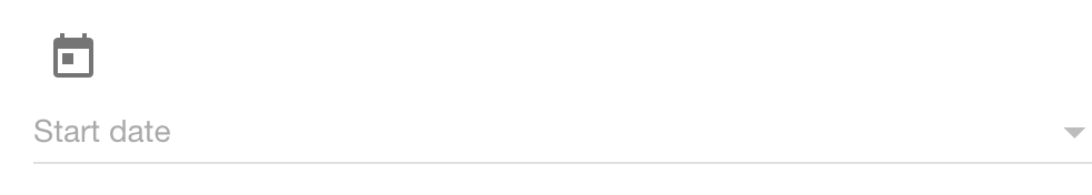
I want to remove the calendar icon and include the ng-click functionality in the input box.
How to bind the runtime event with the input box?
css
<style> .inputdemoBasicUsage .md-datepicker-button { width: 36px; } .inputdemoBasicUsage .md-datepicker-input-container { margin-left: 2px; } .md-datepicker-input-container{ display:block; } .md-datepicker-input[placeholder]{ color=red; } .padding-top-0{ padding-top:0px;} .padding-bottom-0{ padding-bottom:0px; } </style> -
 santhosh almost 8 yearsi'm new to css and angular can you please explain me or give some link so that i understand how is that ip is working..and great solution it was really helpfull
 -
Emir Marques almost 8 years@santhosh, i not understand you question. You can read the documentation of angular or material: krescruz.github.io/angular-materialize
-
santhosh almost 8 yearsi have not understood that initialization to the variable ip.
-
Venu Madhav over 6 yearsActually I am trying to write my own styles like you in my component but it is not effecting in output, where i have to write my own styles to get effected, now am writing in my.component.css.